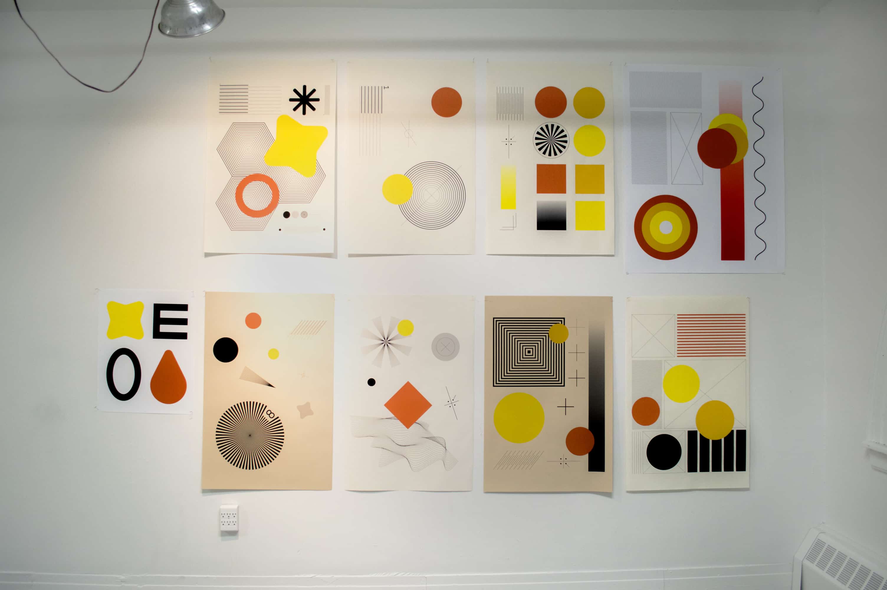
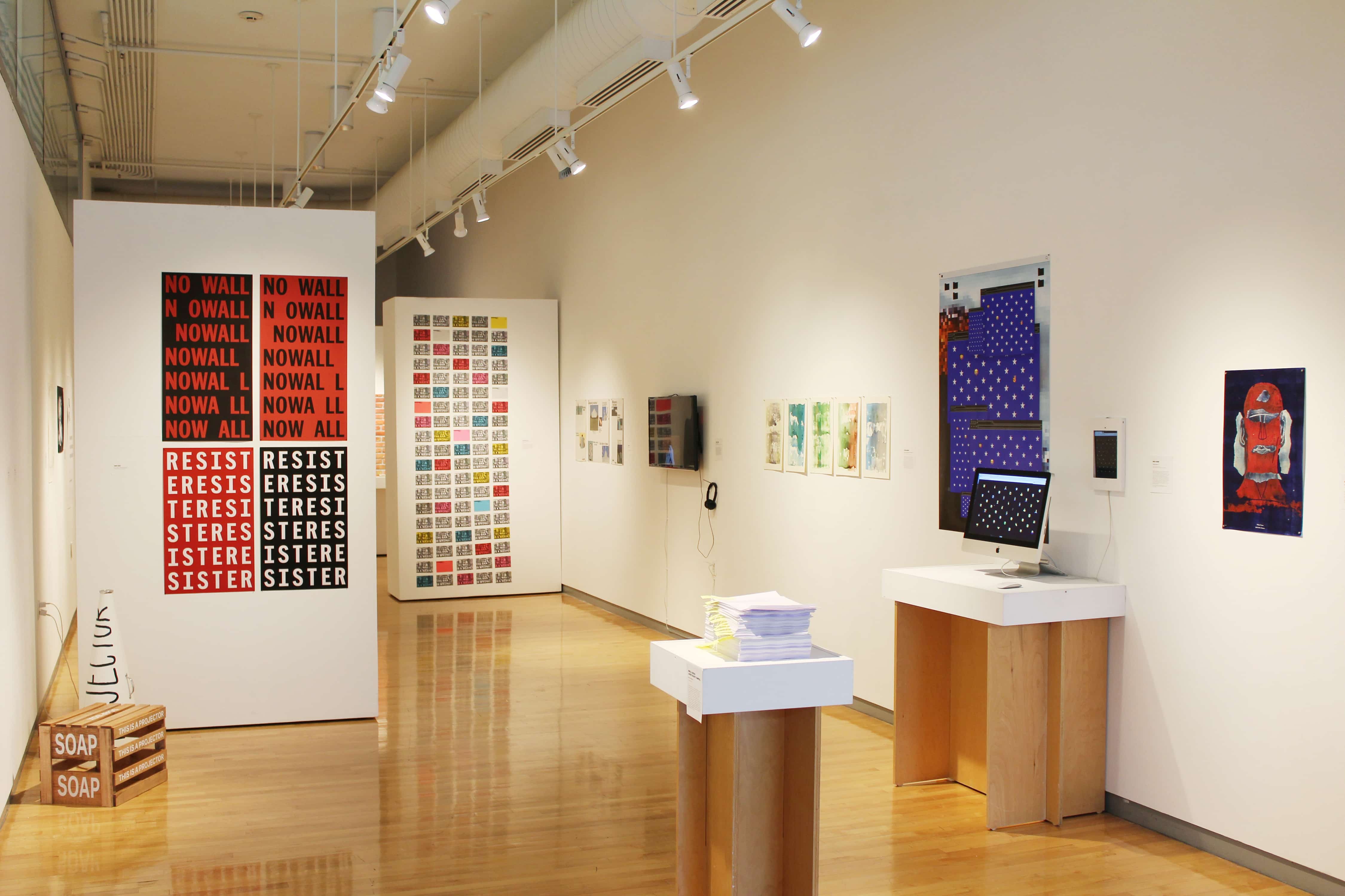
MFA
’17*
#risdgdmfa2017
Rhode Island
School of Design
Graphic Design MFA
Thesis Show
May 24 – June 3, 2017
Rhode Island Convention Center
1 Sabin Street, Providence,
Rhode Island 02903
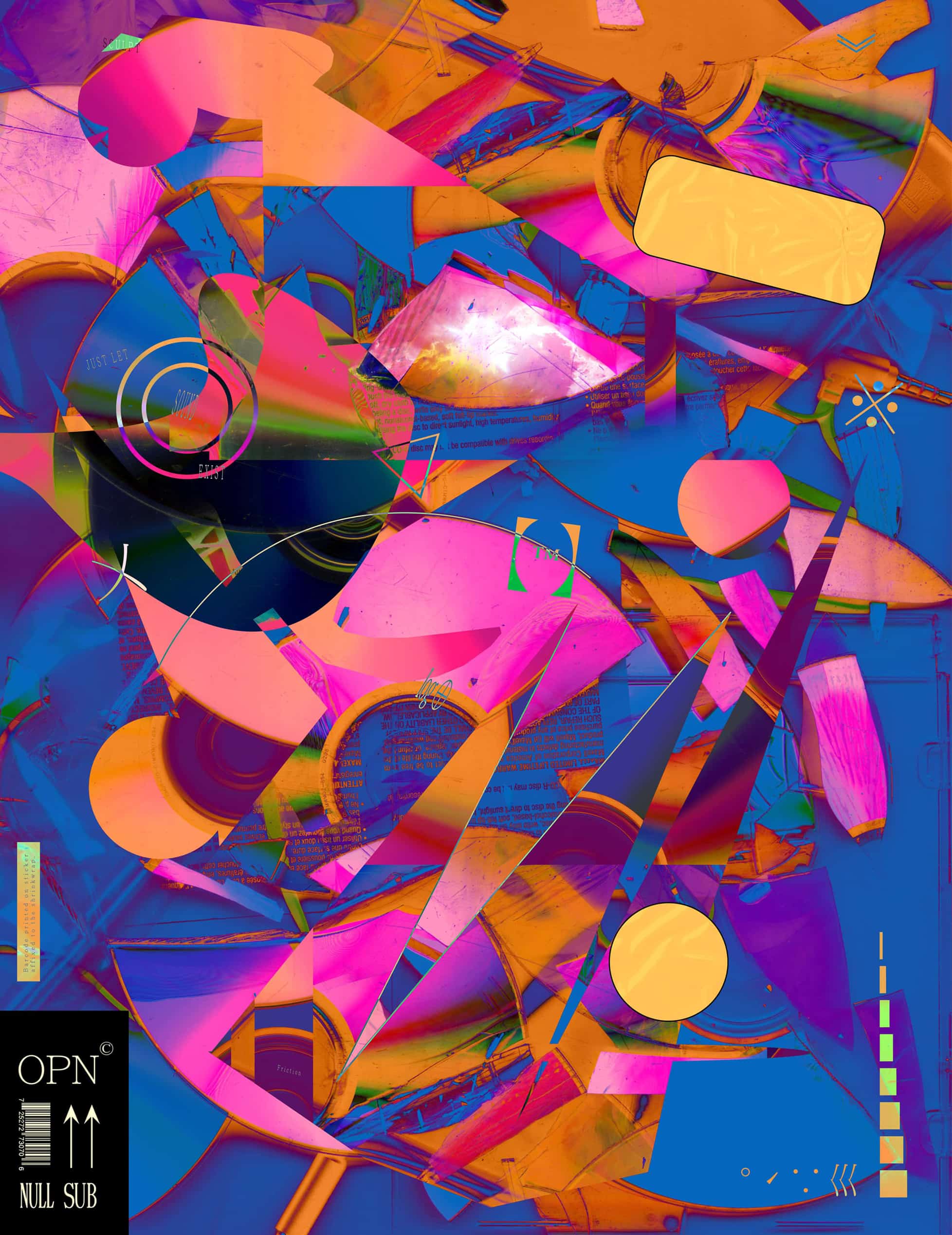
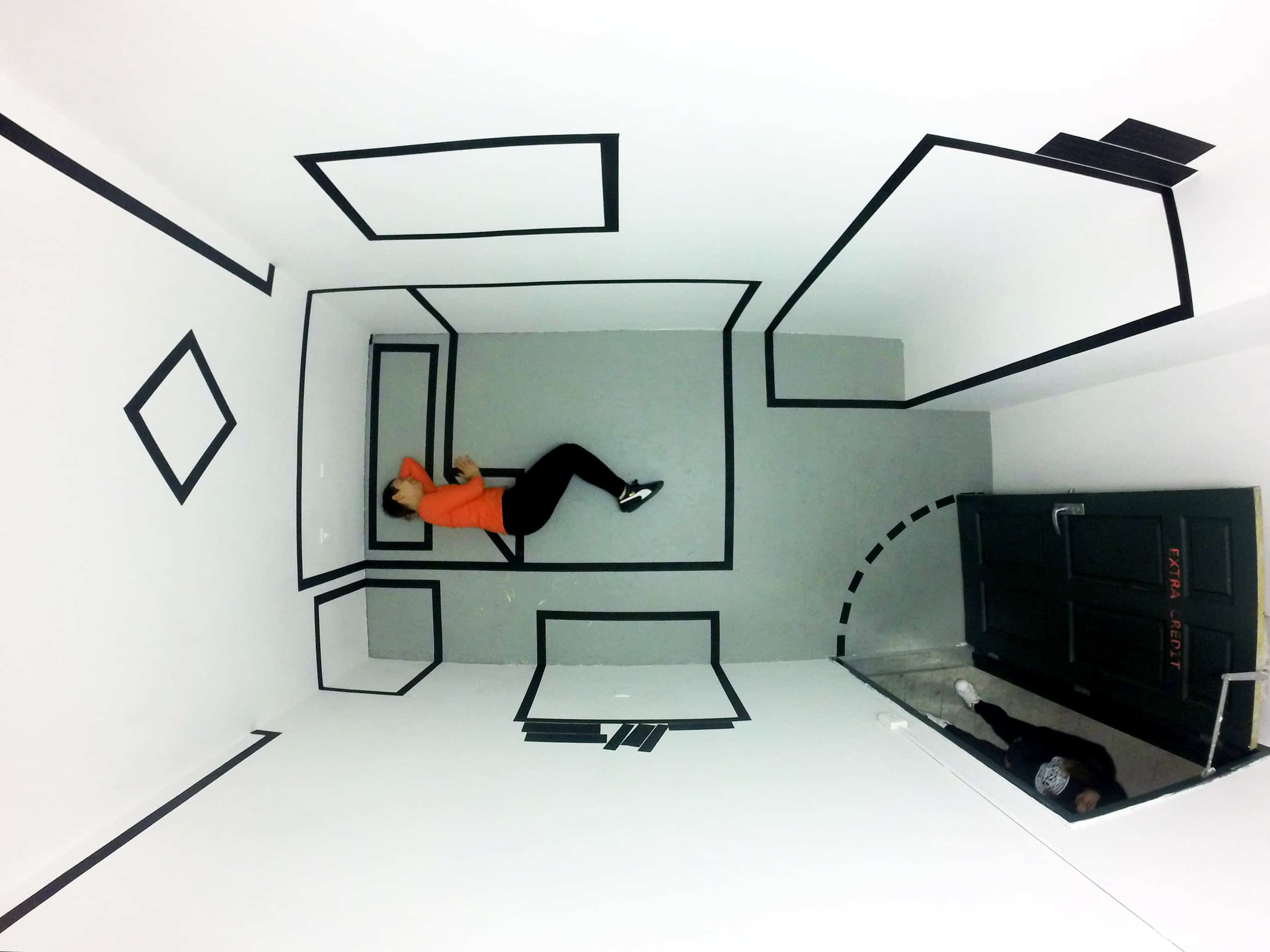
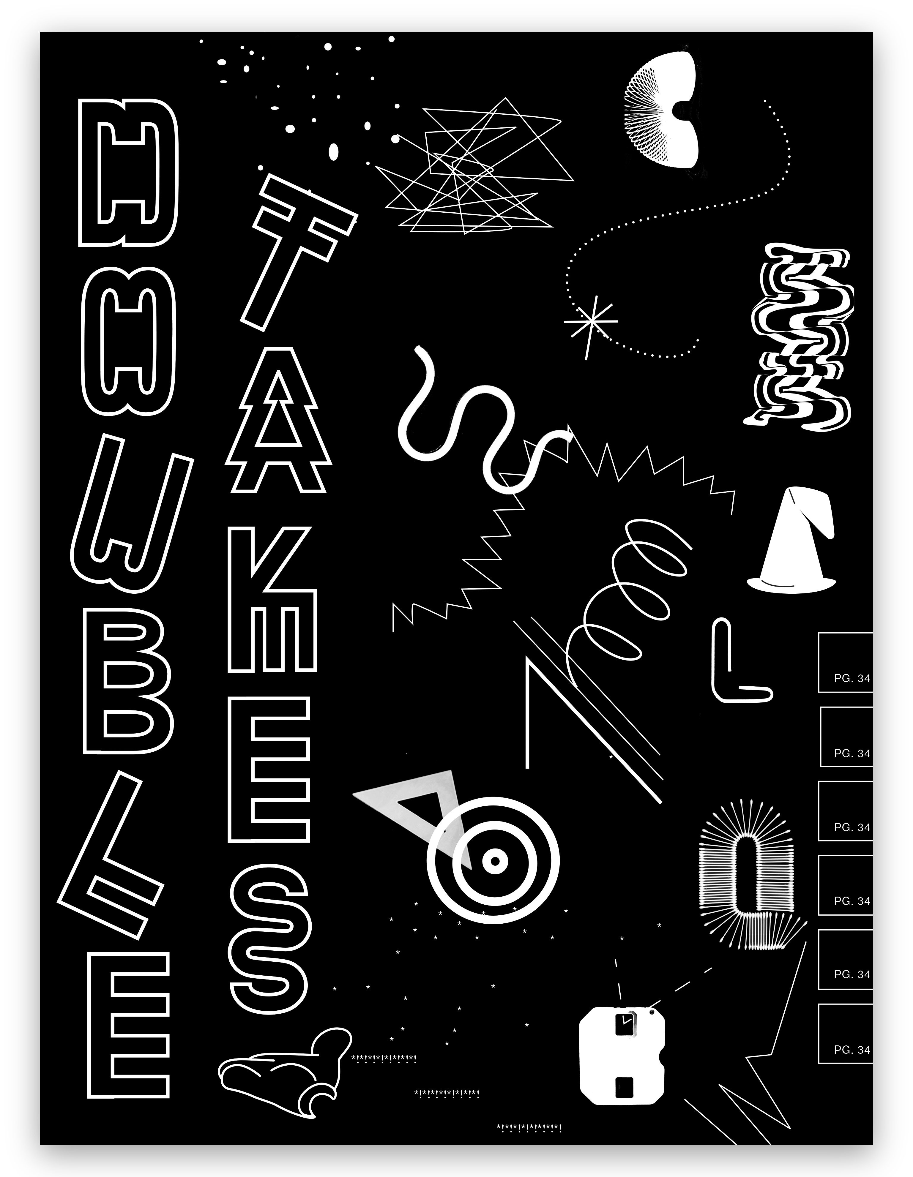 Lake Buckley: Double Takes
 Mary Yang: Design Syncopations
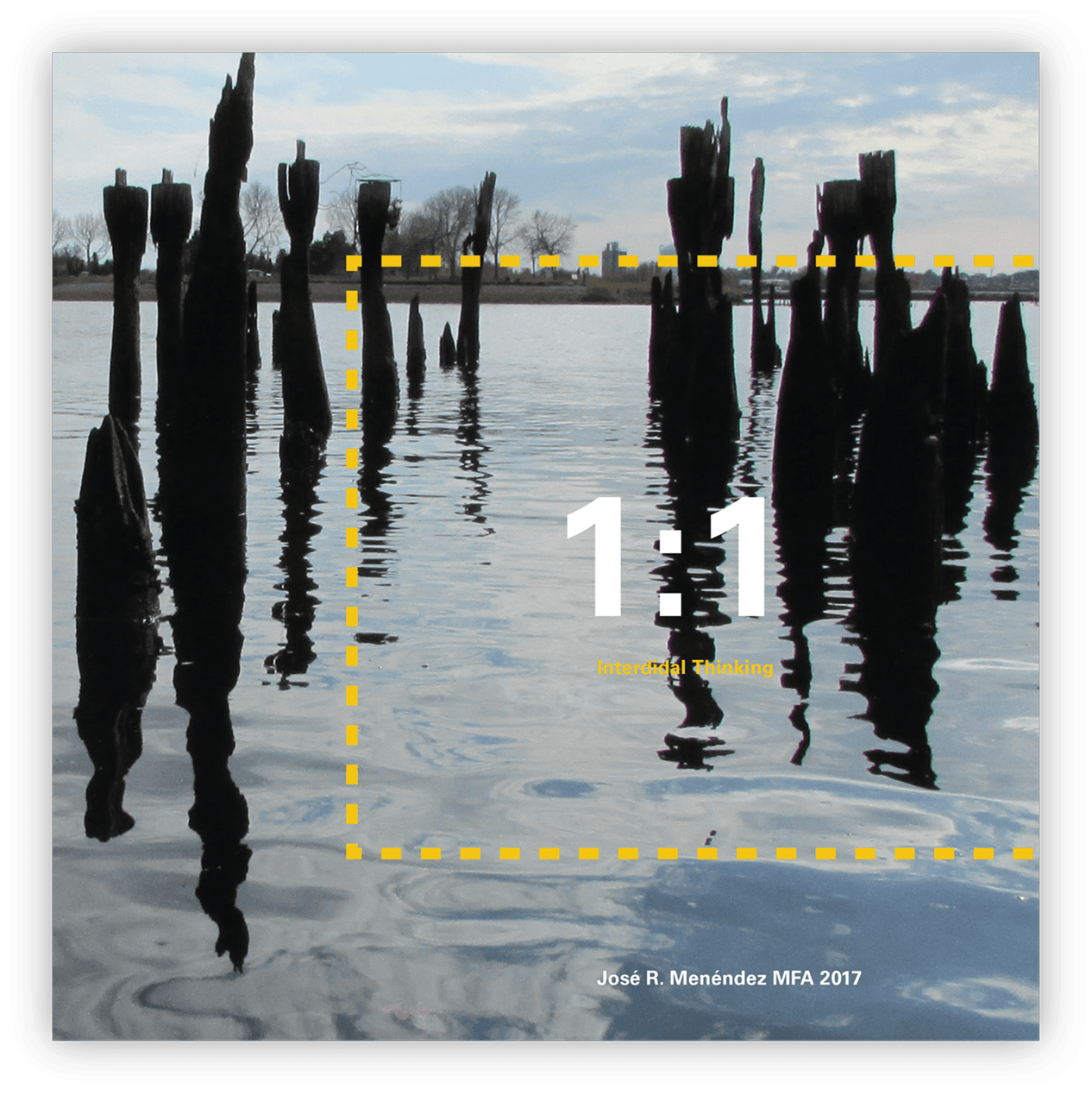 José Menendez: Intertidal Thinking
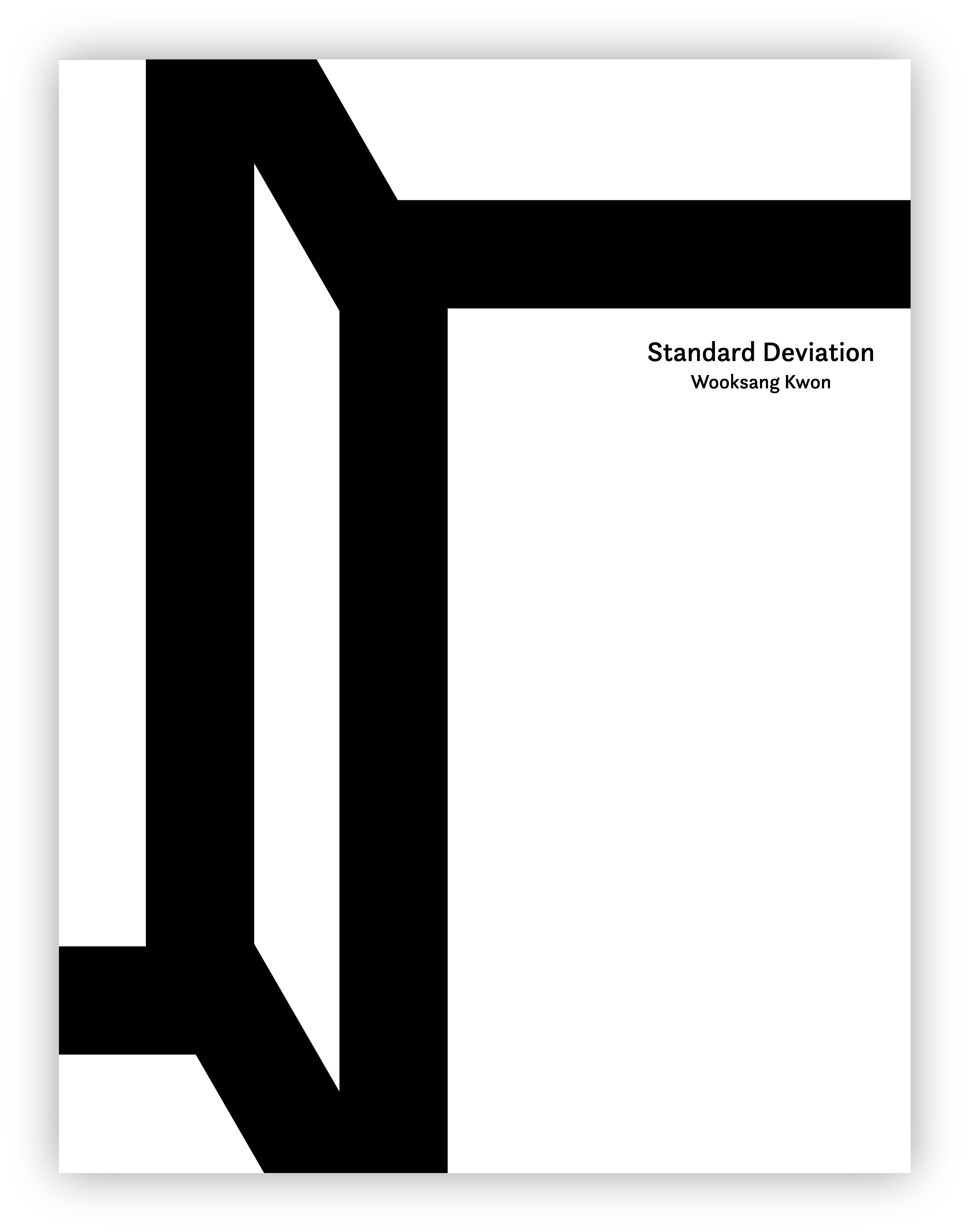 Wooksang Kwon: Standard Deviation
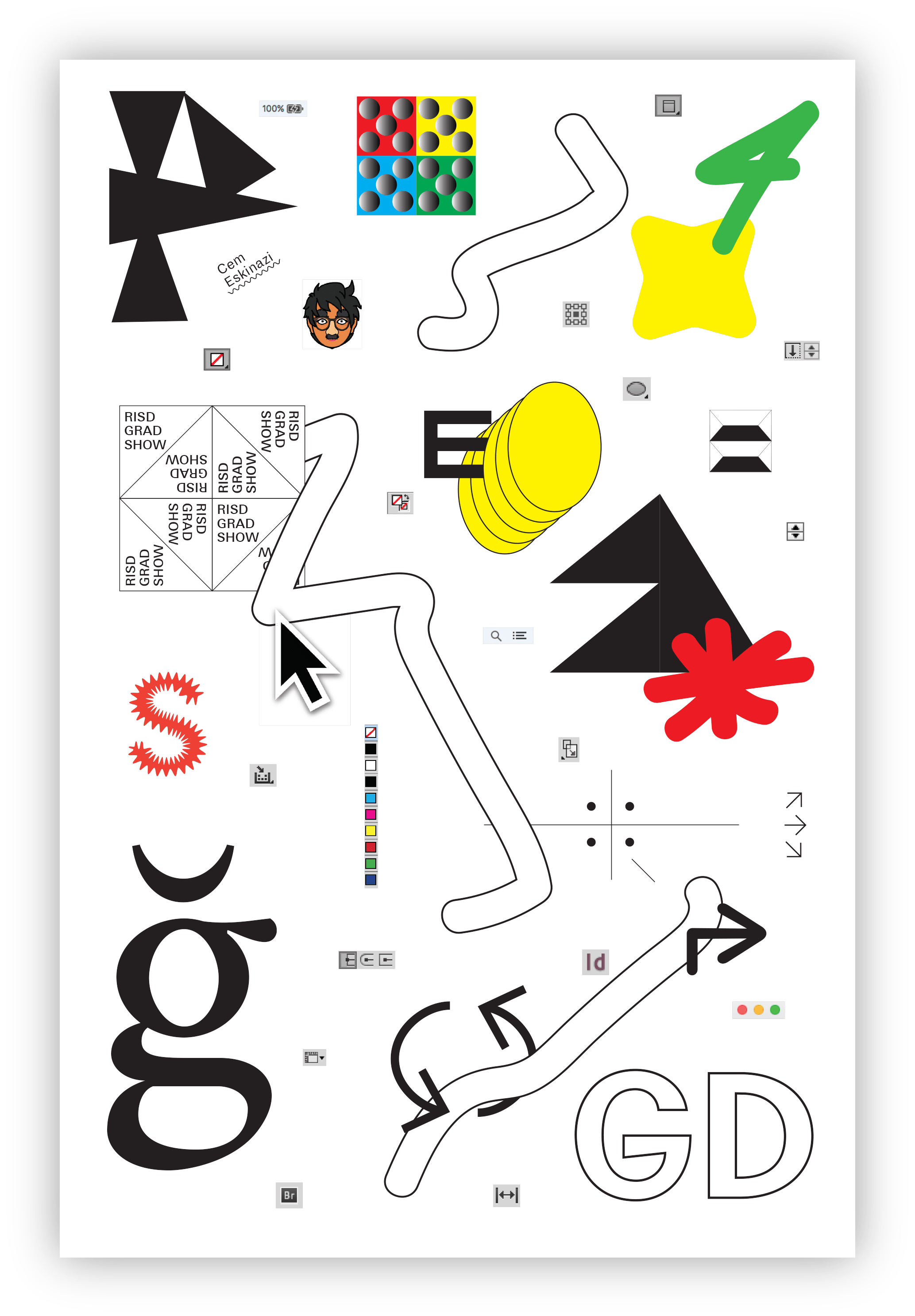 Cem Eskinazi: Playgrounds
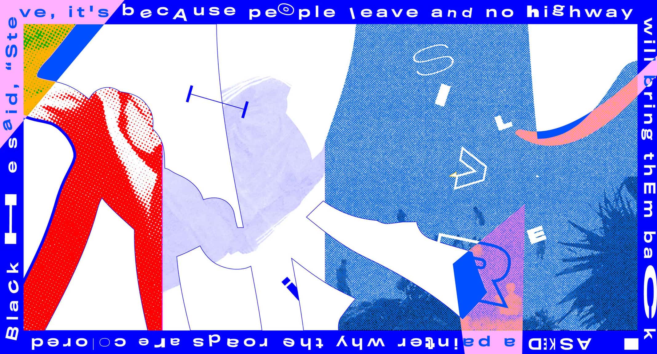
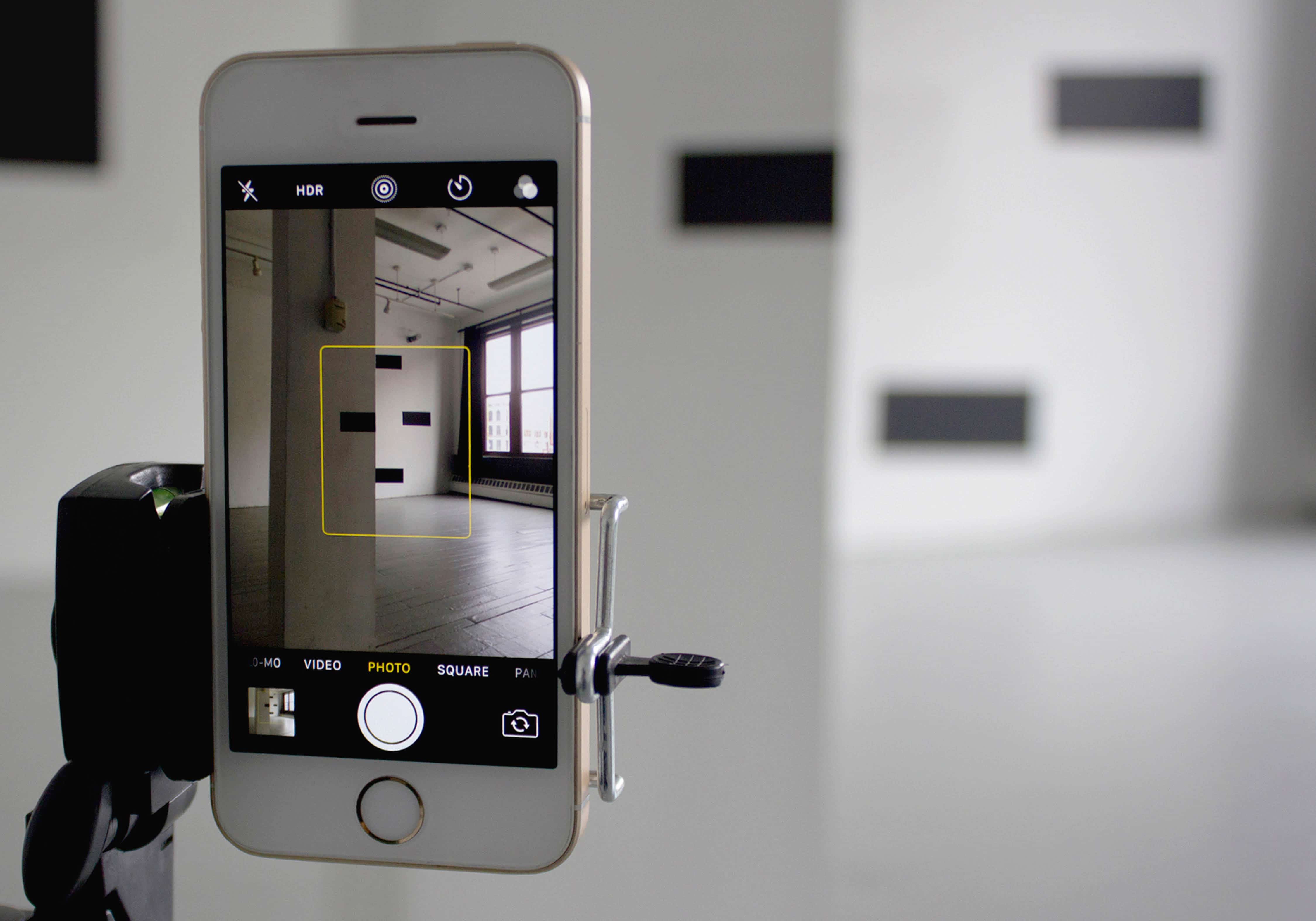
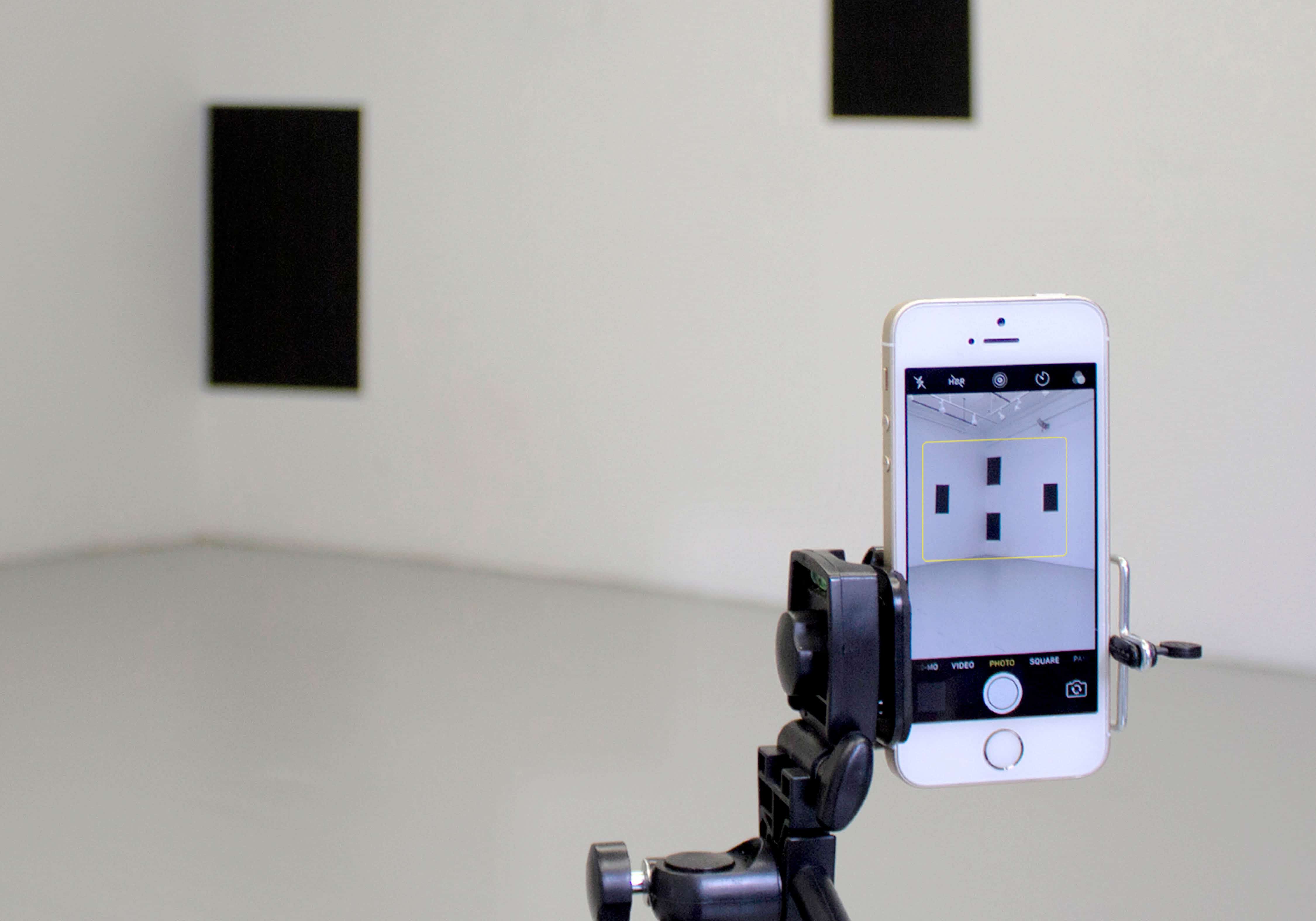
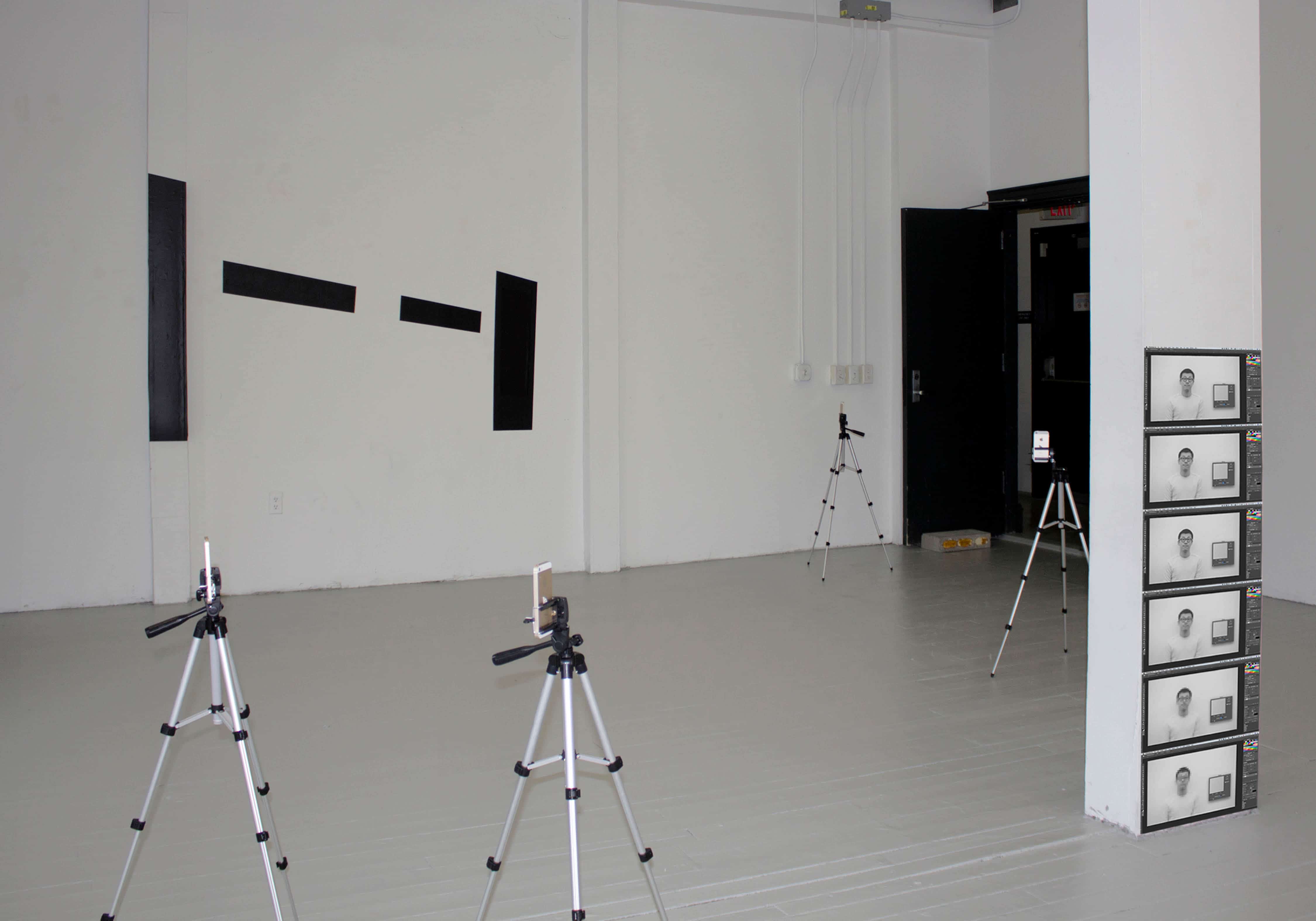
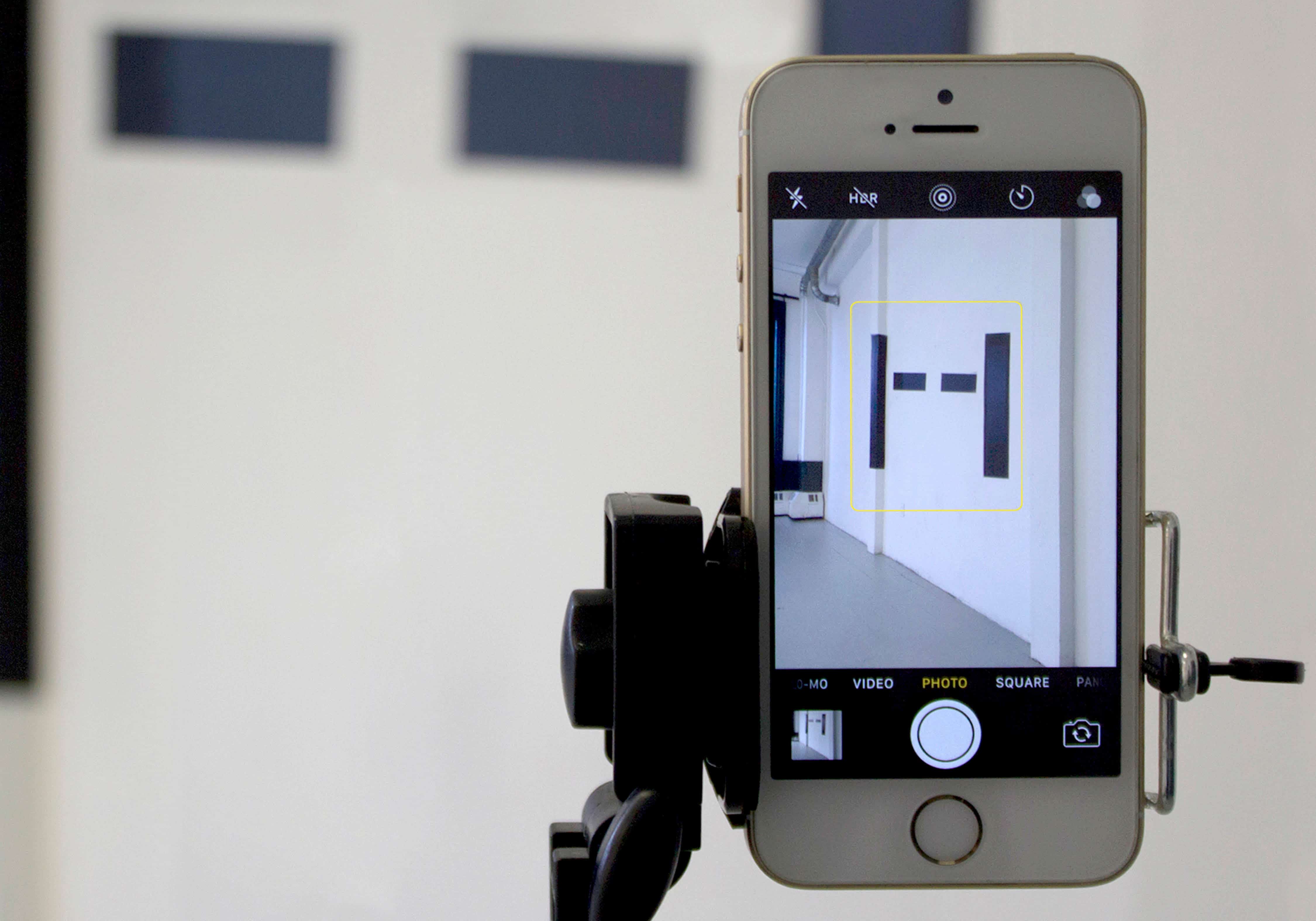
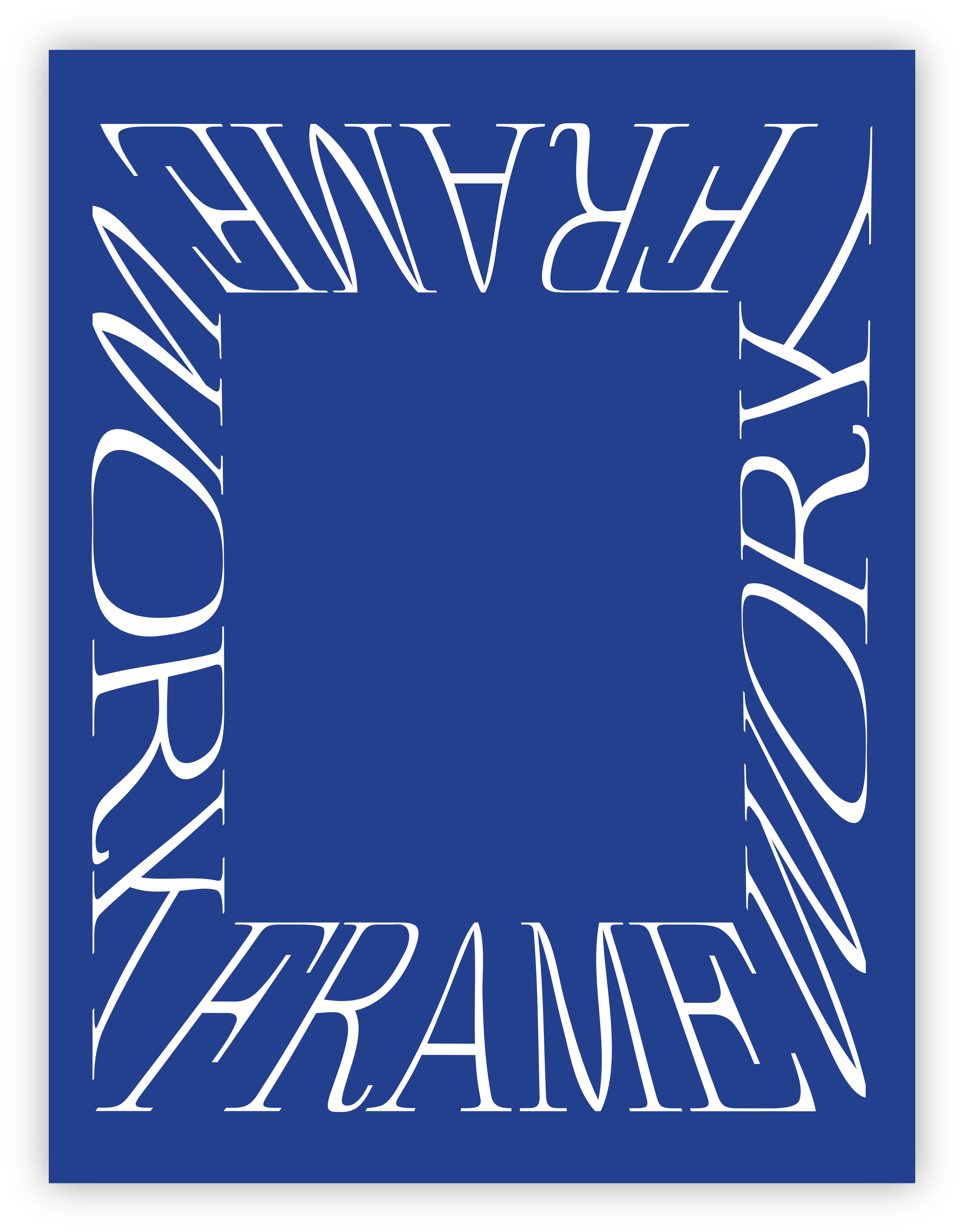 Drew Litowitz: Frame-Work
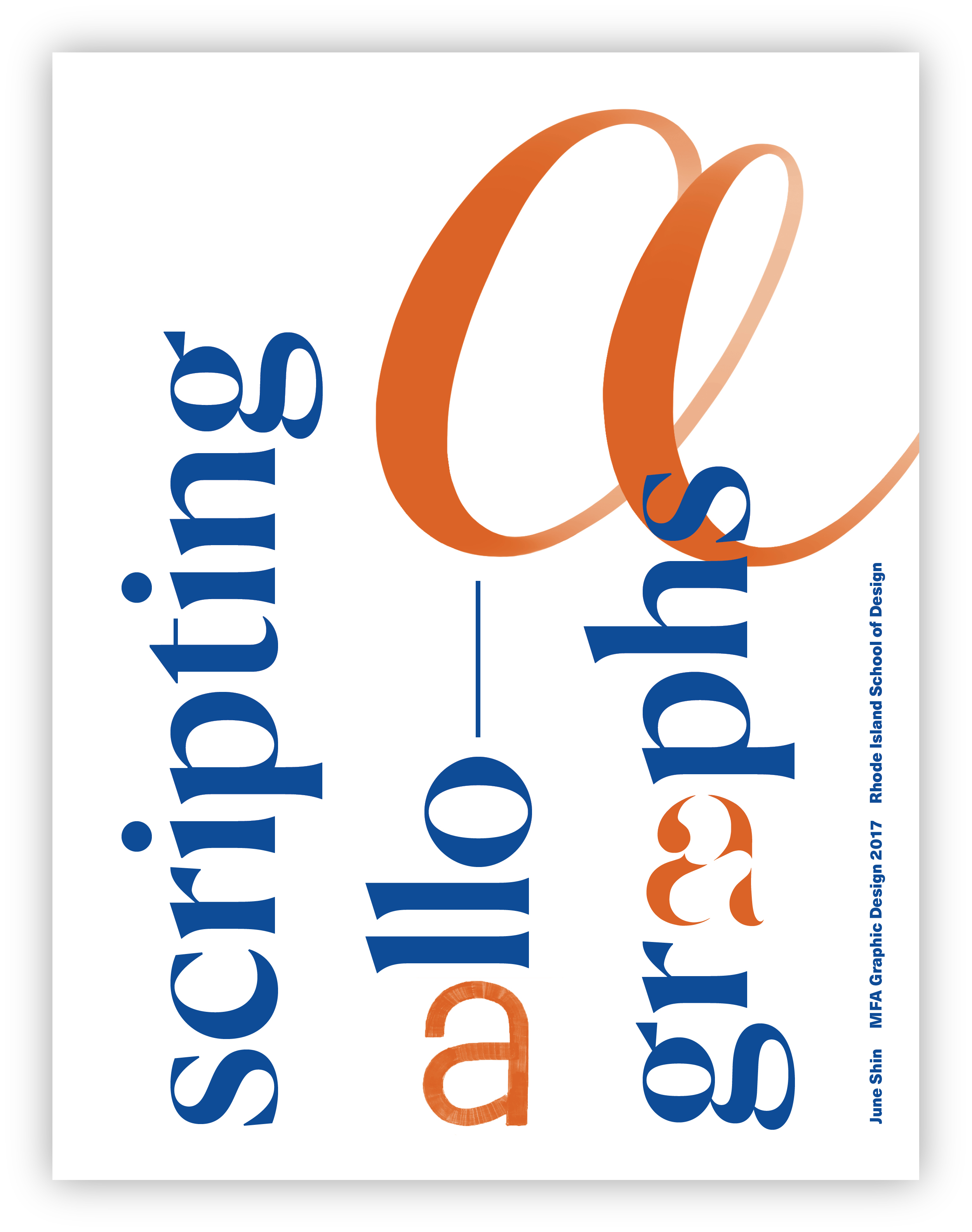 June Shin: Scripting Allographs
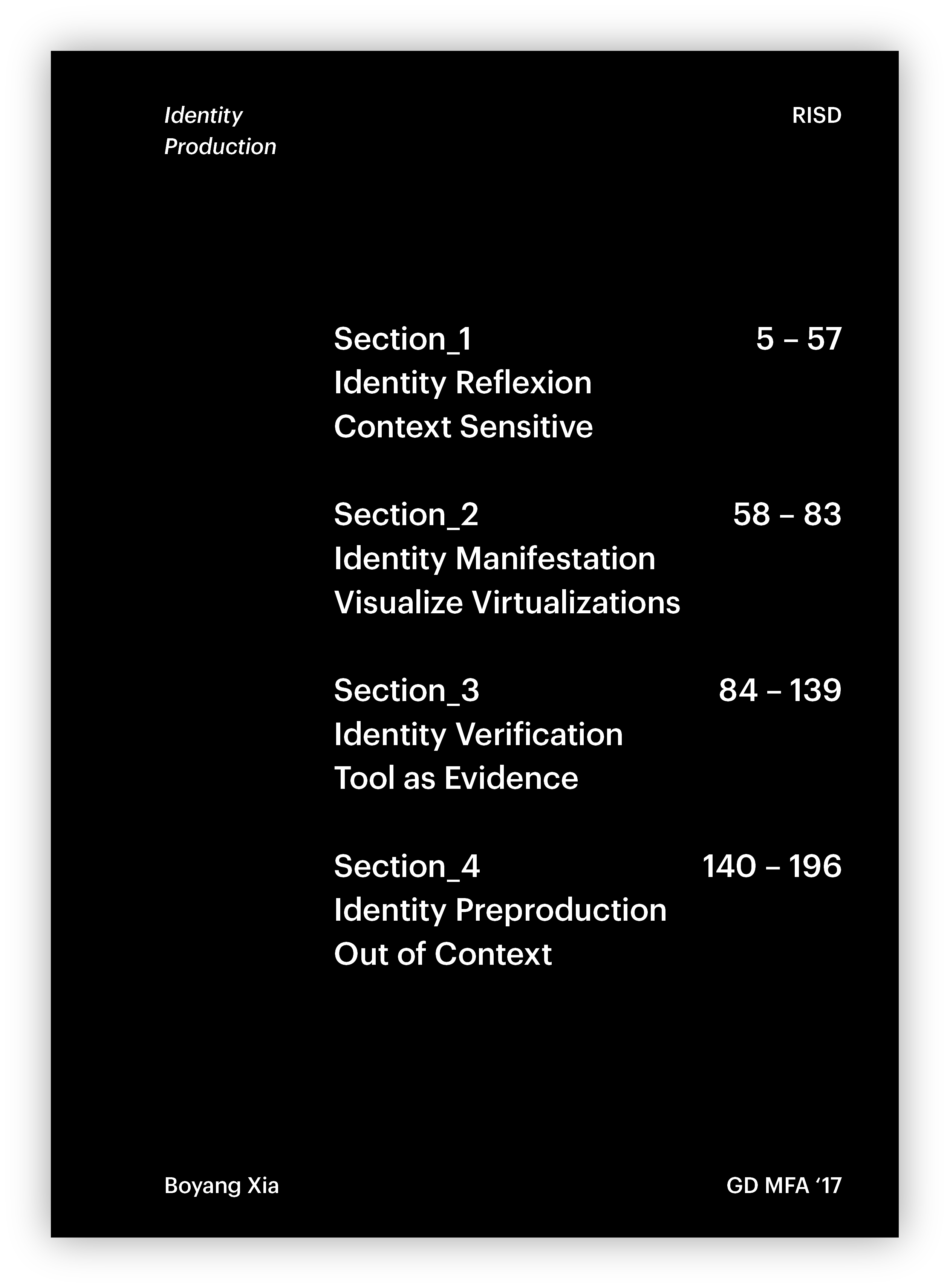 Boyang Xia: Identity Production
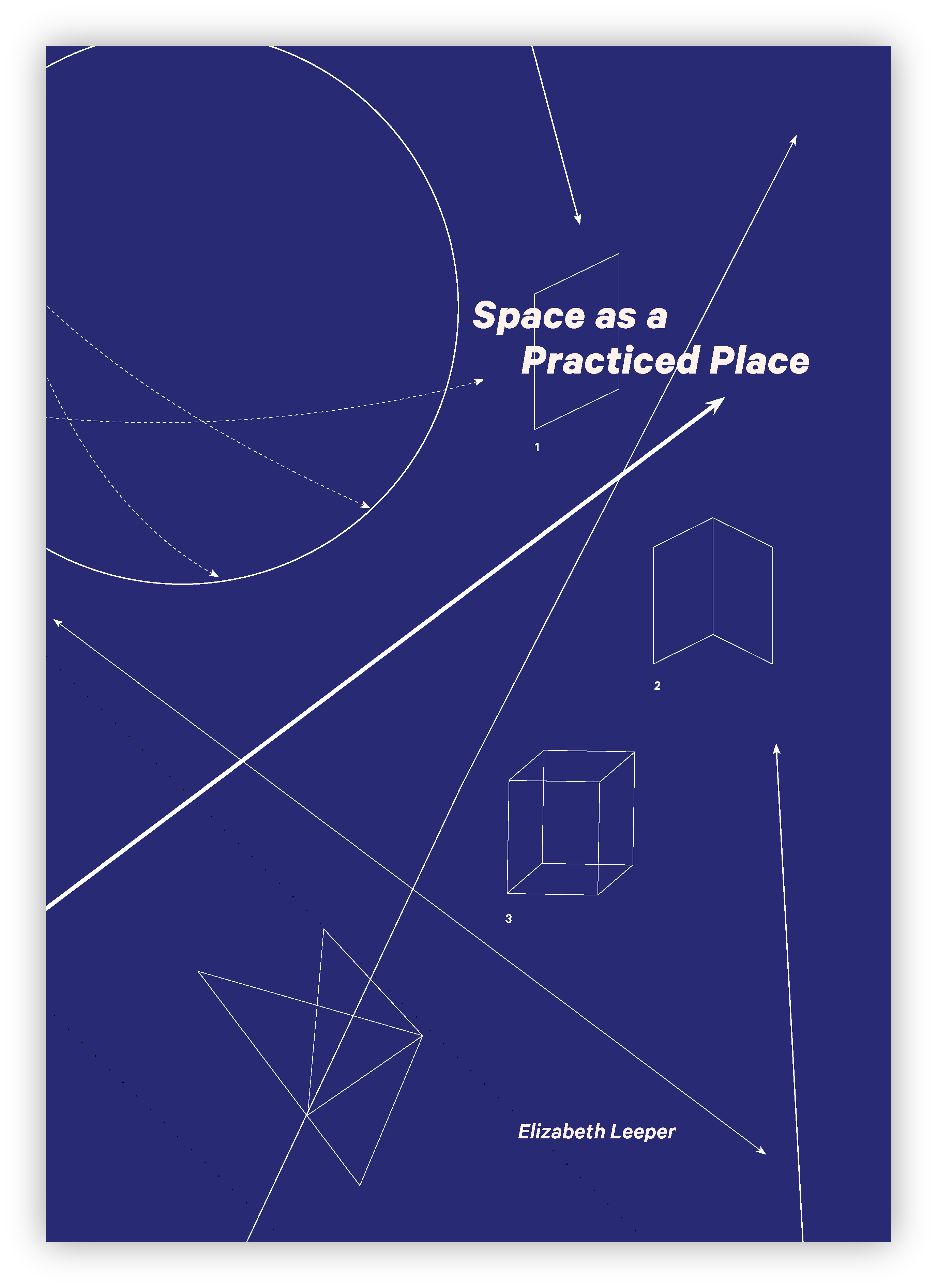 Elizabeth Leeper: Space as a Practiced Place
 Minryung Son: Our Measured World – A Poetic Translation
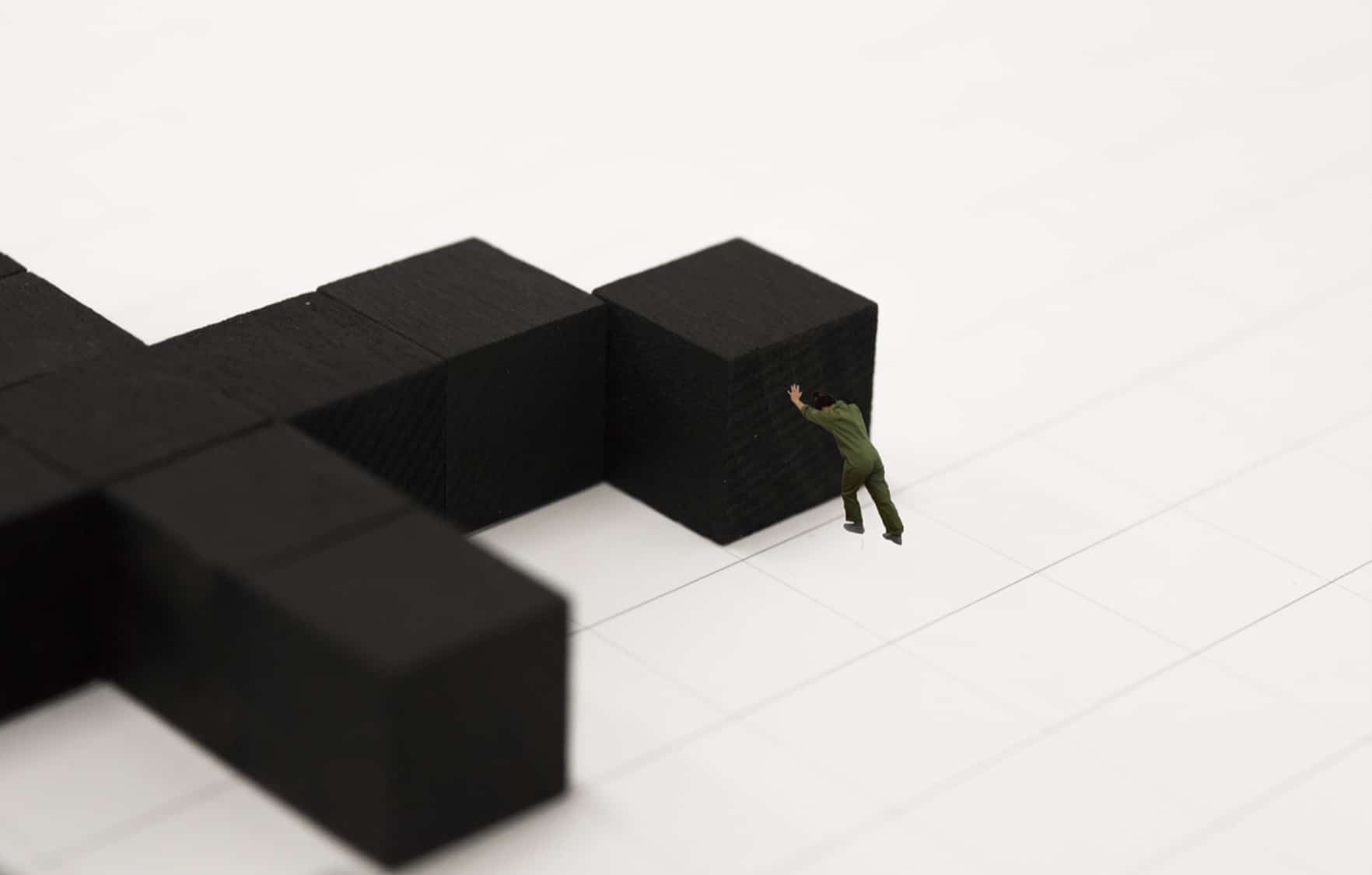
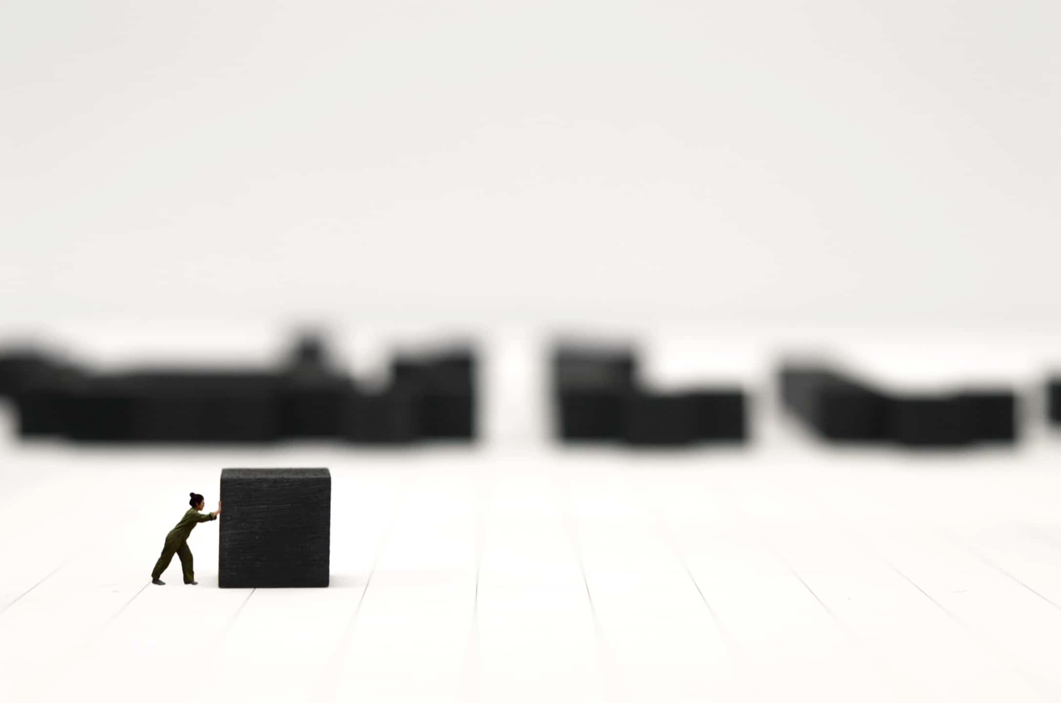
 Bo-Won Keum: When It Won’t Fit
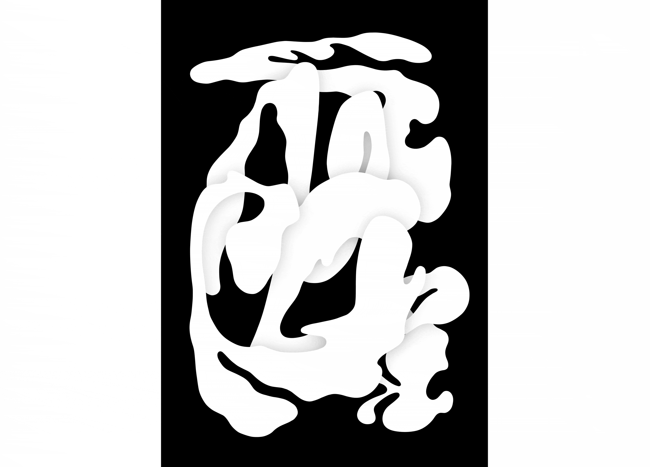
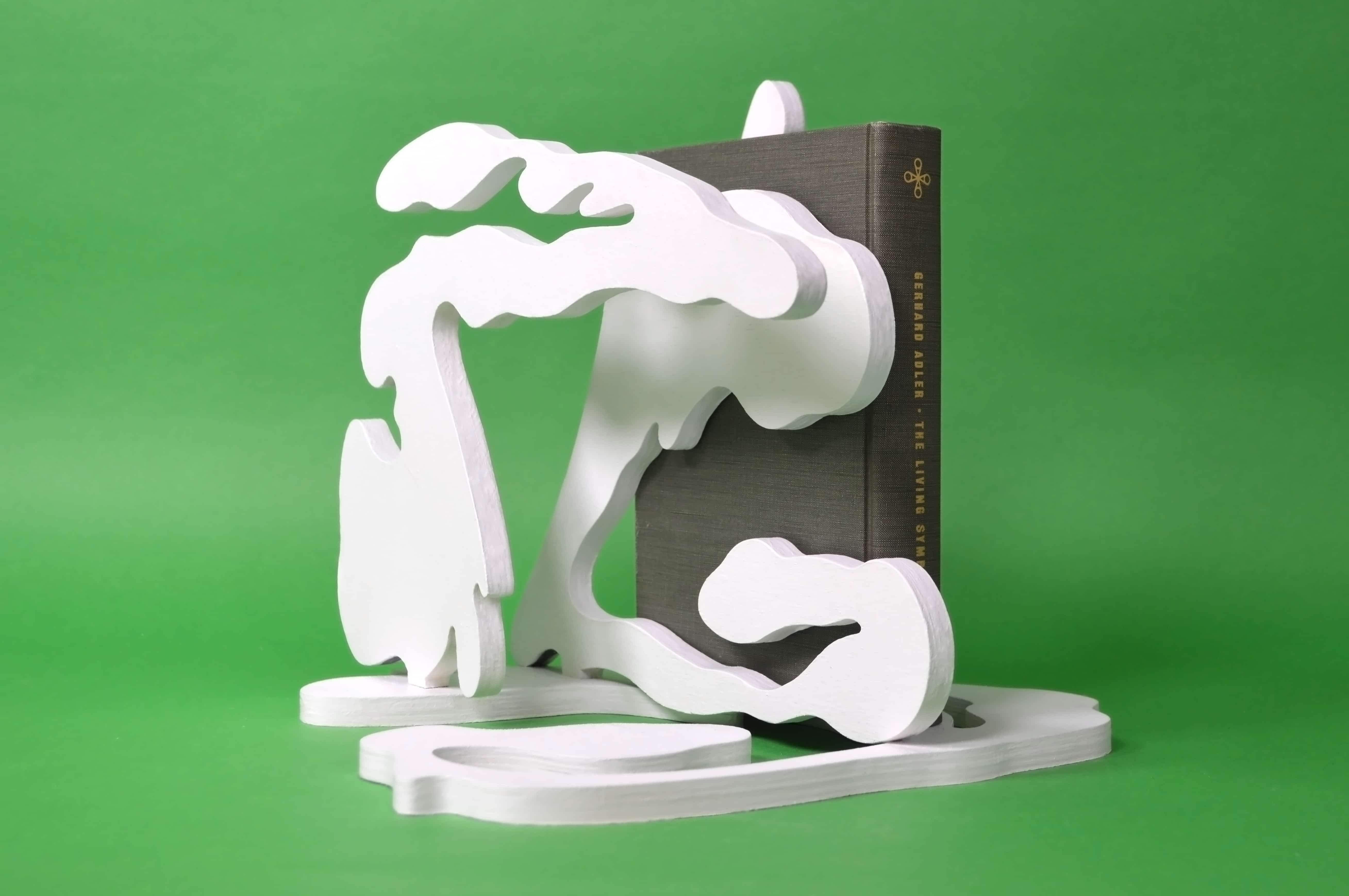
 Llewellyn Hensley: Content-Aware
 Jordyn Alvidrez: Otra Vez – Hierarchy as Designer

All Rights Reserved
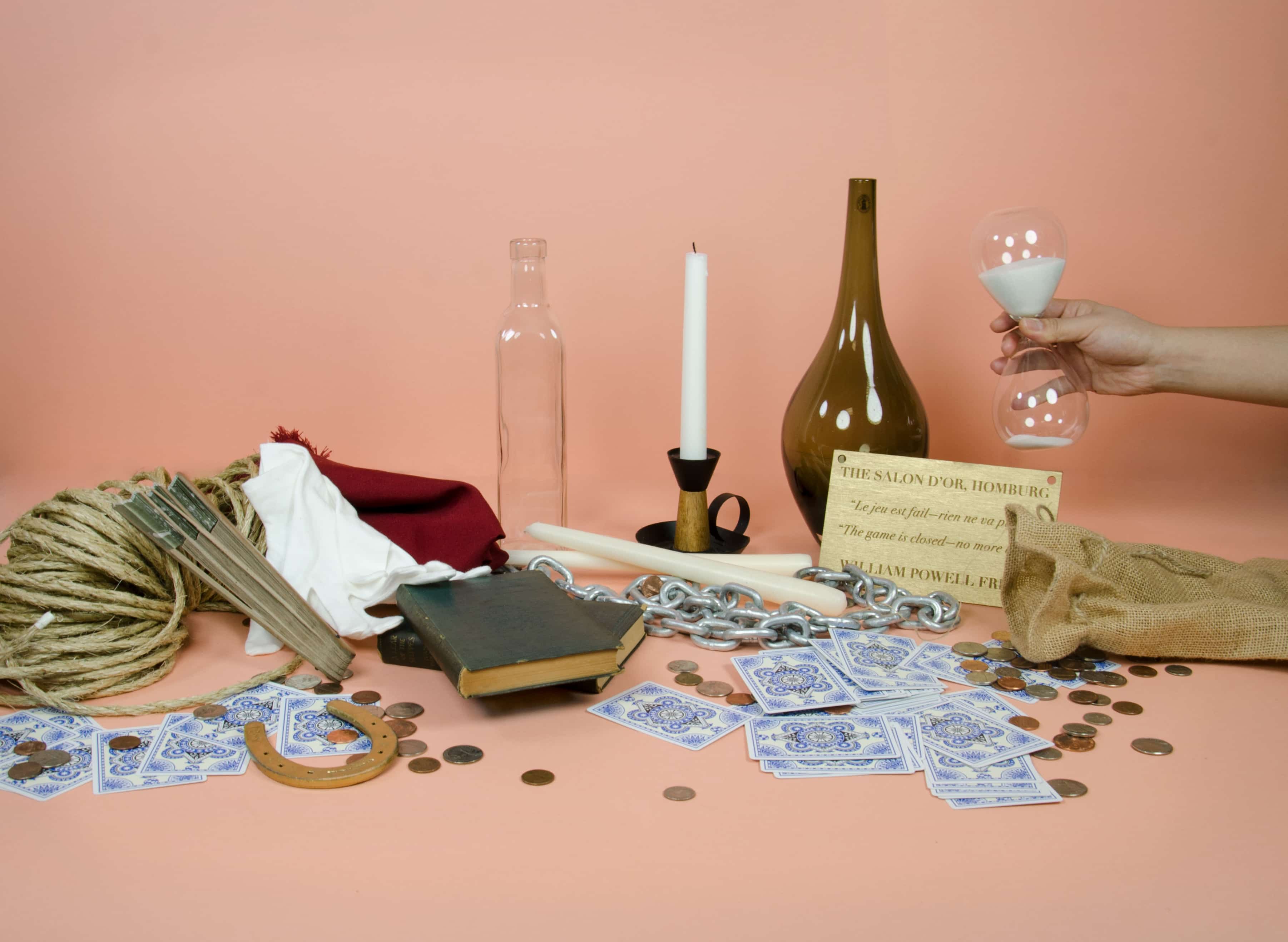
This thesis examines the ways that a history of secular magic has shaped contemporary culture and design lexicons. It reviews modes of secular magic as design principles as well as the terms by which the meaning and value of these modes changed over time.
I carry on the legacy of magician filmmakers who thoughtfully questioned the material nature of their surroundings and tools in order to unearth new modes of visual experience. With film, delight drives invention which in turn strains vision and perception, requiring a certain collusion with the audience. My work celebrates the notion of the double take and the value of prompting an audience to look twice at their environment and to understand it as mutable. Through constant interrogation of tactility, reconfiguration of the mundane and the craft of editing, I re-pose stories for the screen that court humor and delight as they tease out layered themes of human experience.
I. Reassemble
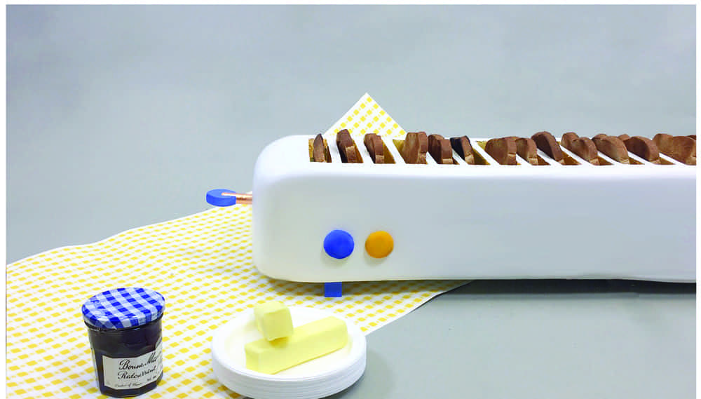
There was always a toaster in the kitchen when I was growing up. Morning traffic jams were common. We would all eat our breakfast at different times due to the single serving nature of the machine. This limitation of the tool was my inspiration. Reassemble is a toaster that is a 1:1 translation of a loaf of bread, ready to toast end to end in one go. The inherent absurdity of this mega toaster highlights the individualistic orientation of mass-produced consumer goods. The toaster itself demands that at least two people are present to use the appliance, making it an inherently anti-individualistic form. This toaster acts as a metaphor, rejoining the single slices of bread into a whole loaf, symbolically rejoining individuals in a community via the communal meal. Many pieces become one whole.
This piece takes inspiration from the way embodied metaphors are carried out in card tricks. A card rises from the middle of the deck to the top, an act of overcoming oppression at all odds. A card vanishes and reappears: a sign of death and return. With magic we are able to experience the sleight elation from breaking free of our physical restraints. With Reassemble, the embodied metaphor is absurd and joyfully represented: what if our tools fostered community rather than individualist consumerism?
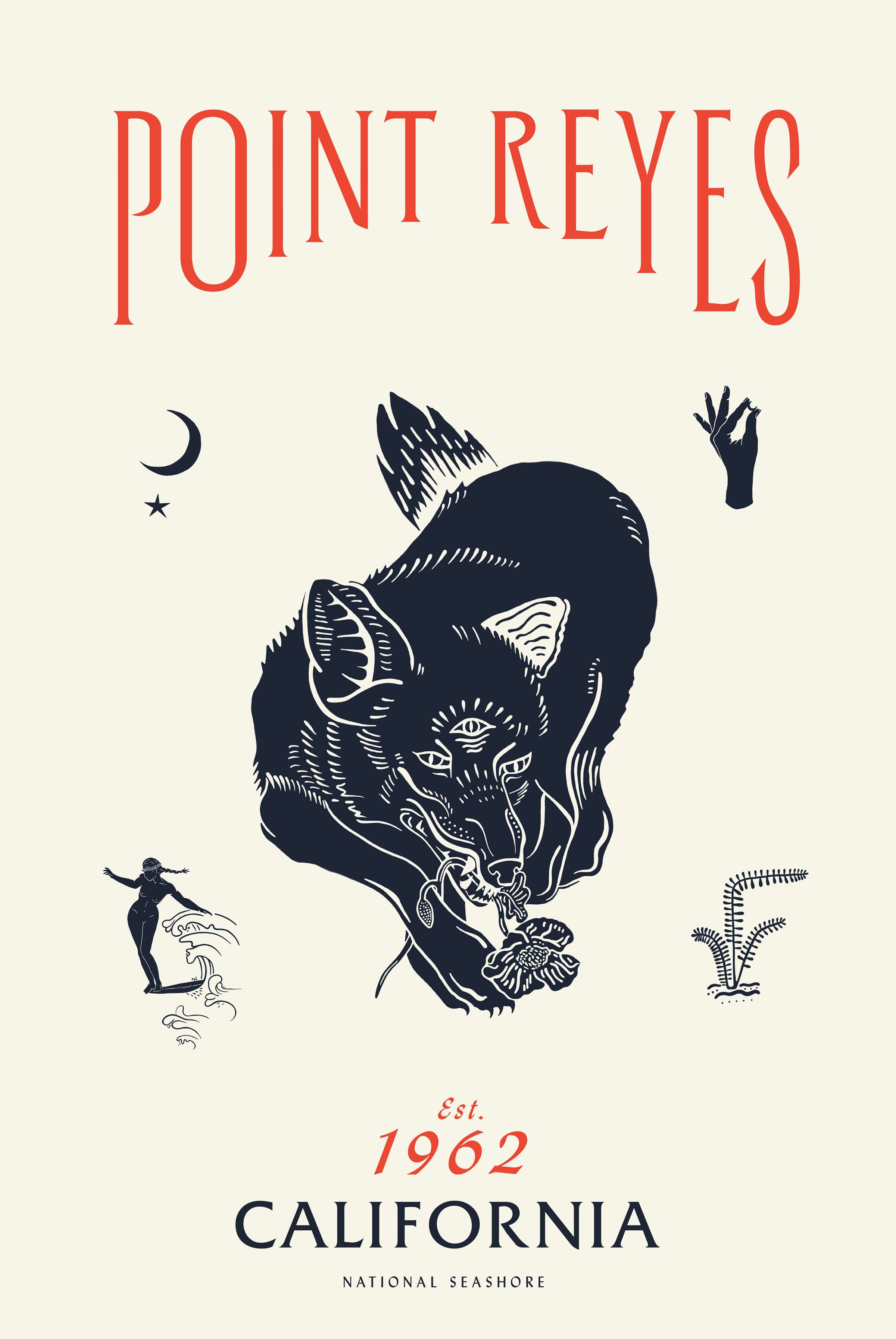
II. Point Reyes Poster
I grew up getting lost on Mount Tam. The sensation of being subsumed in a wild landscape was something I was always chasing. When I was old enough to get my driving permit, I finally had the freedom to roam and would repeatedly find myself in Point Reyes and the surrounding areas. I loved the vibrant wildness of the landscape: the blazing poppies, glimpses of coyotes and foxes behind sage brush plants, the magnitude of the ocean and the endless stretch of sandy beach that would make squeaking noises under our feet.
In high school, my best friend and I would ride our bikes along the twisting roads out to the shore. When we got older we’d find ourselves escaping out to the endless beach after work to build a fire under a blanket of stars. Many chapters of my life have taken place along the same stretch of coastline, and while some things have changed, these lessons remain the same: - Always get in the water. You’ll never regret it. - Don’t expect to be home before dark. - Take care of the places you love.
III. Film Haikus
Inspired by the efficient and primal communication of gesture, these short film pieces aim to metabolize and reinterpret experiences of daily life. They glint with the familiar but are mutated in some way to slant our normal perception of reality. In between legerdemain and a haiku, these provocations challenge the viewer by inverting expectations through a revelation of trickery employed in their own making. The viewers are rewarded with a heightened state of awareness of both the digital and analog worlds around them by accepting the freedom to re-imagine or renegotiate the otherwise predictably familiar. A sense of delight is achieved by letting the viewer in on the joke, thereby inviting them to expand their own questioning.
lakebuckley.com
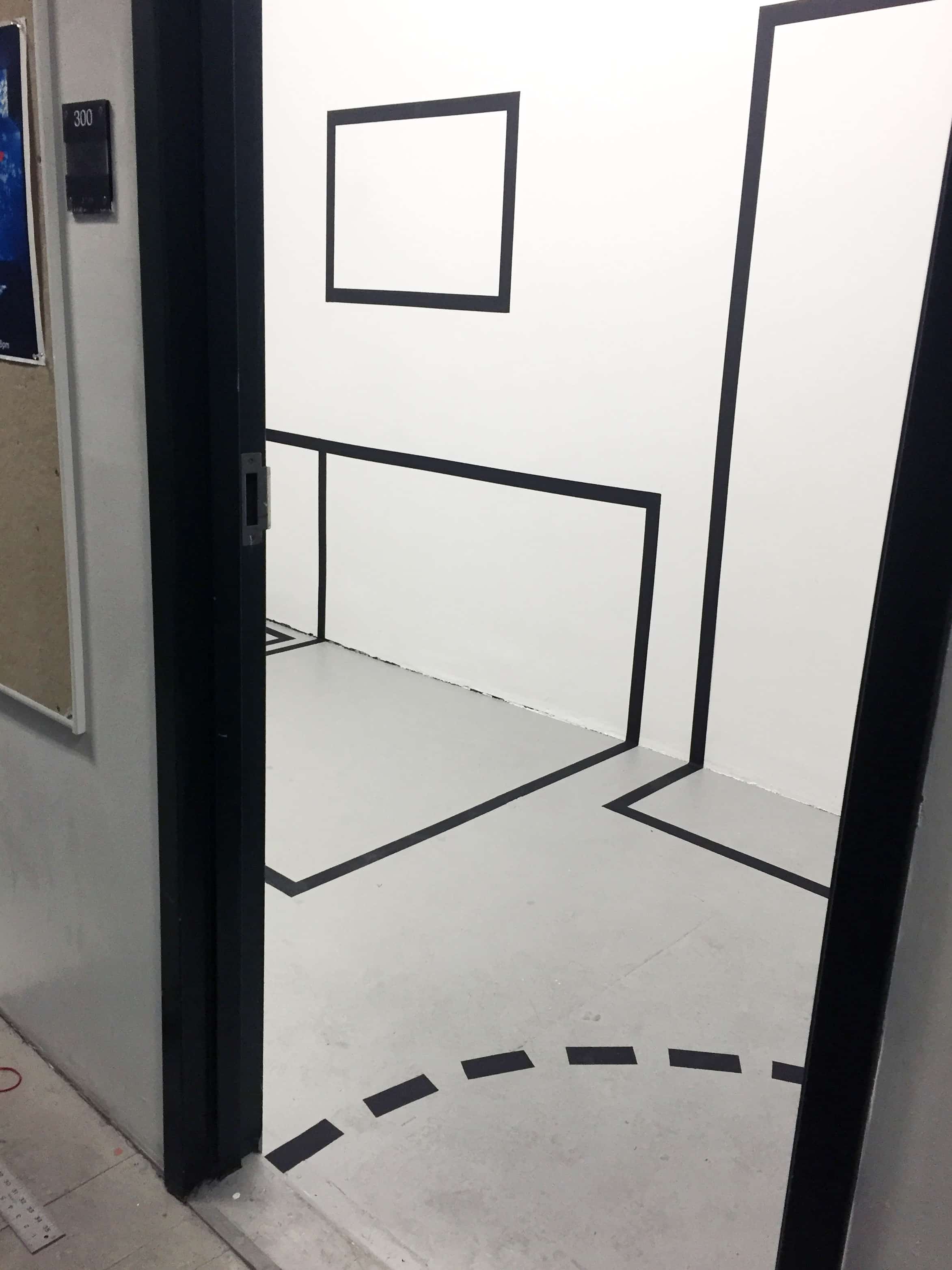
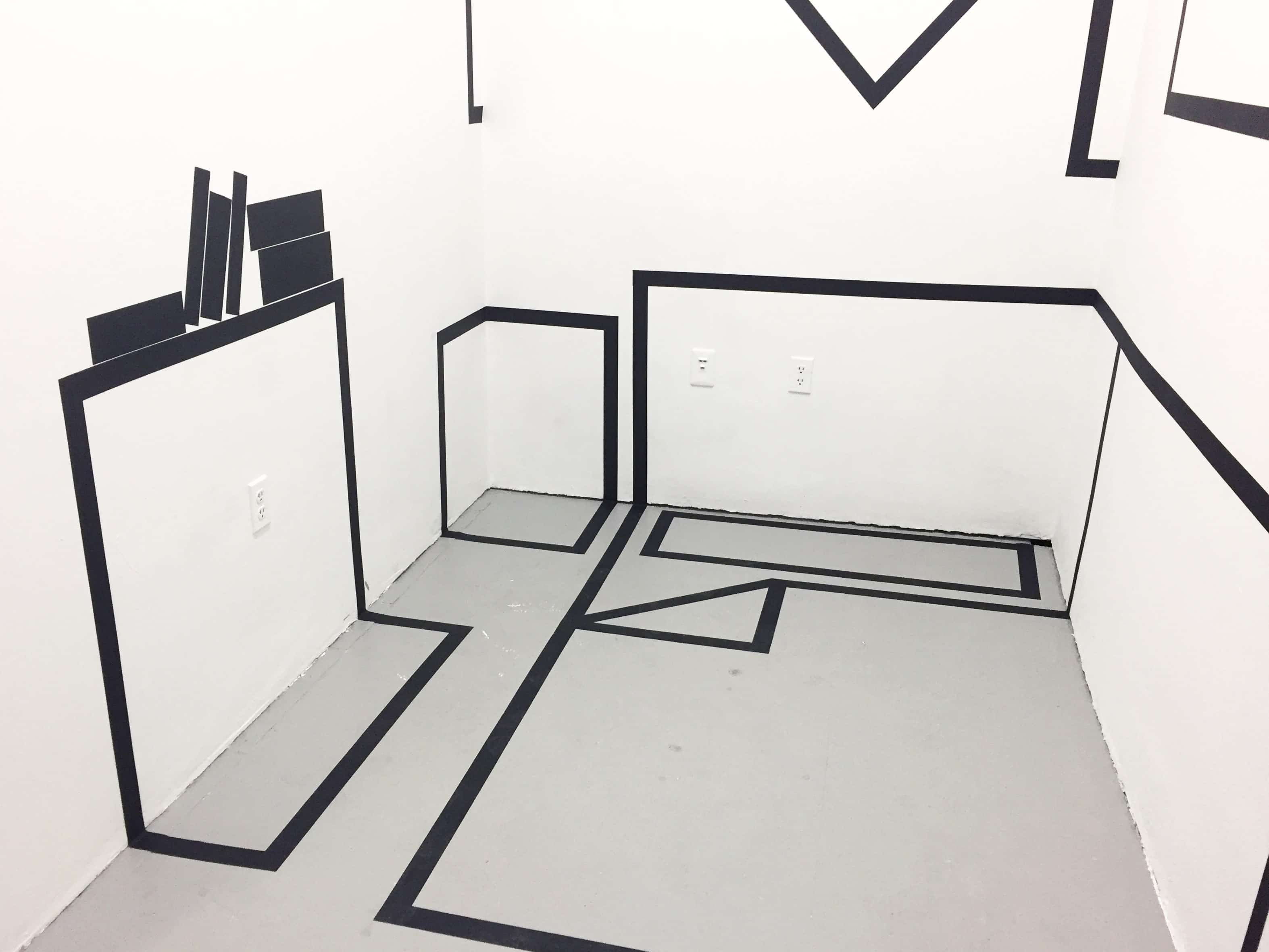
We view the world through a series of frames: contexts, mediators, constructs, oversimplifications. We place frames around things to isolate them and better understand them — to control them and define a context for our audience: magazines, book covers, wayfinding, signage, graphic overlays, subtitles, logos. These frames label, augment, enhance, and explain things for us. They also become habitual frames of mind, granting us fluid access to familiar subjects through consistency and reliability.
But how does the time we spend inside these controlled, reductive frames affect the way we interact with and interpret our realities? What is left out of the frame? What else deserves to be brought back in? What stories are not being told?
With these frames as my toolbox—my framework—I call attention to the untold stories and to the frames themselves. I question the ways we represent things and the ways we represent our own identities. I take the most oversimplified, overmediated, and bluntly prescriptive visual tropes that mass-culture has to offer, and play them back to themselves, full blast, to reveal the humor and anxiety bubbling beneath the surface. I work to explore our designed world’s periphery, reclaiming and reimagining my visual landscape.
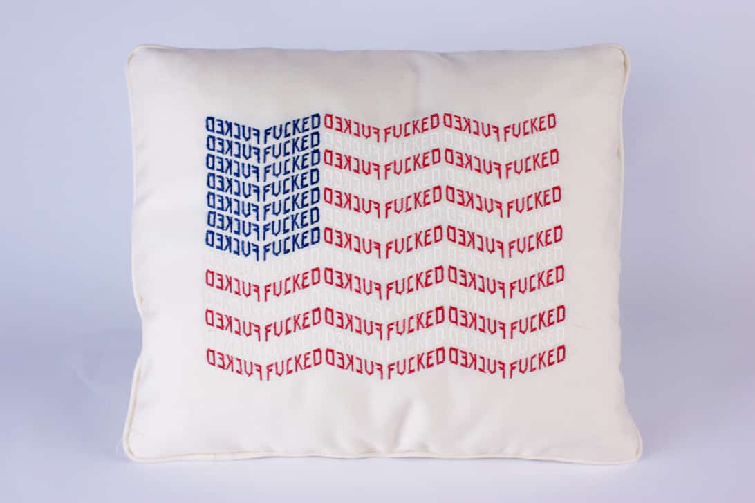
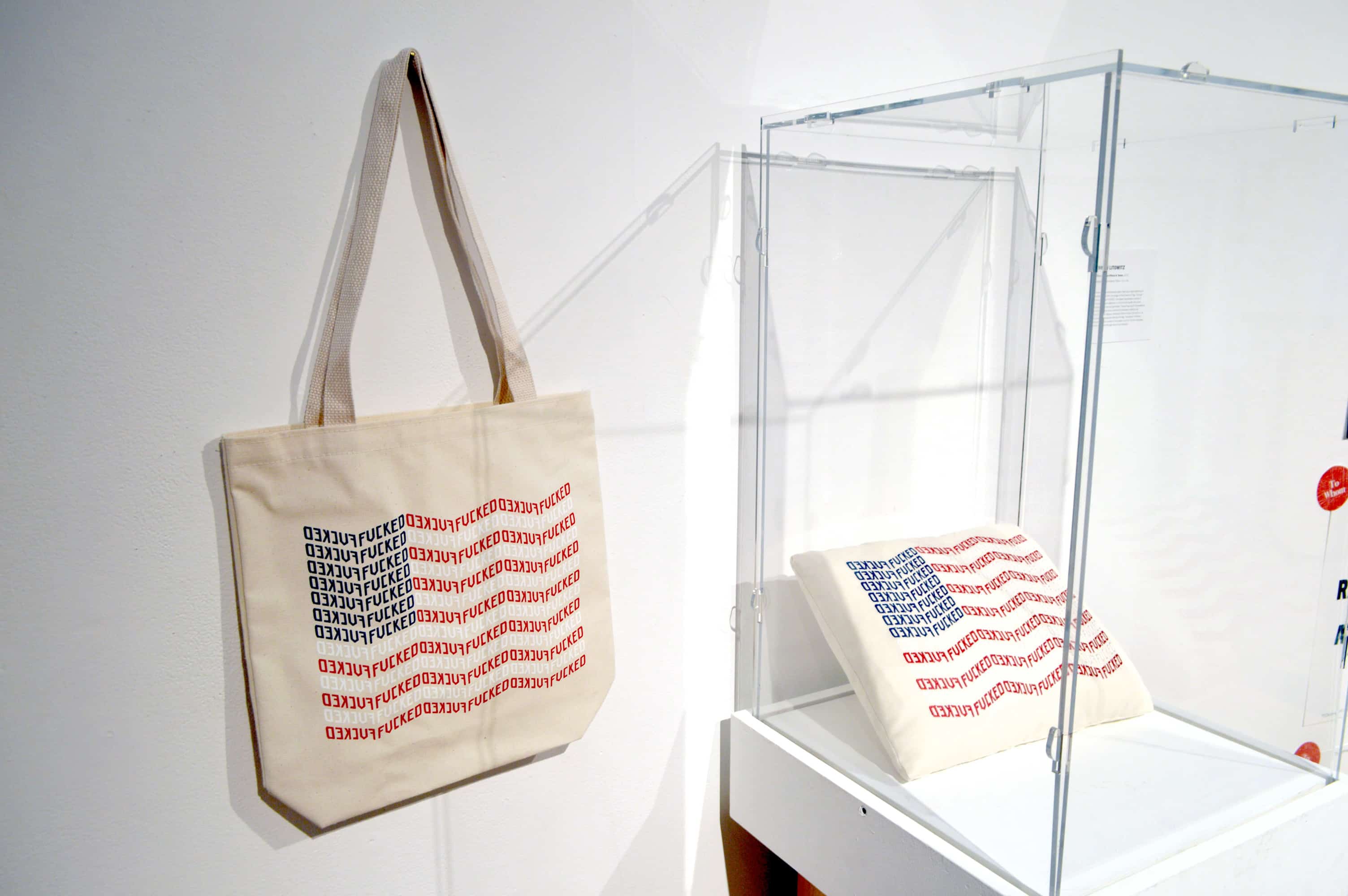
I. The Patriot Pillow & Tote
Nationalistic symbols are inherently vague, meaning different things to different segments of society. This project toys with the ambiguous emotional weight associated with the American flag. The pillow expresses a sense of frustration and dejection, in a form that recalls the quaint nostalgia of colonial patriotism. The jarring use of the expletive within this ubiquitous symbol of patriotism reflects the confusion of being an American patriot in the 21st century, at once embodying and defying the flag. The pillow’s inherent form, usually a symbol of domestic comfort, further stresses this confusion through absurd materiality subversion. As an extension, I mass-produced and sold tote bags of the same design.
Channeling an art object into a commodity for self-expression allowed me to see my design in two different contexts, surveying a wide spectrum of taste and cultural hierarchies through both the difference in my own intention—to commodify vs. to occupy gallery space—and with regard to the interest each application garnered. Several art collectors bought pillows for hundreds of dollars, whereas the easier to produce totes could be sold for $25. This juxtaposition interested me with regard to art aura and reproduction. Playing up this contrast, the tote bag and pillow were displayed side by side at the Graphic Design MFA Biennial To Whom It May Concern.
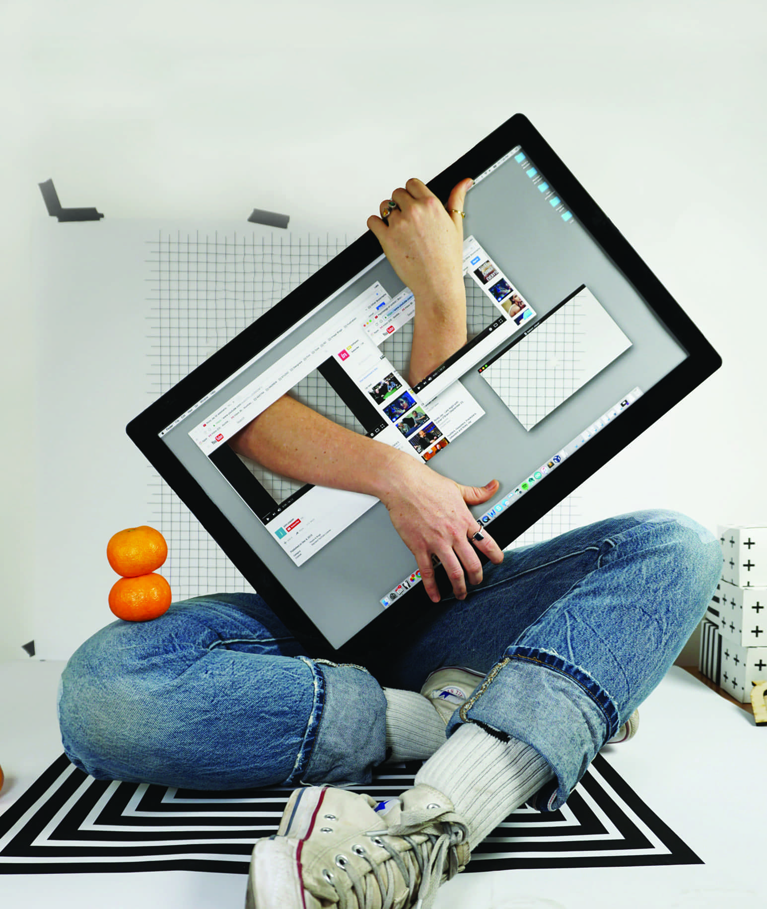
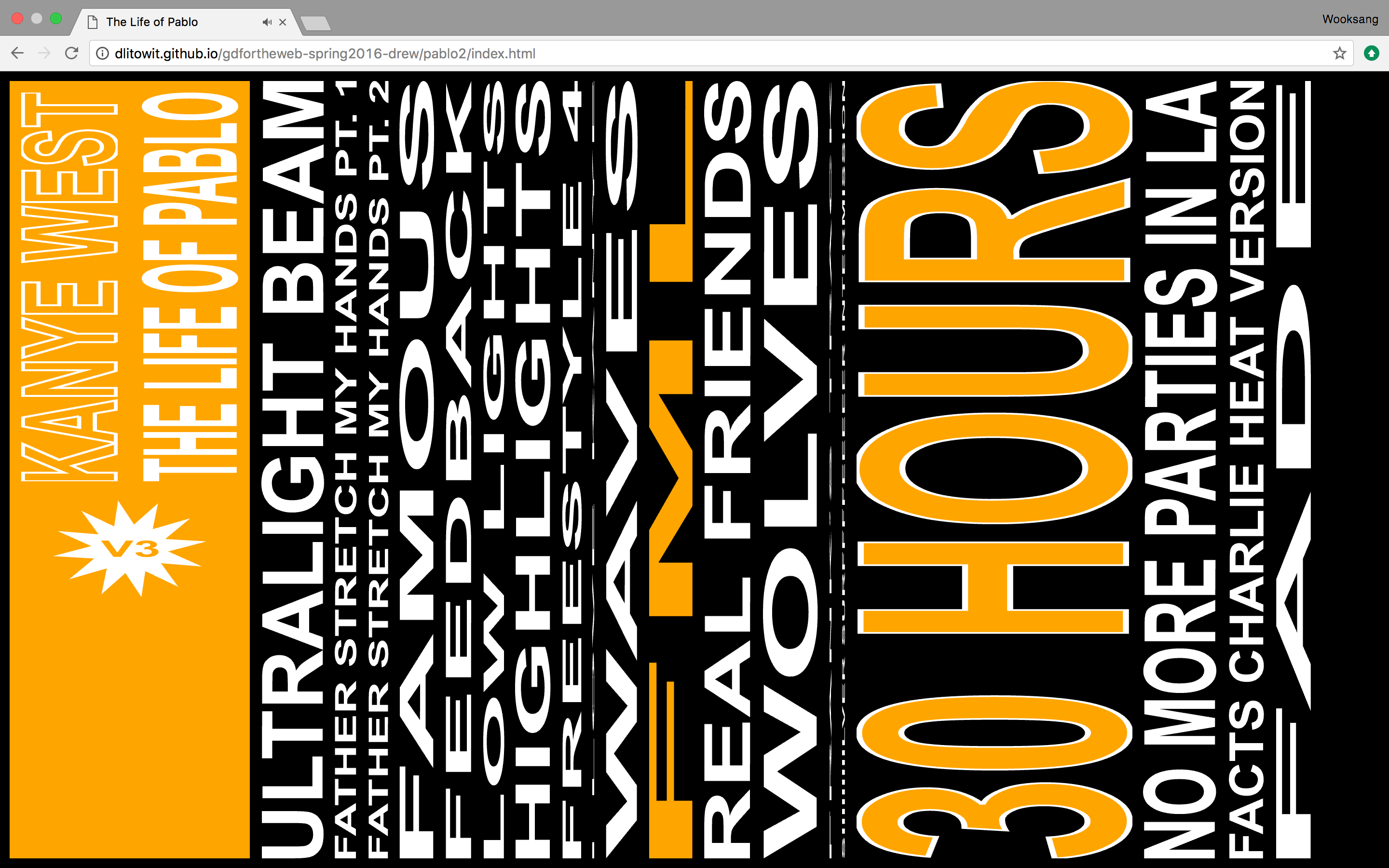
II. Stretch My Hands – The Life of Pablo
This project is my answer to losing the physical record and its cover art to small thumbnail representations and sterile file-lists in the world of music streaming and digital libraries. To counter the monotony, this “tactile” record cover and listening experience visually displays lengths of tracks in proportion to entire album’s length through the width of each column of type. Each track is playable and all can be played simultaneously. The interface is also entirely re-sizable and skew-able. Certain titles are more easily read in certain configurations, forcing the user to continually resize the web browser.
This creates the impression that
your interaction with the record is a more physical one, and turns your browser into a playground.
I chose to base this project around Kanye West’s The Life of Pablo, an album whose streamed content would periodically change when West decided to tweak a song or make additions. This solution would make any update to the album visually aapparent, creating excitement around the idea of the record cover as a source of information and a summary of shifting contents.

Check Out the Website!
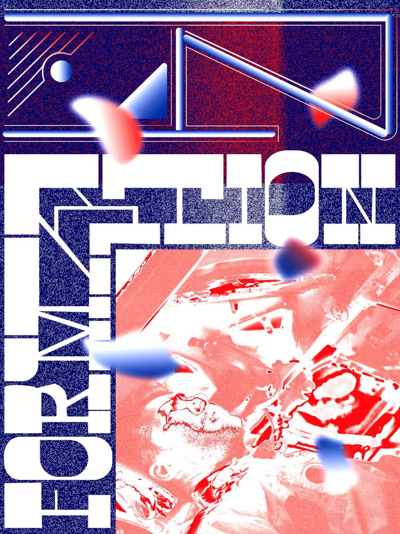
III. Newly Formed
Drawing from the periphery of culture and media, I create formal experiments reimaginging my visual landscape. With Newly Formed, I was able to create risk-free, which often yielded unexpected results. Repositioning negligible or secondary visual information as primary or central, I focus attention on the images and frameworks that have a quiet, but strong presnce in our day-to-day lives. I view many of these pieces as editorial illustrations or visual arguments.
IV. Instrumentals
Instrumentals was a semester-length experiment in concentrated form-making. For eight weeks, I committed to letting function follow form. Titled Instrumentals in reference to instrumental music and the wordless song, the aim was to focus on expressive form as content; the music without the lyrics. Under the guidance of Keetra Dean Dixon, I created daily compositions based on little but my imagination and a loose prompt. Some were quick, others laborious. Before beginning the project, Keetra and I established formal goals and styles of interest for me to work towards. As for composition and content, these were a combination of arbitrary references (photo, news, type) and more interest-based decisions (song lyrics, liner notes, logos). These were flowed into a matrix of aesthetic styles, content possibilities, and compositional inspiration, which allowed for chance operation to dictate how I might begin each composition.
Based on the parameters and my impulses, I regularly looked to brand and logo culture, media formats, and general deconstruction as tools for formal play. As the project progressed, themes began to emerge, both conceptually and formally. Through a combination of chance and foresight, I drew from an interest in culture, music, records, film, and consumerism to create strange mash-ups of images and forms, some of which are loosely recognizable as familiar iconography or imagery, but difficult to place. This project revitalized my love for intuitive form-making as a ritualistic practice. My hope is that these experiments will stand as personal reminders to take risks, try new things, and push forward with excitement, even if I have no idea what lies ahead. As in music, when you don’t know what to say, sometimes you just need to start playing.
drewlitowitz.com
One to One presents a dialogue between humanities. It also presents the fundamentals of defining a design problem in order to provide a direct solution. The Intertidal Zone is the space between the water and the land that is exposed or covered between low and high tides. Intertidal Thinking is a metaphor that urges cross–disciplinary interaction. It represents my academic experience of teaching across disciplines and being a student simultaneously.
This body of work offers many gestures — acts of design. Graphic design in this thesis is seen in the context of generating proposals through research, making form, and creating solutions for people. One to One refers to human scale—a proportion used in determining the relationship of a representation to that which it represents.
I. A3
A3 summarizes my practise today–landscape architect, graphic designer and future design scientist.

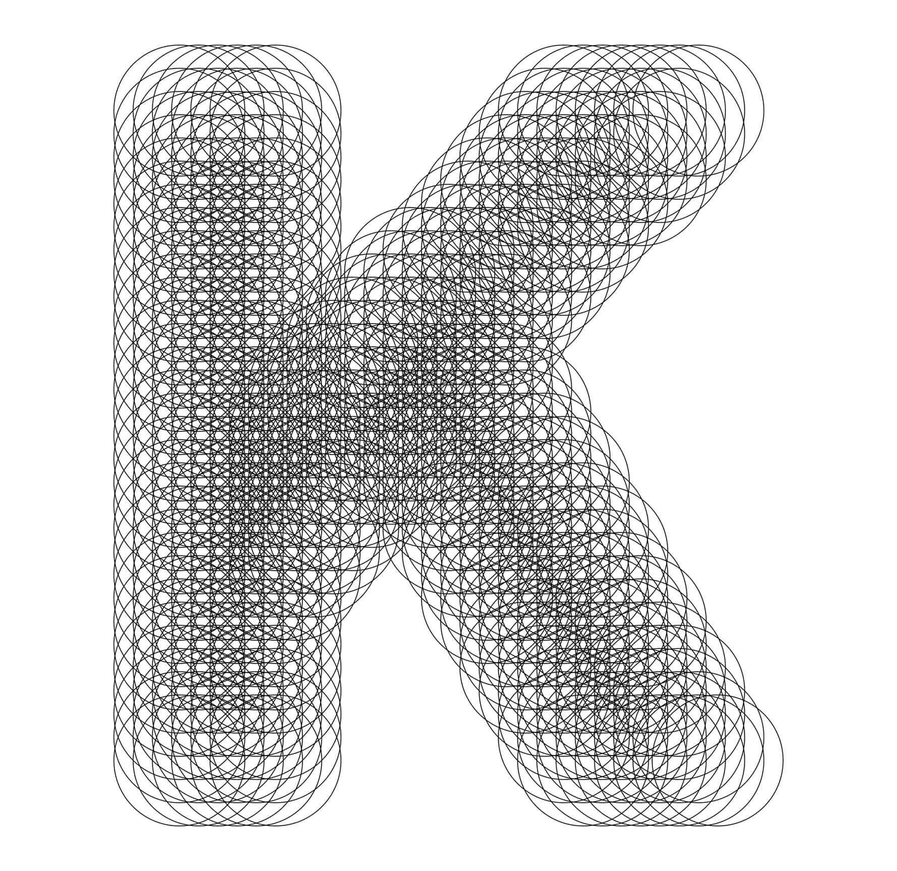
II. Letter K
This project looks at computer generative processes resulting in the design of several typefaces using algorithmic code.I applied parametric design principles resulting in four different typefaces. The typefaces were modified using algorithmic growth components.
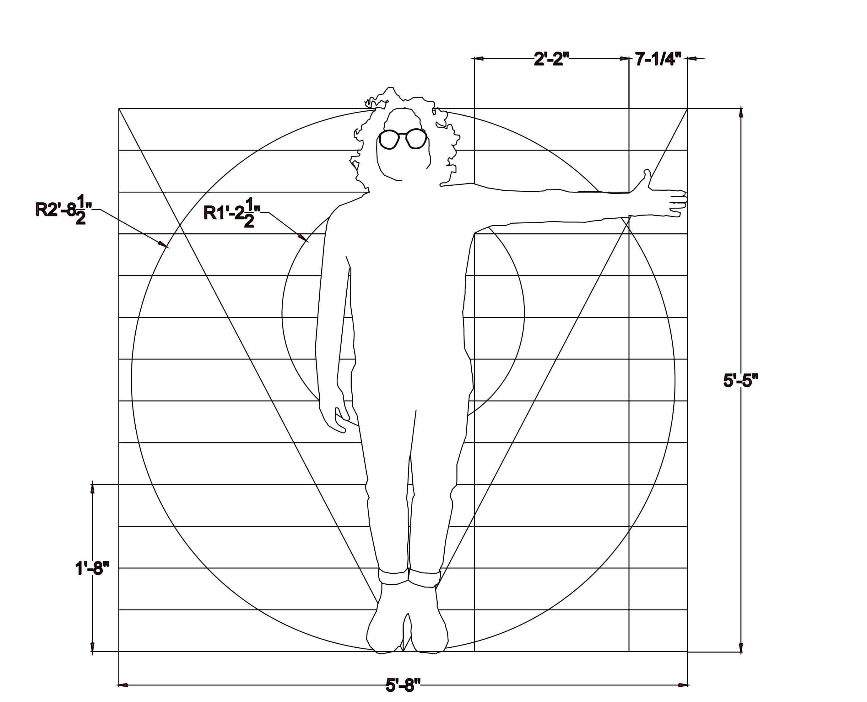
III. Me & Scaffolding
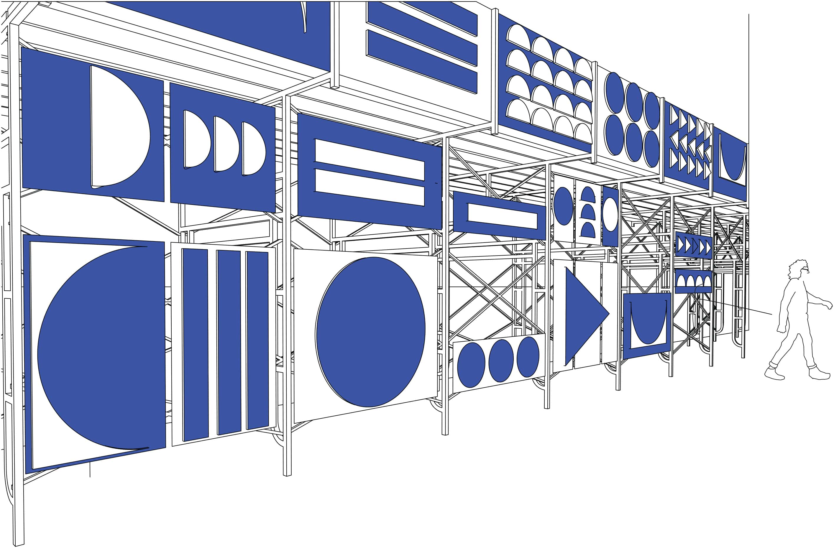
Proposal for Activating the scaffolding system located at the the Industrial National Bank Building, known as The Superman Building, in downtown Providence. The idea for this installation was to locate a void in the city and activate it by using exhibit design techniques. I used my body proportions to develop geometric compositions that are applied to the surface of the scaffolding structures.
josermenendez.work
An Abstract1 for a Librarian2 Playgrounds defies the idea of singularity and control through a practice of design aiming to offer generous universes3 for one to explore freely. Building blocks of cognition such as modular thinking, hyper-linking, recursion, repetition, self-referencing and self-representation are utilized for designing honest and slightly uncomfortable experiences in order to keep the reader awake and aware.
1 Abstract, a short paragraph that defines what is sitting underneath itself, the thesis. The abstract is not a sized-down mirror of the full thesis but rather an
independent form that will help you understand the whole. The abstract however is considered an essential part of the thesis itself. This gets us into a weird problem, if the abstract is defining the thesis, and if it is a part of the thesis itself, then is the abstract defining itself? This paradox is one of many paradoxes that this thesis is interested in.
It not only describes a generative methodology where paradoxes, such as the one above, is used to generate works of graphic design but also touches on systems of referencing and representing such as this exact piece of writing which is supposed to represent its remaining.
Thinking in strange loops like this one had been a topic of interest
to humankind starting from the ancient Greek philosophers to today. What created a computer—which is also the machine that was used to create this very text—is rooted in a curiosity of mechanizing this unique property of humans, the ability of falling in
and out of strange loops. The consciousness that can create such paradoxes is the very thing that makes us human.
2 I never wanted to write an abstract since packaging and representing such a complex and multi-layered set of ideas in one short paragraph seemed unfair to the content. When I asked my mentor Anne West the advantages of an abstract she raised a good point by telling me that an abstract makes the book searchable when it goes in the library. I want my thesis to be searchable. Therefore the abstract I wrote is
a functional piece. It is meant for tagging keywords and phrases. This is why the abstract is not meant for the reader of this book but it is written for a librarian.
3 As a rapid maker of mind-maps, this thesis covers the territories where cognitive sciences, graphic design, modularity, honesty, and universe building collide.
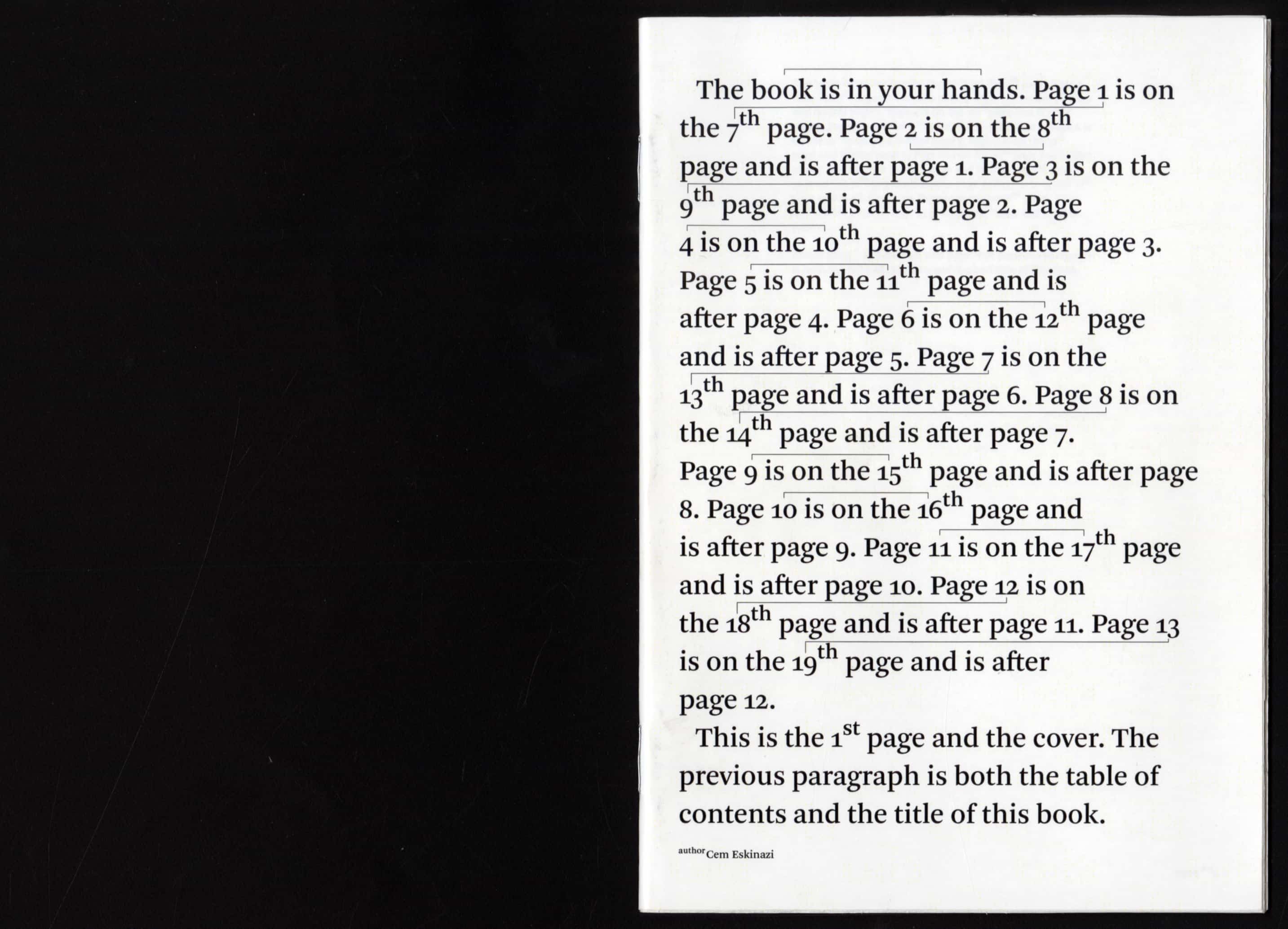
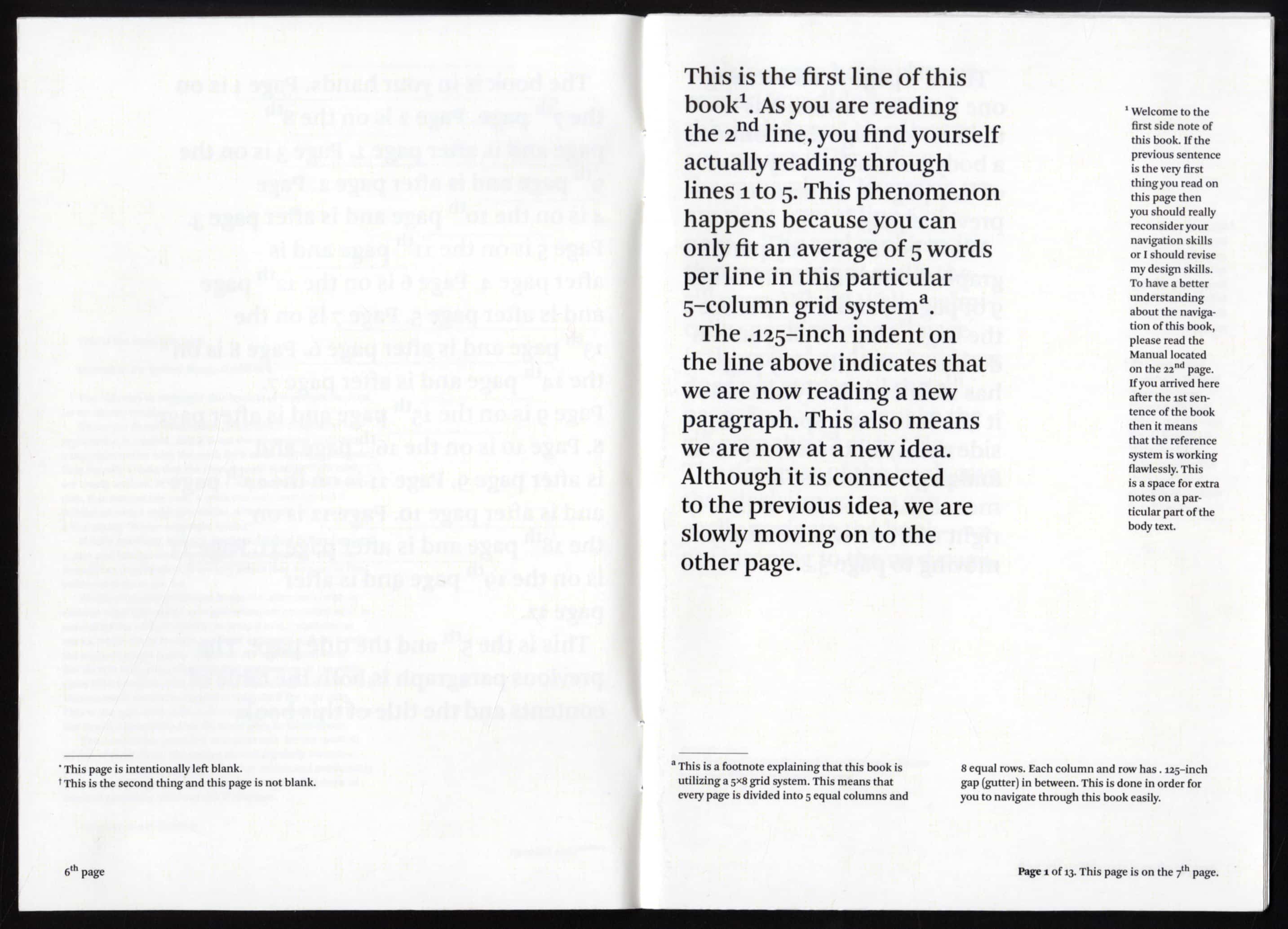
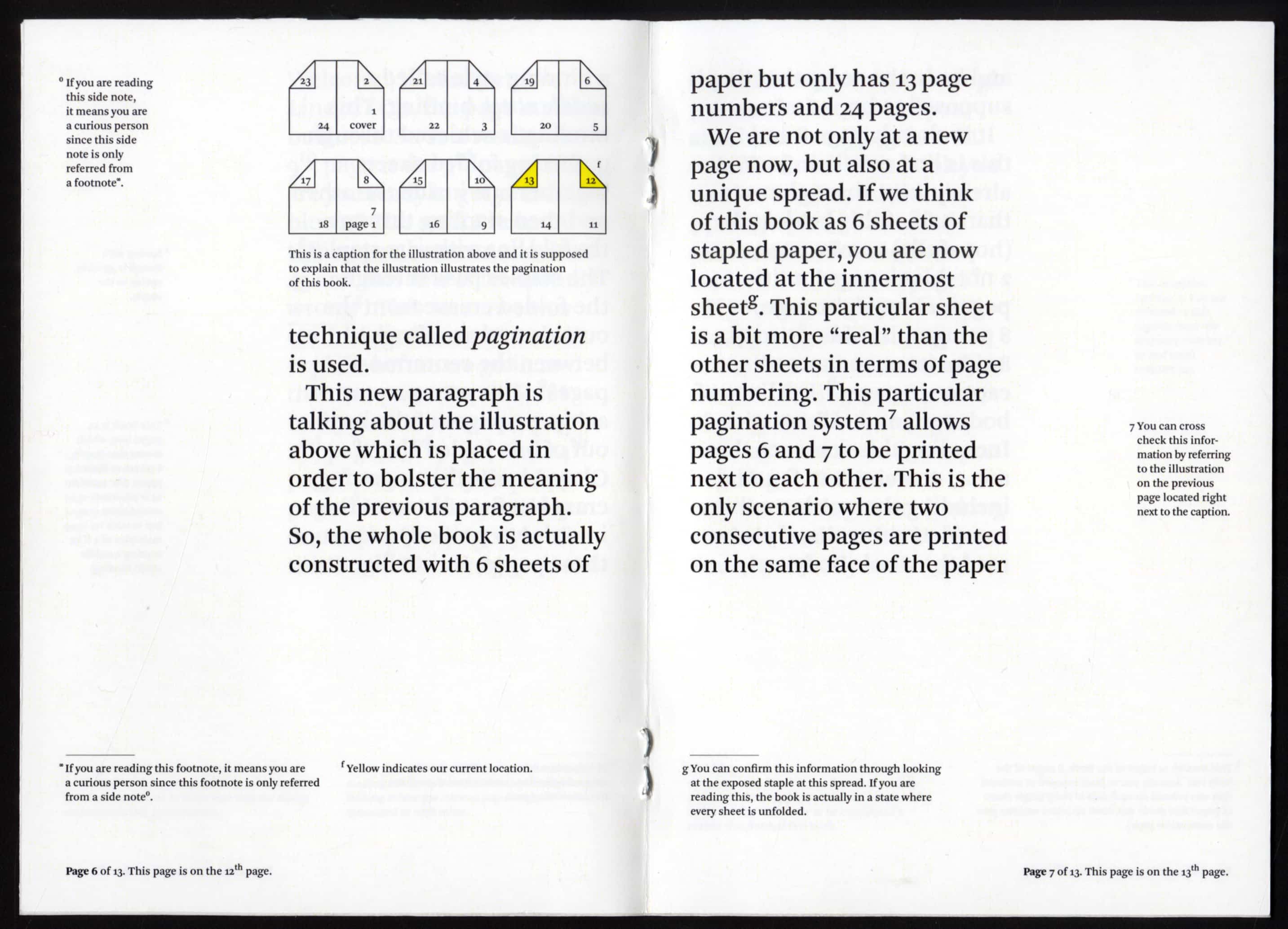
I. The Book is in Your Hands
The Book is in Your Hands is a book about itself. It’s language restates readers’ current actions in any given moment during the reading process. The content also offers a simultaneous in-depth investigation of its object. The content is ornament as it displays information about its context (its material, history, culture etc.). The container (context), in this case the book, is the content, and the content (the text) is meta-data.
This project is about the book’s relationship to itself. It creates a unique reading experience wherein the reader is hyperengaged with the object he/she is holding. It concentrates the reader’s attention to be fully aware of the present moment. In this case, the object is its own contained environment.
II. Test
In the summer of 2010, I was in charge of a small sized dark room in İzmir, Turkey. It was then, when I first worked with a focusing sheet to fix our enlarger. TEST, was a week long installation consisting of 18 posters and 6 booklets. Inspired from my previous job as a dark room photo printer, I developed an interest in functional forms drawn by engineers to test and calibrate machines. I decided to re-create the marks using a similar mathematical approach. I removed the forms out of their contexts to create a purely aesthetic experience. However, these posters could still calibrate and focus cameras.
The archive of modules I recreated were uploaded to a public site in order to be shared so any visitor could create their own posters. Later on, I developed an interest in particular group of calibration targets, the ones that are testing the very device that produced them. Like a projector calibrator, that is being projected or printer tests that tests the printer that prints the test itself. These are unique situations where a device creates content about itself. The content becomes an ornament about the device. Since my posters were still functional, they could be considered as ornaments for the studio plotter.
III. Security Blankets
Security Blankets are comfort objects used to mitigate fear and distress in uncertain times. Printed with densely layered patterns sourced from proven information camouflage technology, these coverings add a layer of protection to keep you safe from chaos and surveillance. Security Blankets add a cozy layer of encryption to keep your innermost thoughts and feelings private. This work explores the nature of protection, security and susceptibility.
As we become increasingly vulnerable to breaches of privacy, we are also more reliant on the invisible systems that encrypt our data (identity, credit, taxes, biometrics). These patterned blankets serve dual purposes: providing psychological comfort and making information security visible. In collaboration with Llewellyn Hensley and Diane Lee.
cemeskinazi.com
Design Syncopations is an inquiry into space and intervention. Central to this work, is the orchestration of scenarios to prompt visual, auditory, and physical engagement. My background as a musician strongly informs this practice as I borrow from and disassemble musical structures — time, rhythm, composition, and counterpoint. Through designed prompts and invitations, I incorporate musical themes of chance and improvisation, setting up programs, altering spaces, and interrupting existing conditions. Working at the intersection of sound and design allows me to conduct audience-led musical performances, reprogram gallery spaces, and collaborate with artists and musicians. The ensemble of works adds up to a sequence of experiences and syncopation of attitudes.
I. To Hear is to See
To me, music is an inherently visual discipline. When I play a piece of music or look at a music score, I see patterns composed of structures, notations, and positions. In To Hear is to See, I investigated how a graphic system could reflect this experience of listening to a piece of piano music. This video and installation piece presents graphic explorations of three contrasting piano pieces that are translated using a set of visual rules and relationships. It exists as multi-screen projections with accompanying videos that the viewer can listen to with headphones. The graphic system is designed by assigning quantitative notations to musical characteristics such as key signature, note value, tempo, and dynamics from the score. Qualitative notations are assigned to musical characteristics based on existing performance recordings, which reflect a more subjective and expressive interpretation by the pianist. Each note is represented by a shape and each complete video frame represents a measure of music from the score. Notes appear in the sequence in which they are played.
The translations of the three piano pieces explore the relationship between hearing and seeing. For example, Two Arabesques No. 1 by Claude Debussy is smoother and harmonious; Hungarian Rhapsody No. 6 by Franz Liszt is bolder, more assertive; and Three Piano Pieces, Op. 1, No. 3 Bewegte by Arnold Schoenberg is dissonant and aggressive. This piece encourages the viewer to become a more active participant in the process of listening to music. The visual and auditory experience allows the viewer to notice the nuances of music composition and perhaps gain a new appreciation for music through this visceral experience.
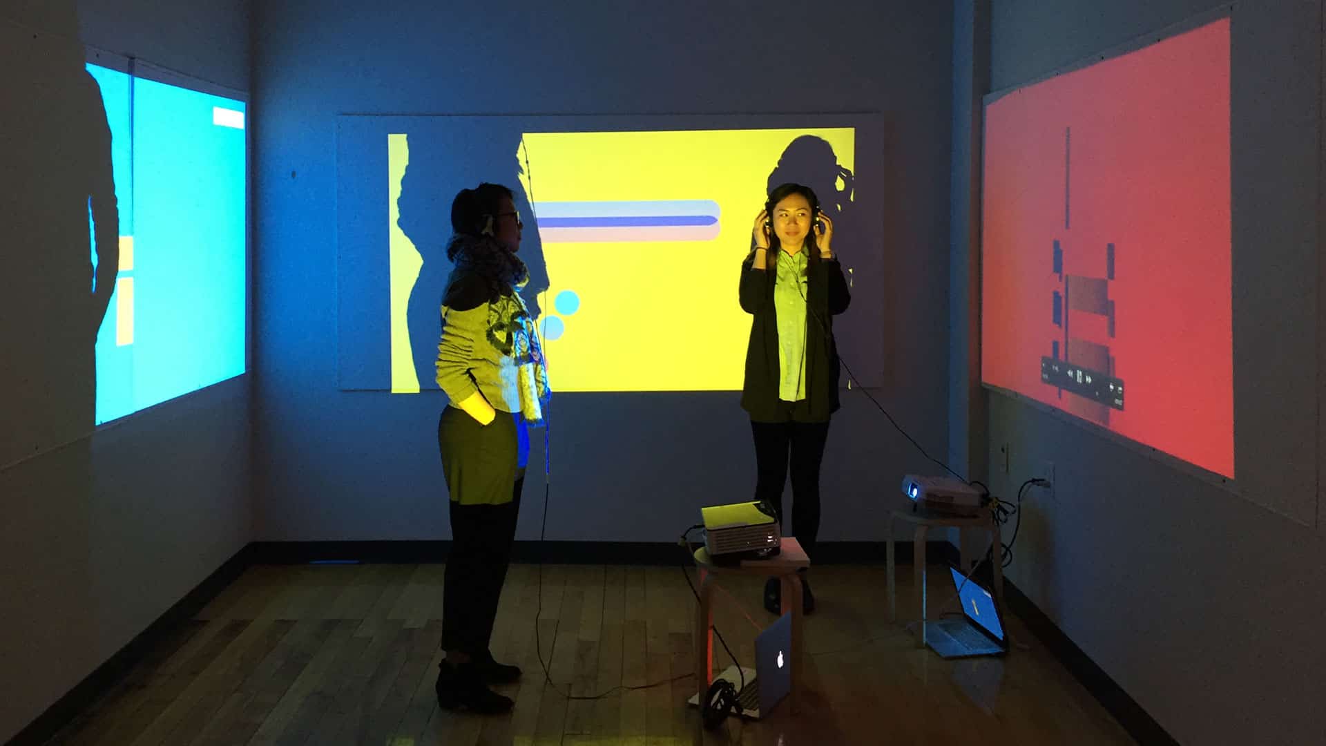
II. Entr’acte
Entr’acte is an intervention, composed of an open rehearsal and performance, that makes connections among the visitors, art, and space in the RISD Museum through exploring narrative soundscapes. It considers how museum visitors act in the RISD Museum’s space and how a designed sound space can encourage different patterns of interaction. How can the RISD Museum serve as a platform for visitors to have a dialogue with the art and space? How can the museum space create occasions for visitors to have overlapping experiences with each other? How can the museum challenge visitors to share, experience or rethink knowledge? Gallery visitors were invited to participate in creating connections between the art and space in Intermission, the RISD Museum’s temporary exhibition of 12th to late 19th century European paintings, using sound gestures to activate the viewing experience.
III. 72 Sq. Ft.
As graphic designers, we are constantly reading spaces and contexts which inform the way we deal with work in space. In 72 Sq. Ft., I embraced the limits of space to define a new constructed space composed of objects that represented behavioral patterns and site-specific conditions. During the summer before my graduate studies at RISD, I had the opportunity to visit Beijing, China where I visited “rat tribes:” small living quarters in the basement of residential buildings often occupied by migrant workers. The overpopulated city has resulted in a shortage of living spaces forcing landlords to rent out small rooms located in the basement of
residential buildings. Often times, these small rooms (on average about 72. sq. ft.) do not meet legal living standards. They do not have windows or proper ventilation, and require multiple residents to share bathroom and kitchen spaces. What I found to be most interesting about the limitations of these spaces were not the spatial qualities, but rather the objects that defined the human conditions and relationship with space. A wash bin reveals the resident uses a communal bathroom. A picture frame of a child reveals a mother who moved to the city to find work to support her family still back in her hometown.
mary-yang.com
Through my work, I highlight both peripheral and intrinsic aspects of graphic designers’ quotidian lives to reveal new ways of thinking about design tools, media, and processes.
As a creator who always seeks for novel perspectives, I keep observing and interpreting irony in aspects of the world. Using storytelling methods, I portray a certain object, machine or system in a way that deviates from its intended purpose.
I animate static media to convey sequential stories. I use familiar tools of designers to discover their inconspicuous characteristics. I translate graphic elements that we usually experience through two dimensions into three dimensional objects.
Connections between the graphic design apparatuses and my observations thereof become the inspiration for my designs. This process perpetuates a constant cycle of questions and further investigations into assumed forms and functions of objects to ultimately highlight the absurd expectations we hold for our world.
I. Urging Osmosis: Media Translation
Urging Osmosis was a workshop title taught by Keetra Dean Dixon, a professor currently teaching at RISD and the second visiting designer of 2016. The RISD Graphic Design Department invites four designers every year and opens periodic workshops for graduate students. In her workshop, students exchanged inspirational aesthetics of various artists and imitated their unique stylistic choices. Following an artist’s form-making methodology, I outlined marbled patterns from another student’s work, constructed white shapes out of the patterns and overlaid them to create the above poster.
After transferring the marbling cutouts into the above digital poster series, I imagined one more translation to another media/translated the patterns into a three dimensional form. On a whim, I went to the RISD Co-work Space where I could access diverse form-making machines. I tried out the laser cutting machine, which could directly read the outlined vector files and translate them into physical objects using plywood.
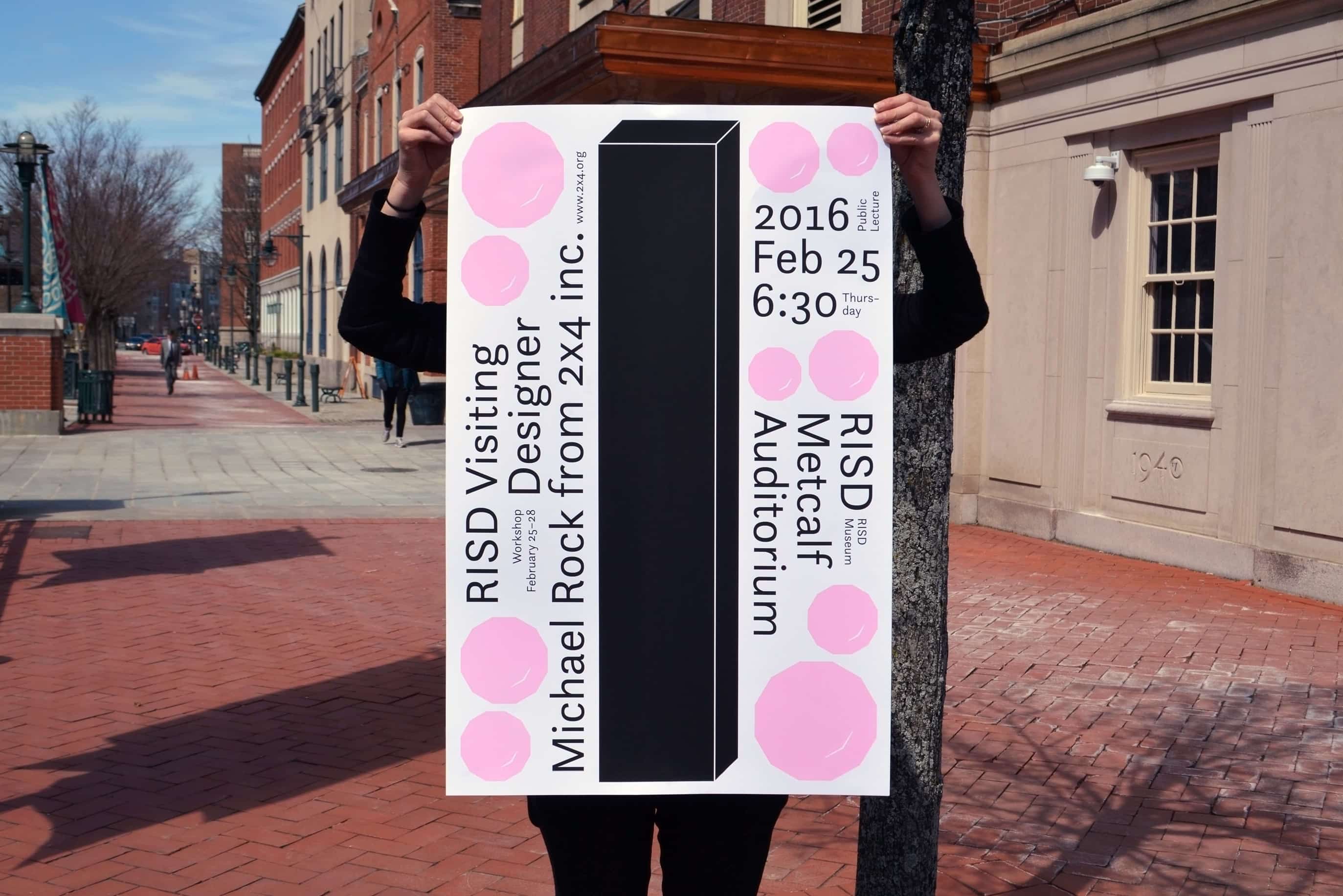
II. Visiting Designer Poster
This poster contains information regarding a designer’s lecture and workshop for the Visiting Designer class. The RISD graphic design department invites four designers every year and opens periodic workshops for graduate students. Michael Rock, the founders of 2x4 inc., was the first visiting designer in 2016 and I was in charge of designing a poster for the class. I decided to put a big 2x4 stick on the center of the poster to draw passerbys’ attention and typeset vertically. The remaining spaces are filled with pink rocks that were inspired by the invited designer’s name.
III. Workout Guide for Graphic Designers
This poster series is designed to target social prejudices against graphic designers’ lack of physical capabilities. All the graphic designers from various countries that I have met with work until late and agree that it is always hard to make time to work out. However, we, as graphic designers, can also effectively exercise while working professionally in the studio. Here, I strongly assert that we need to be stronger, not only for our health and fitness, but also for our design practice. In order to achieve physical fitness within your studio process, here are some solutions for you.
http://fletchermuseum.com
wkwon.com
Scripting Allographs* examines typographic principles and their pervasive impact on ways of seeing and making through design. This body of work demonstrates the many faces of typography and type design and the way they inform allographic thinking. It employs type as the primary tool and medium for scripting possibilities, embracing their differences, idiosyn- crasies, and imperfections. Beginning with a focus on close observation of small details and ending with an approach that invites and celebrates variability, this thesis offers a glimpse into a design practice from the lens of a typographer, type designer, and educator.
* SCRIPTING The term “script” has more than one meaning: handwriting, calligraphy, a writing system, a predetermined sequence of events such as a musical score or a screenplay, or a programming language as in computing. Its verb form,
to script, then, can mean to write a text, draw a letterform, or devise a plan that determines a course of action.
* ALLOGRAPHS An allograph, a linguistics term, is every possible manifestation of a letter: A, a, A, a, A,
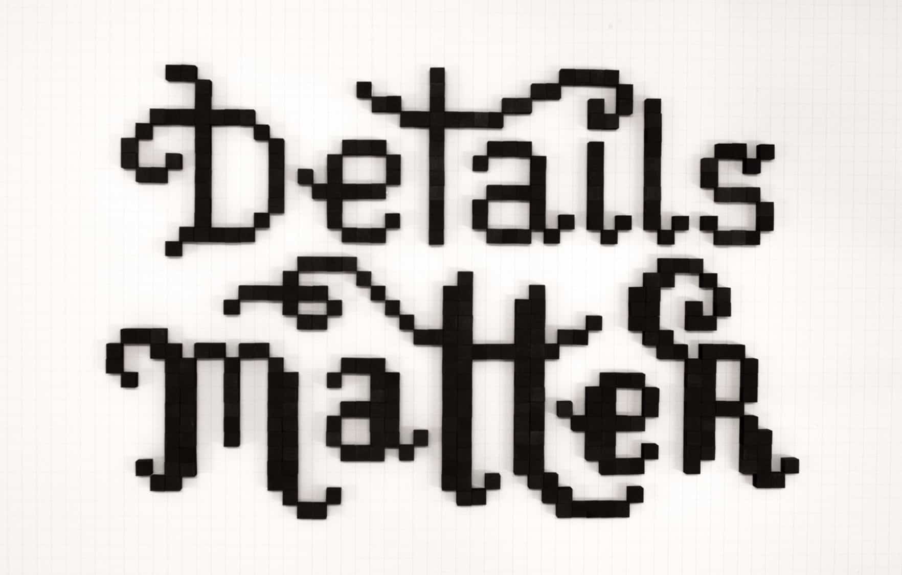
I. Details Matter
This stop-motion video highlights and celebrates the immense labor and care that designers dedicate to their work. Using over 400 wooden cubes (1⁄2 × 1⁄2 × 1⁄2 in. each), I playfully yet resolutely assert that details matter, a message that is both literally spelled out in the end and reflected in its labor-intensive production method.
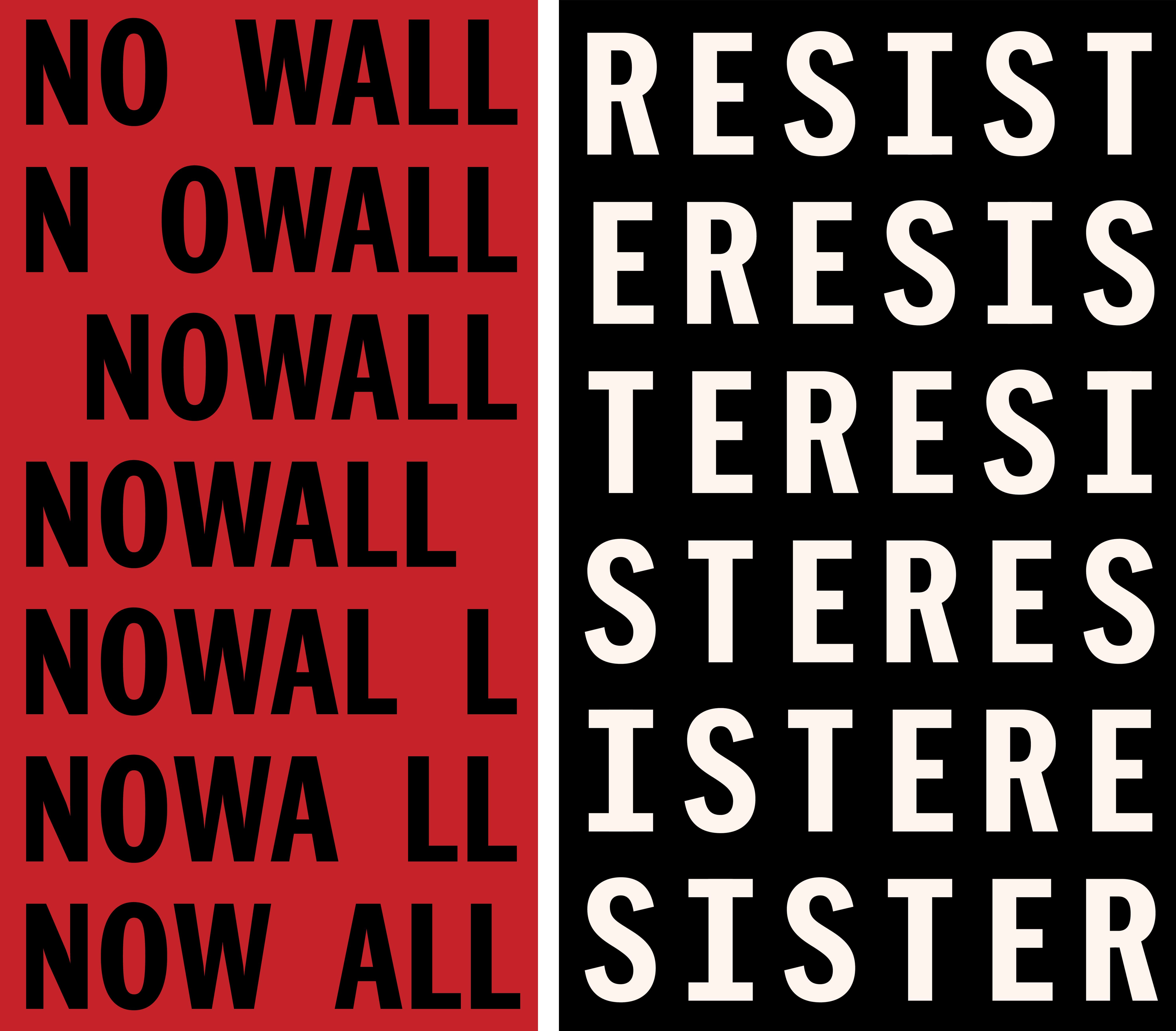
II. Anagram Posters
Anagram is a word formed by rearranging the letters of another. Created as an immediate reaction to the current political climate in the U.S., these posters use no more than the letters already in the words to say something completely different than their original meanings.
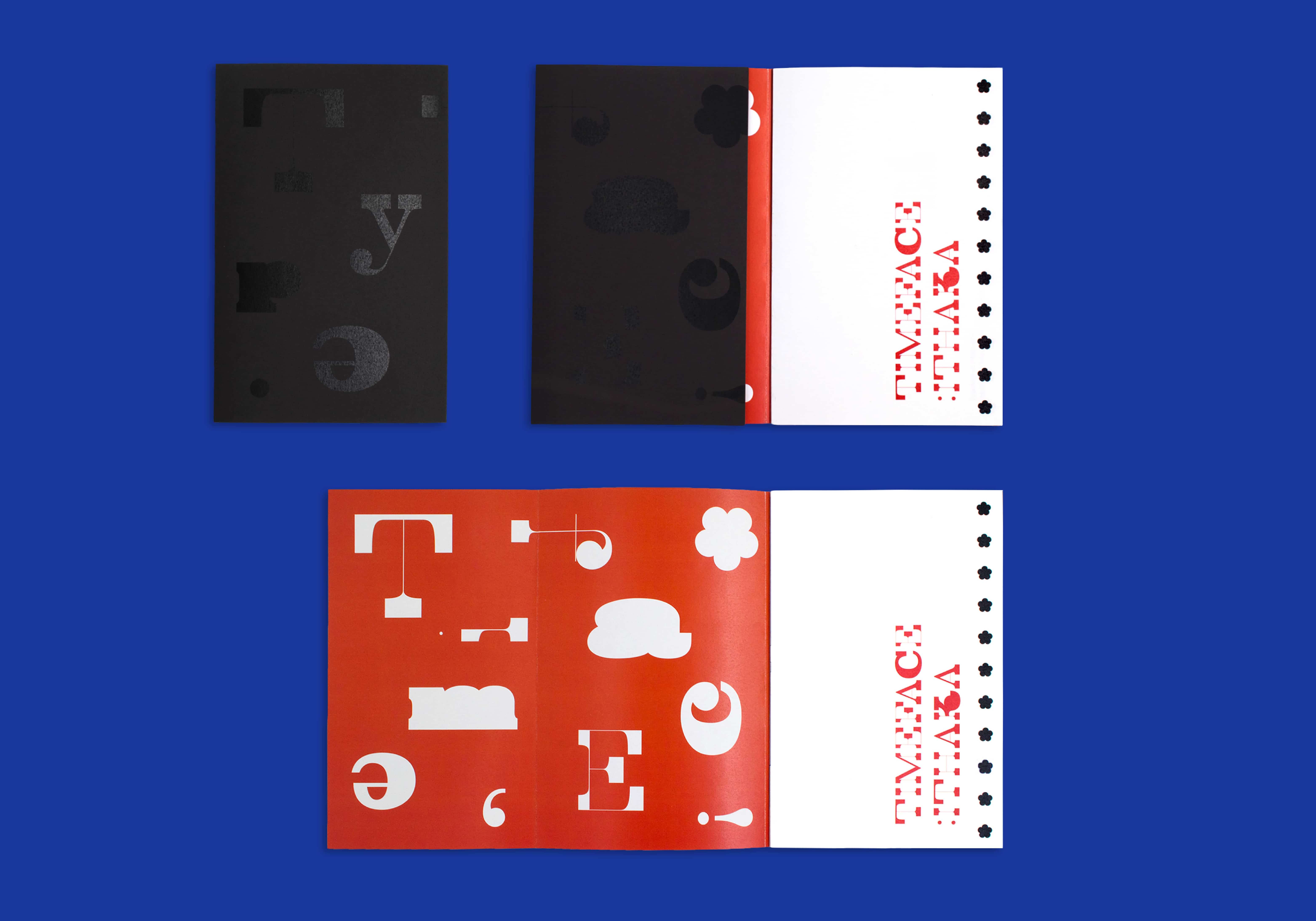
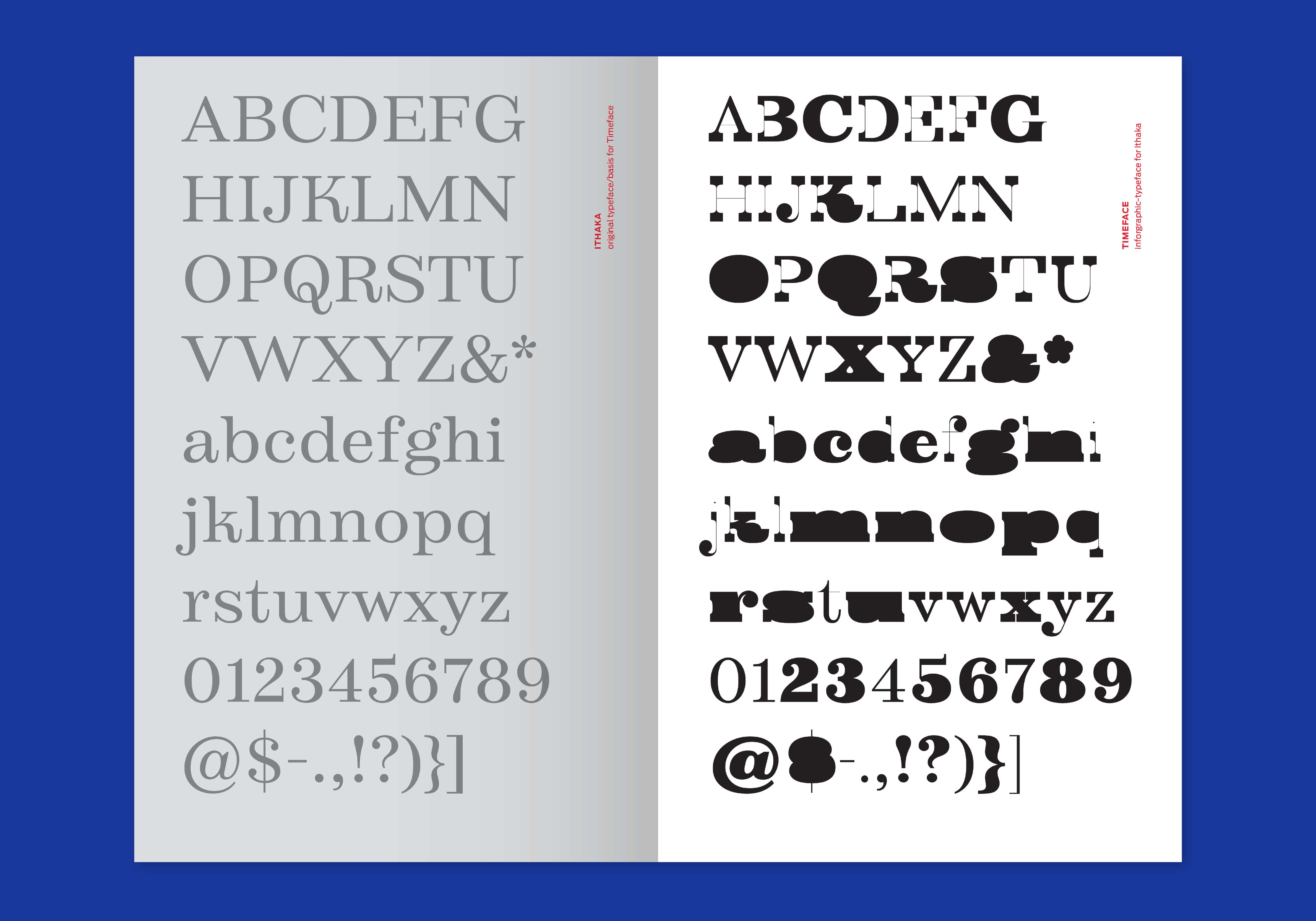
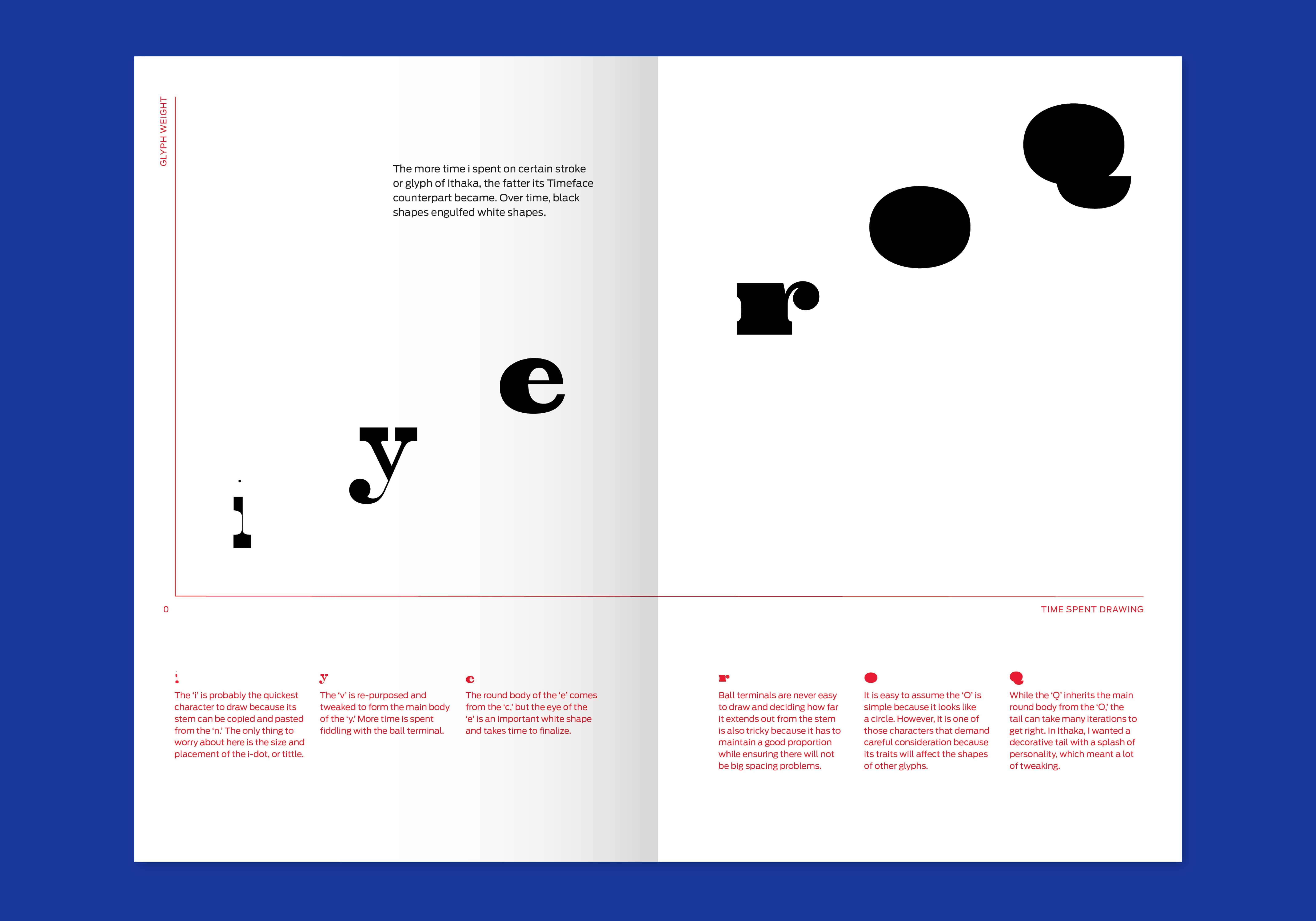
III. Timeface
Fonts do not just drop from the sky, yet not many people realize there is a designer or a team of designers behind each one. Even for graphic designers, type design is a particularly specialized niche field whose inner workings are mysterious and whose craft is often overlooked. Type design takes time. It is a laborious process that demands patience, persistence, and a hell of a lot of love for type. As a type designer myself, I wanted to make a typeface about type design, in order to share my process as well as my love for letterforms and the type design practice. Timeface is an infographic typeface that visualizes the time investment and logic involved in type design. With the memory of my design process for my latest typeface Ithaka (2016) still fresh in my mind and the numerous UFO (Unified Font Object) files still on my hard drive,
I created a sequel typeface in which the amount of time I spent on designing a character for Ithaka determined the weight of its Timeface counterpart. Those letters that required the most effort—the “control characters,” for instance—gained so much weight that they lost their white spaces and counters, ending up as blobs. While Timeface is based on my process for one particular typeface, it also provides insights into some of the mechanics of type design in general. It is my hope that these exuberantly eccentric forms convey a fresh take on reimagining what a typeface can be or do while offering pure graphic delight.
notborninjune.com
Graphic design is a spatial practice.
This thesis seeks to examine and retrace ways in which graphic design is fundamentally concerned with space, and tests spatialized theories, methods, and potential for praxis.
My practice investigates the spatial qualities and dimensions of graphic design at three distinct scales.
1 Spatial logic within a design object [design space, book space, counterforms, etc.]
2 Spatial relations between participants across a network [mediations across time and distance — the local network — ex. neighborhood, internet]
3 Space within the world[Space as composition, product, relational; not container, not fixed]
Through research, experiments, and projects, I examine the materiality of language in relation to the construction and composition of space.
Understanding how language is made to operate authoritatively in space, and how space as a composition can be reordered and interrupted, opens the possibilities for understanding, agency & action within the subjective, the interpersonal, and the environment.
[ ]
Treating language and space as elastic allows us to see what is as only one version of what might be. This re-visioning becomes generative and political in its potential for affective strategies towards connection and collaboration, and a catalyst for organizing and action.
I. Gestural Counterforms
Writing is a means of accessing, understanding, and re-forming our ideas. This is an ongoing project that examines writing as the result of the gesture of the hand — a trace of the physical action. We consider letterforms in terms of the relationship between form and counter, and we talk about black shapes and white shapes, rather than letters and negative space. I am interested in this idea of recognizing the negative space as its own form. The hand interests me as a physical form of the written gesture. What does its counterform look like?
To capture the physical counterform of the written gesture, I enlisted colleagues to write their names for me while pressing paperclay into their writing hand. The results are a strange collection of small sculptural forms, and what I loveis the participation that they invite — because they are curious and unfamiliar shapes, they ask to be picked up, and to be understood through touch. It is difficult and fascinating to try to form one’s own hand around them; but in doing so, one is able to experience the gesture of someone else.
elizabethleeper.com
Twenty-seven years alive. Sixty-one inches tall. One hundred forty-nine days abroad. How many more units would it take to describe me? What value is derived from this quantification? What quality of understanding does it offer? As human beings, we are constantly measuring our lives and implementing systems of standardization. Throughout history, measuring systems have served as frameworks for our comprehension and navigation of an increasingly complex world. This thesis approaches measurement as a means of revealing and processing this complexity of human experience rather than one that merely simplifies and distills. Through the lens of graphic design, my translation of units of measure from raw data to accessible forms provokes questions and ideas that simultaneously inform my practice and enrich my understanding of human nature as well as the systems and conditions with which we live.
By measuring and systematizing objects, bodies, nature, space and time, abstract concepts can be shaped and made tangible in ways that expand our comprehension of what it is to be human. In my thesis investigation, I highlight the ways we recon gure the spaces we occupy, the time we spend and the tools we use according to these systematized metrics. Through a range of design methodologies, I approach this investigation as both actor and observer, agent and critic. Inhabiting these complementary roles, I reflect upon our relationship to standardized measurements, and I consider not only what these structures obscure but also what they reveal. By transforming quantitative data into poetic narratives, I expose the personal and emotional realities behind the data and usurp our understanding of measurement as a means of simplification and reduction; I frame it instead as a technology that—when approached critically—serves to amplify and illuminate.
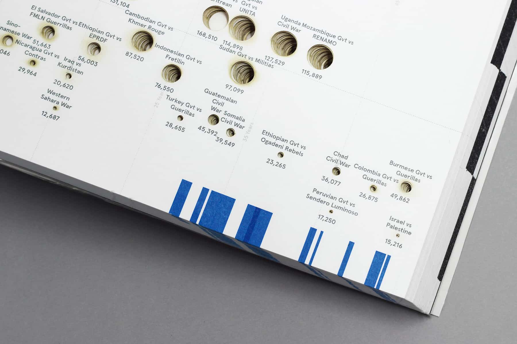
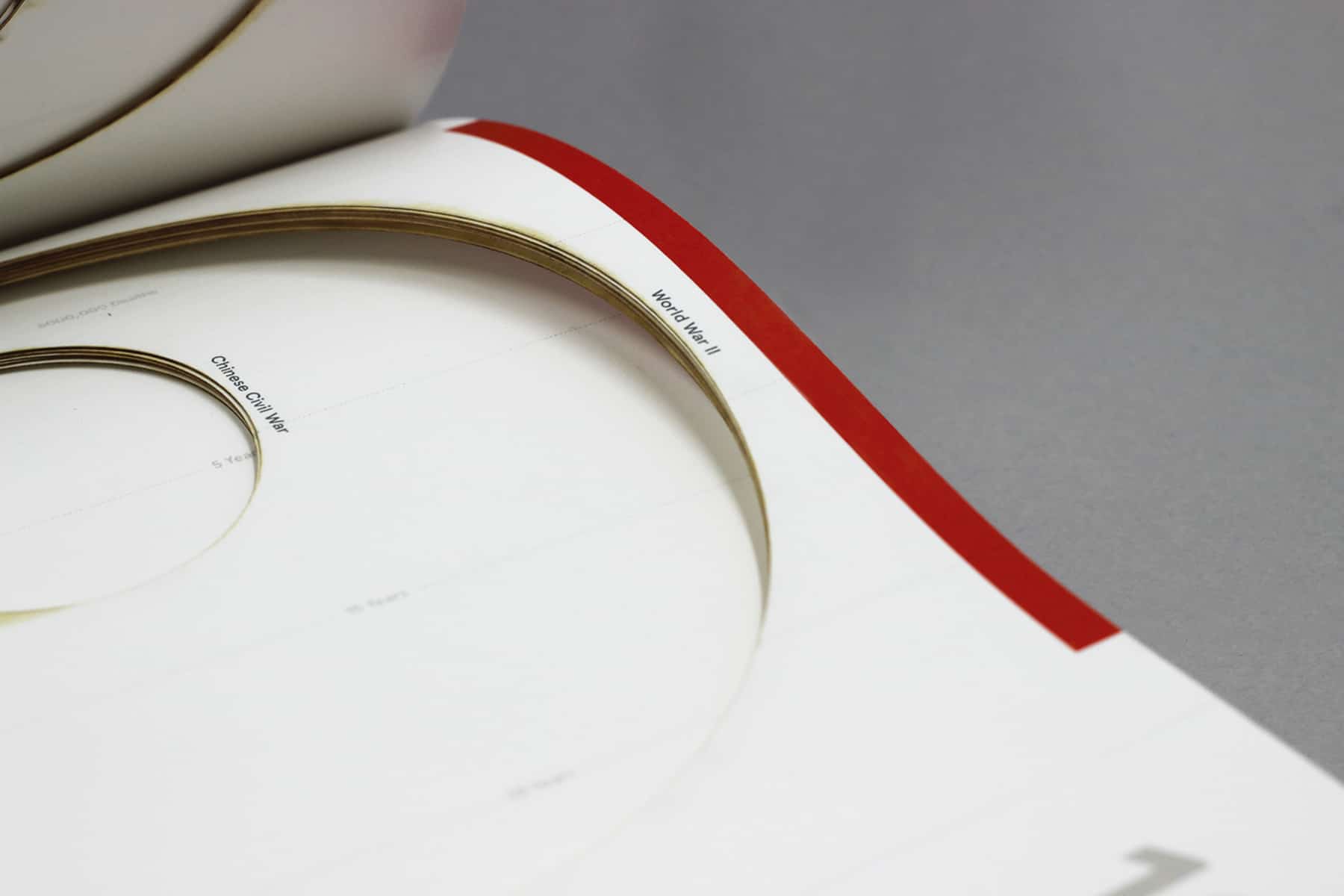
I. Timeline of Wars in History
Timeline of Wars in History is a laser-cut book that comprises a record of all wars noted in the historical record from 1900 to the present. The book visualizes content using various elements of book structure. It highlights the duration and fatalities of each of the wars through codes of laser cut circles and varied treatments of the three edges of the book. The top edge of the book illustrates the ten deadliest wars, the fore edge of the book represents time in decades, and the bottom edge demonstrates the ten longest wars. The thickness of book also represents time in a physical form, with two pages equaling one year. Because of this complex and layered design, the book has an introduction explaining how to interpret this symbolic language. By transforming the historical data into a physical and temporal experience for the reader, I highlight the devastating consequences of war.
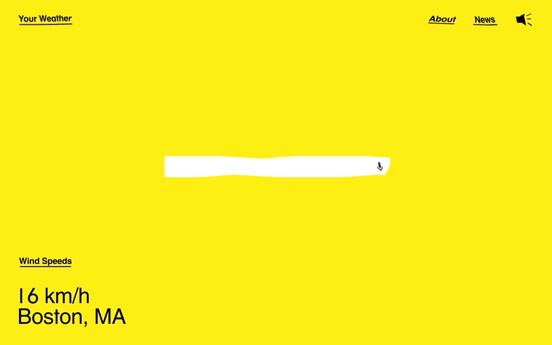
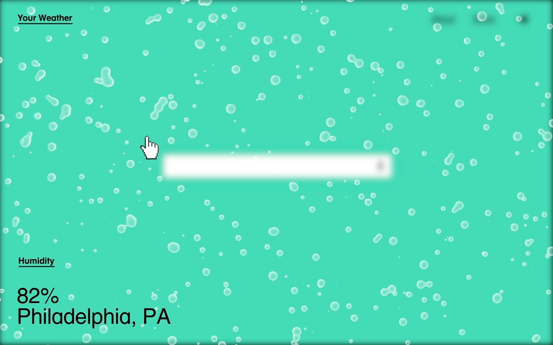
II. Your Weather
Your Weather is a prototype website designed to present weather forecasts through geolocation data. Using the data, this website informs Google users of weather conditions at different locales. Sound, movement and graphics give users more direct sensory information, replacing the familiar details of temperature and wind speed index. By transforming quantitative weather data into tangible experience in this way, abstract statistics become an experiential animation of wind, sun and rain.

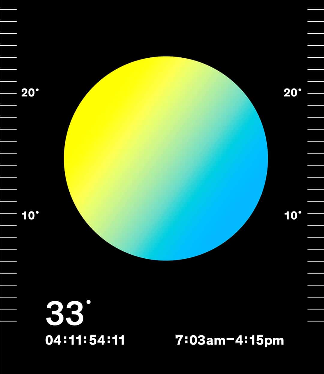
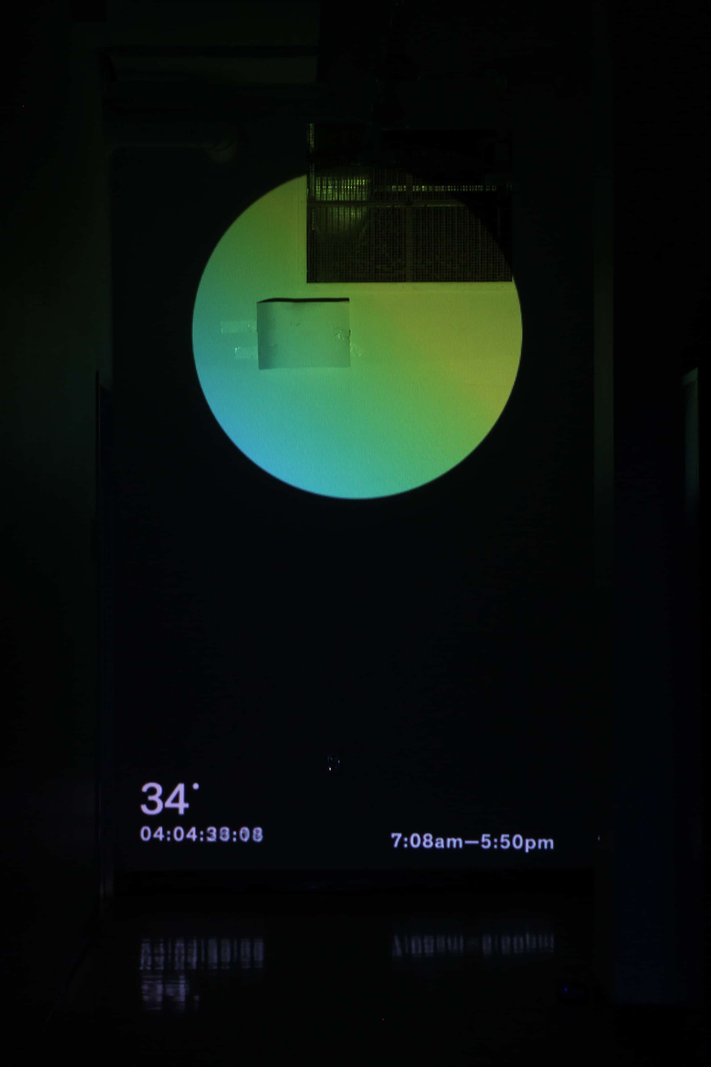
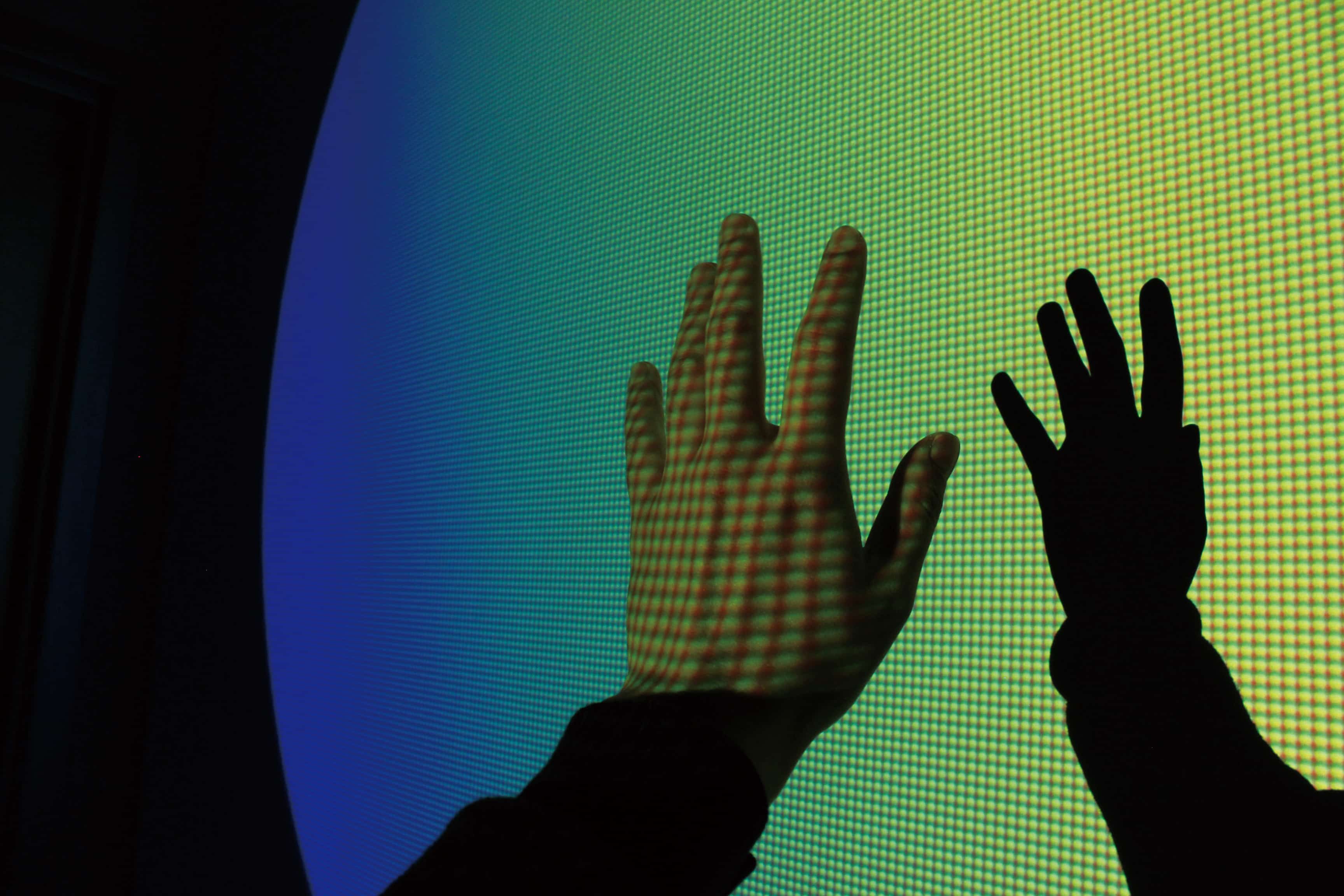
III. Sun Clock
Sun Clock is a real-time light projection installation. In our daily lives, weather and light patterns affect our routines much more than we realize. In my own experience, for example, I find it difficult to truly sense the weather outside of the building during the day because I spend most of my time working in my studio. Even though I use a weather app that inform me of temperature, wind direction, wind speed and humidity, the numbers in the app do not really help me understand how we feel weather. Inspired by this realization, I created a means of bringing the sun into the building to highlight the fact that it is, in fact, vital to our lives. This installation consists of a large sun projected onto the wall at the end of a darkened hallway on the first floor of the building.
Sun Clock reflects the length (ten hours and forty-two minutes) of a particular day in Providence. Both the color and the location of the projected sun change gradually depending upon the actual sun’s altitude in this geographical location at a given moment. This work incorporates color, geometry, movement, light and sound to offer viewers alternative means of experiencing and interacting with daylight. Through various portals of engagement, viewers become participants as they immerse themselves in the work.
cargocollective.com/minryungson
Content—Aware serves as a platform for investigating structure, corruption, and visual interference. I use fragmentation, movement, repetition, and abstraction to interrogate views of the physical and digital world. Physical and graphic spaces become grounds for testing visual hypotheses.
By testing images and subverting image-making technologies, I challenge the fidelity of vision and representation. I collaborate with digital tools, play with their edges, and build perceptual portholes. Through documentation and curation of visual experience, I engage with and challenge a capitalist image infrastructure.
I create, collect, and process images using smartphone cameras, screen recordings, and applications such as Shrub and Photoshop. These devices and programs, which have the capacity to produce visual smoothness and polish, also inherently engender repetition and fragmentation. The same set of tools used to perfect images is easily reoriented towards visual destabilization.
Projects presented here are not meant to serve as literal translations, but rather as symbols or variables in experimental graphic communication strategies. Employing these strategies, I reveal the frames and tools through which we view the world. By exploring and exploiting the limitations of digital instruments, I reveal the breadth of the human experience surrounding them, including those of their creators, directors, users and recipients.
I. Giant
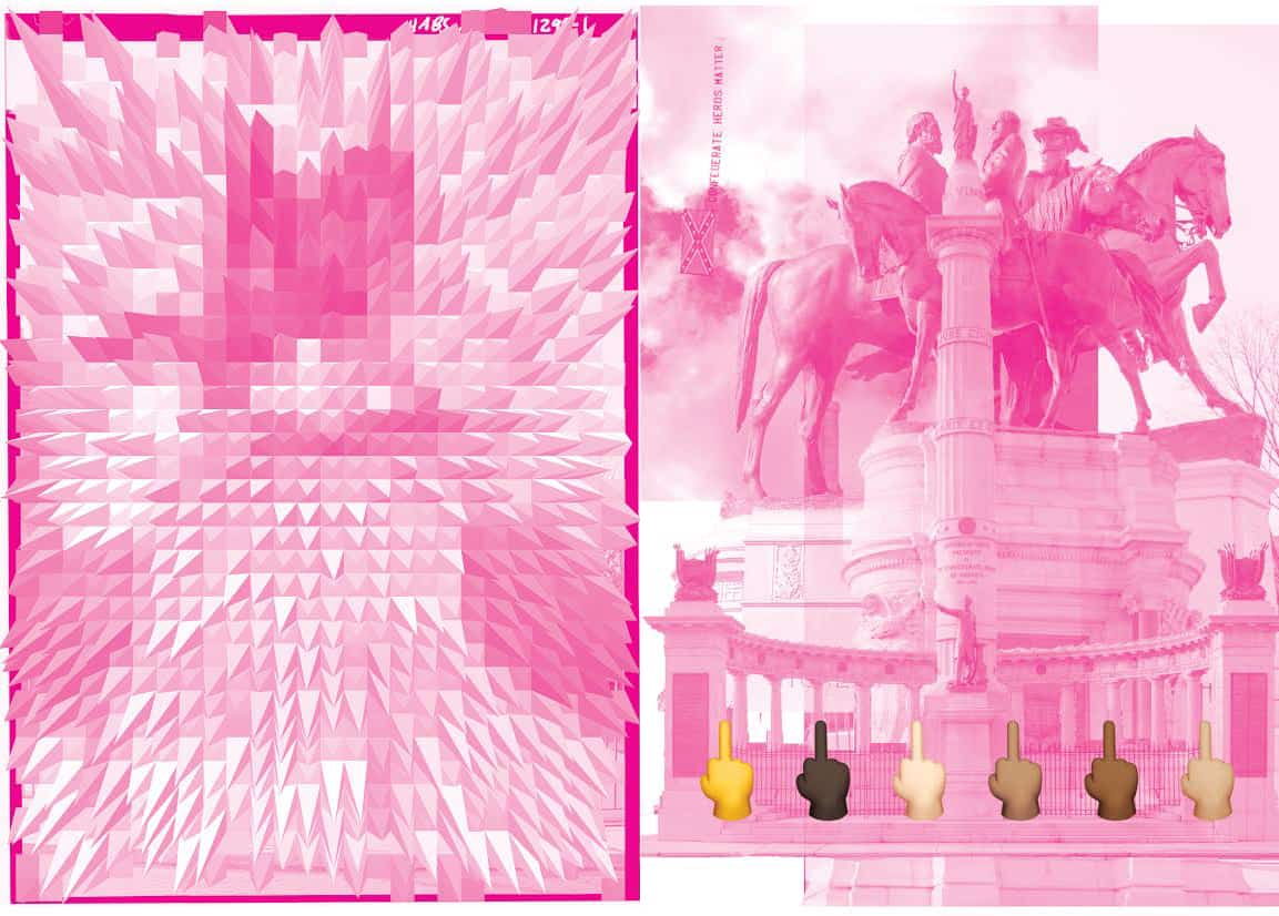
Giant is a pair of huge posters, each 5’x8’, made using images from the Library of Congress’s Historic American Building Survey archive. The archival photographs depict bronze statues erected to celebrate Virginian Confederate soldiers who fought against the United States in the American Civil War. The monuments were installed between 1890 and 1929 along Monument Avenue, a prominent and architecturally significant thoroughfare in Richmond, Virginia. Process magenta duotone was applied to subvert the heroic, hyper-masculine forms. Along the bottom center is a row of middle finger emoji, enlarged to the point of pixelation, challenging the statues’ dominance.
II. Amplify the Mask: Direct Address
Using computer vision, Snapchat uses “pixel data from a camera to identify objects and interpret 3D space.” The Viola–Jones Algorithm is used to run repeated scans on an image, looking for a specific pattern of visual contrast. If the algorithm detects a certain arrangement of light and dark areas, the program registers a face. Next, the software places facial features onto the face area using an “active shape model,” a statistical model of a face shape that’s been trained by people manually marking the borders of facial features on hundreds or thousands of sample images. The algorithm aligns an average face map with the face shape detected by the camera, scaling it and rotating it based on where the camera detects the face location. Because the match is not perfect, the algorithm analyses the contours of the face, looking for contrasted areas to adjust and refine the alignment. Match points are used to create a mesh, a mask that can move, rotate and scale in along with your face, frame by frame, as video data is received. From there, the program can deform the mesh to change your face shape, change colors of different parts of the face, add accessories at the periphery of the mesh, and trigger animations to specific movements, like opening your mouth or moving your eyebrows.
Although the technology needed to accomplish the real–time facial recognition, mesh creation and feature application was patented in 2001, only recently has the processing power of mobile devices been strong enough to run the application. Snapchat is also known for the temporal nature of its messages, which disappear after one or two viewings. The sender is notified if the recipient takes a screenshot of the message. By focusing on the grotesque aspects of Snapchat’s facial recognition and projection-mapping softwares, I reveal aspects of the digital tool and its human collaborator. Through this project, I take aim at the duck–faced selfie. I pit my images against those crafted in the name of preening and display. Gestures learned from software combine with a kind of filter-based, role-play roulette to normalize the strange and allow the user to inhabit a set of visualized fictional exaggerations. Our softwares learn from our data and teach us new behaviors. Working against the temporal nature of the tool, I archive each image and video I make, saving them to my “Memories” and later downloading them to my “Camera Roll”. These speculative surfaces—which I hope to make real—reflect on the nature of intimacy, attractiveness, and relationship.
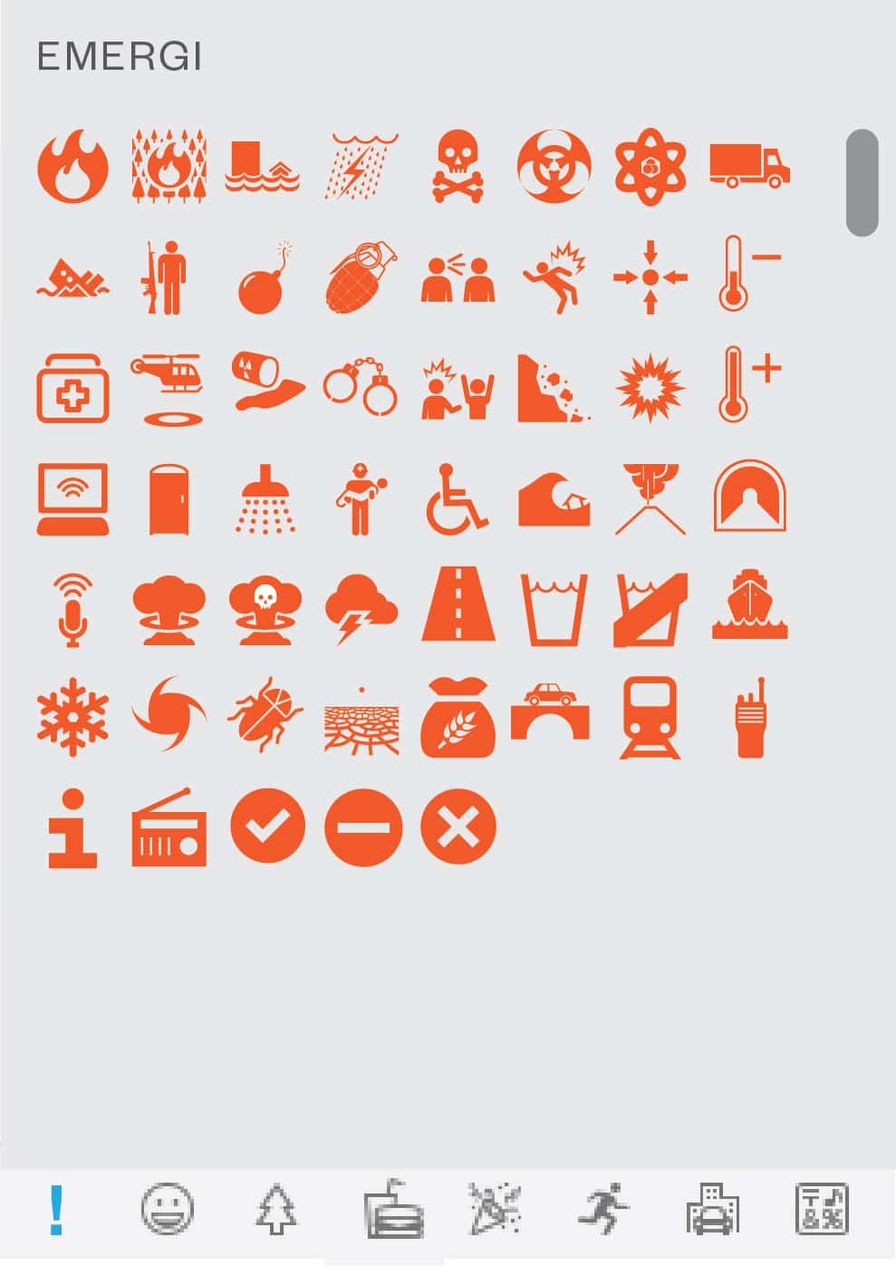
III. Emerji
Emergency emoji (or emerji) will allow rapid communication during sensitive and critical situations, including medical emergencies, natural disasters, active shooter scenarios, and terrorist attacks. The existing emoji set is lighthearted and playful, with a focus on food, entertainment, travel, and leisure. This proposal offers a range of iconographic, utilitarian emoji which would allow communication of complex information during critical situations. This emoji proposal was drafted and formatted in accordance with the Unicode Consortium guidelines.
llewellyn-hensley.com
Methods of hierarchy are often represented in graphic forms. They shape our world into subjective places / spaces of belonging or oppression. The need for order is a human condition. There is constant tension between the utility of ordered systems against the manipulative and ultimately subjective manner in which they are created. Where there is a system, there is a story. The narrative the hierarchy tells is just as crucial to me as the mechanics.
I position myself within various hierarchical systems as a way to understand the logistics of their becoming, but also, to manipulate (or justify) my cultural and ethnic status in relation to them. My work often deals with multiples of a system — copying, transferring, and detaching the pieces into abstract, void, or recon gured images. This self-re exive method of undoing order — of viewing the neatly bound as a whole or into the smallest fractions, takes my subjectivity (and relationship to narrative) and reinterprets methods of hierarchy that are historically viewed as objective. This book demonstrates my disruption, compliance, and /or fabrication of order in pursuit of creating a cosmos of my own making.
jordynalvidrez.com
What are we talking about when we talk about identity? People are likely to define themselves in terms of what is relevant to their time and place, in other words, context. This indicates that identity is not a fixed definition, but more of a malleable construction;1 it develops its attributes via context. I am constantly recalibrating the relationship between the two. Context is ubiquitous, unnoticed, coexistent and interchangeable. Identity is reflexive, fragmented, shapeable and fluid. Identity Production explores and unveils how identity is adapted and manifested in contemporary conditions, as well as its external validation2 which paradoxically defines this indefinable concept. This thesis asks readers to be conscious of the contexts with which we interact on a daily basis, as well as the corresponding identities that are activated by them. My role as designer shifts accordingly within each section. Substitution, subversion and superimposition are the methods allowing me to materialize the intangibles and simulate the incompatibilities.
This process has led me to wonder: Where can an identity exist? What does an identity look like? How is identity validated? The research subjects cover from standardized manufacturing and social platforms to universal surveillance and machine vision. My work orients context as the defining factor, leading to a subsidiary production of the identity. Through my thesis, I hope to offer a better understanding of our relationship with the environment, both digital and analog, as well as a better understanding of the self.
1 Handbook of Self and Identity. Mark R. Leary & June Price Tangney.
2 Identity nowadays relies more on the evidence like IDs and passwords than on the quality itself.
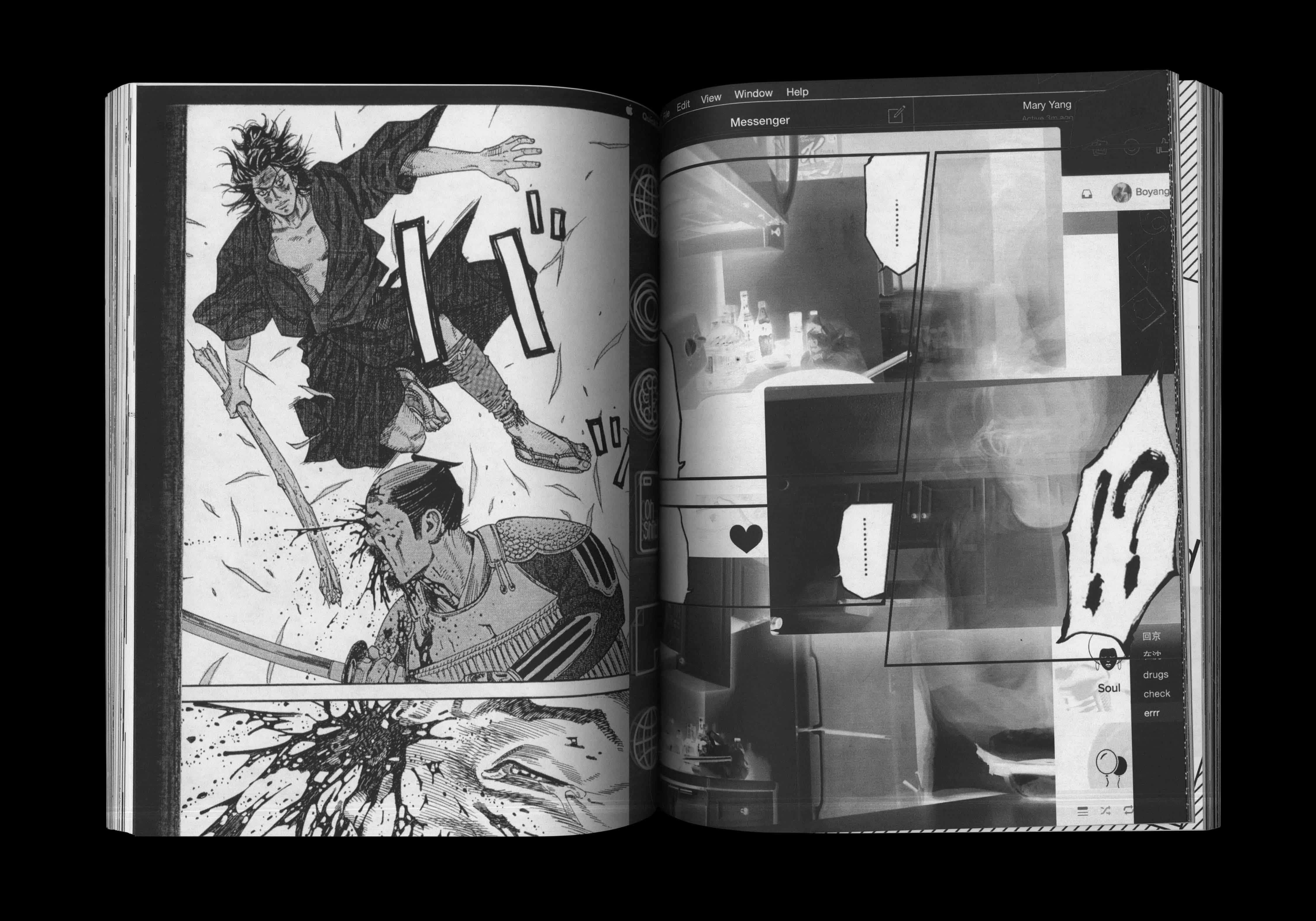
I. Re-place
Atlas is the first project I did in RISD. At that time I had only been in America for a month and there was a lot for me to adjust to and take in. This assignment was designed for us to explore the city and be acquainted with our schoolmates (at least I think it was) by completing a series of tasks.
Through the process of content collection, I came to realize my inadequacy in the English language: I perceived Roman types as images instead of understanding what they signified. This incident gave me the idea of using only images to construct my section in the project. It was my exposure to this new context that led to this shift. One of the project tasks led me to find a familiar manga in Brown library. Vagabond was a manga that I had often read as a teenager.
This time, however, the manga was printed in its original Japanese language, one that I do not understand. Again, the recognizable becomes unfamiliar within different contexts. Since the whole section was presented without any text, I borrowed the classic visual language of comic books—the talking boxes. These visually dramatic text boxes communicate spontaneously with each other. They are then overlaid on top of images I had collected, eliciting a visual conversation from the compositional construct. My section is thus created to be recognized and not read.
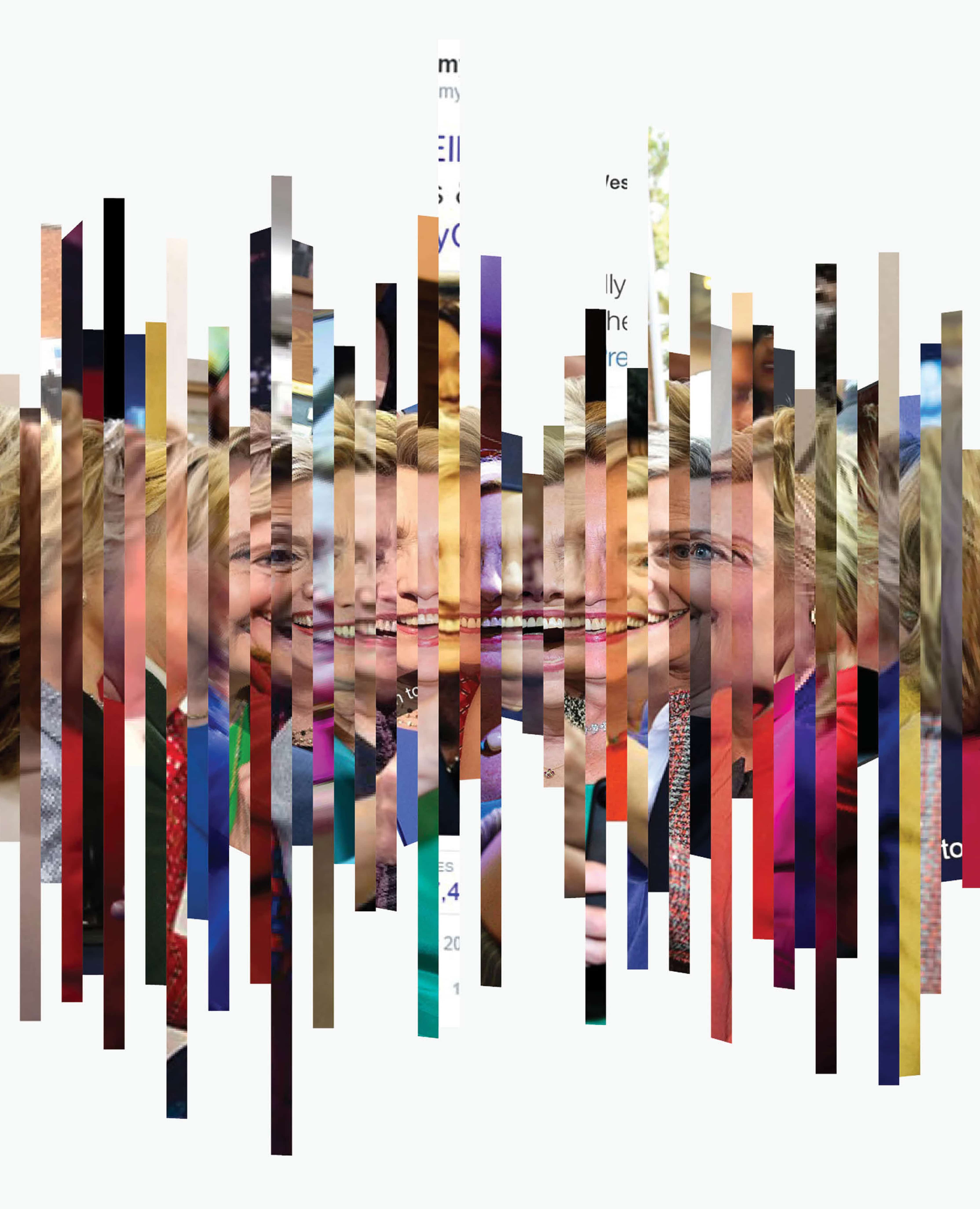
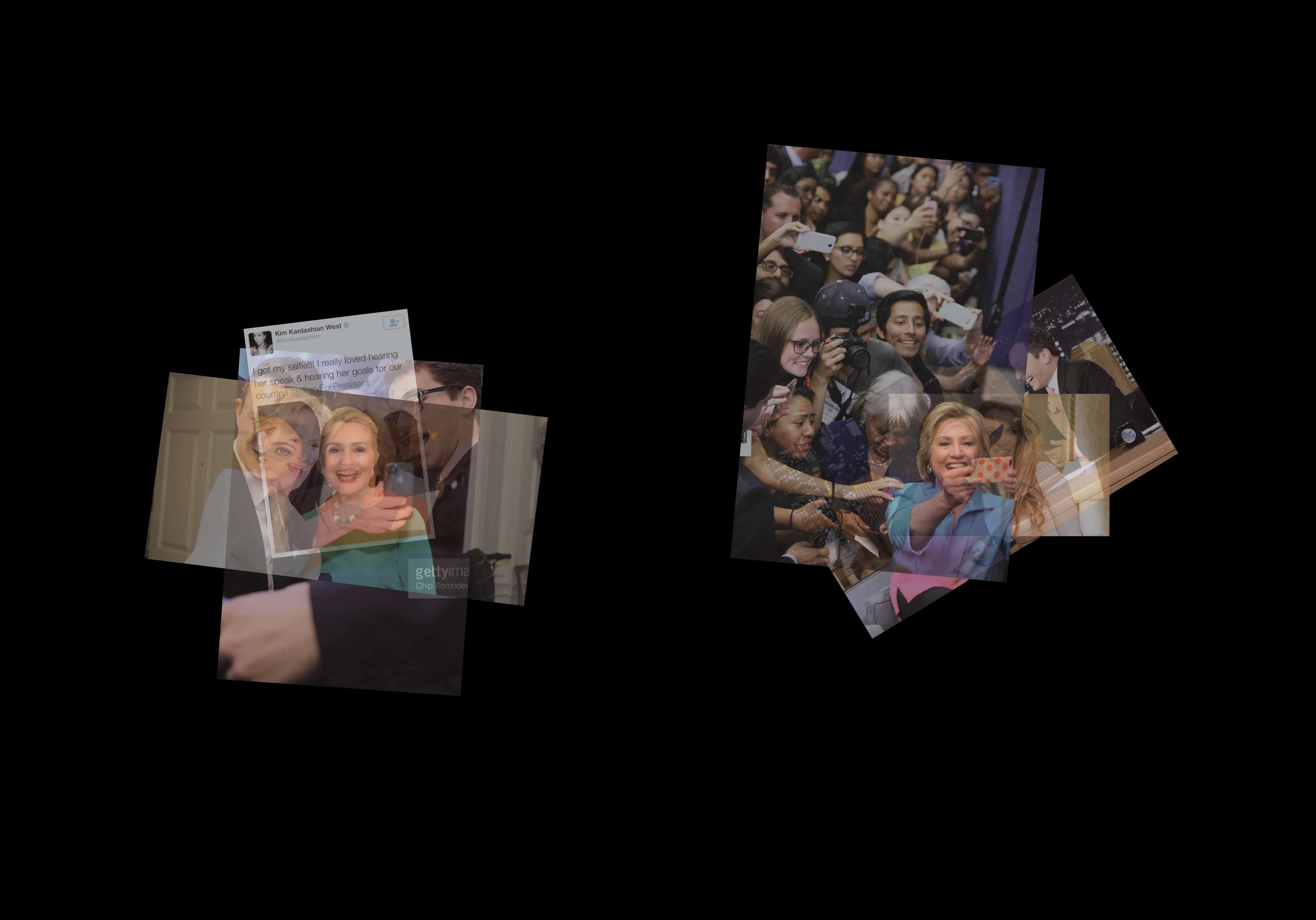
II. Hey, Candidate
Hey, Candidate discusses how identity is constructed through information disseminations. The limitation of the media offers viewers to perceive the images of the candidates through a surface-driven lens. The goal is to reassemble the three-dimensional configurations by using two-dimensional public imagery.
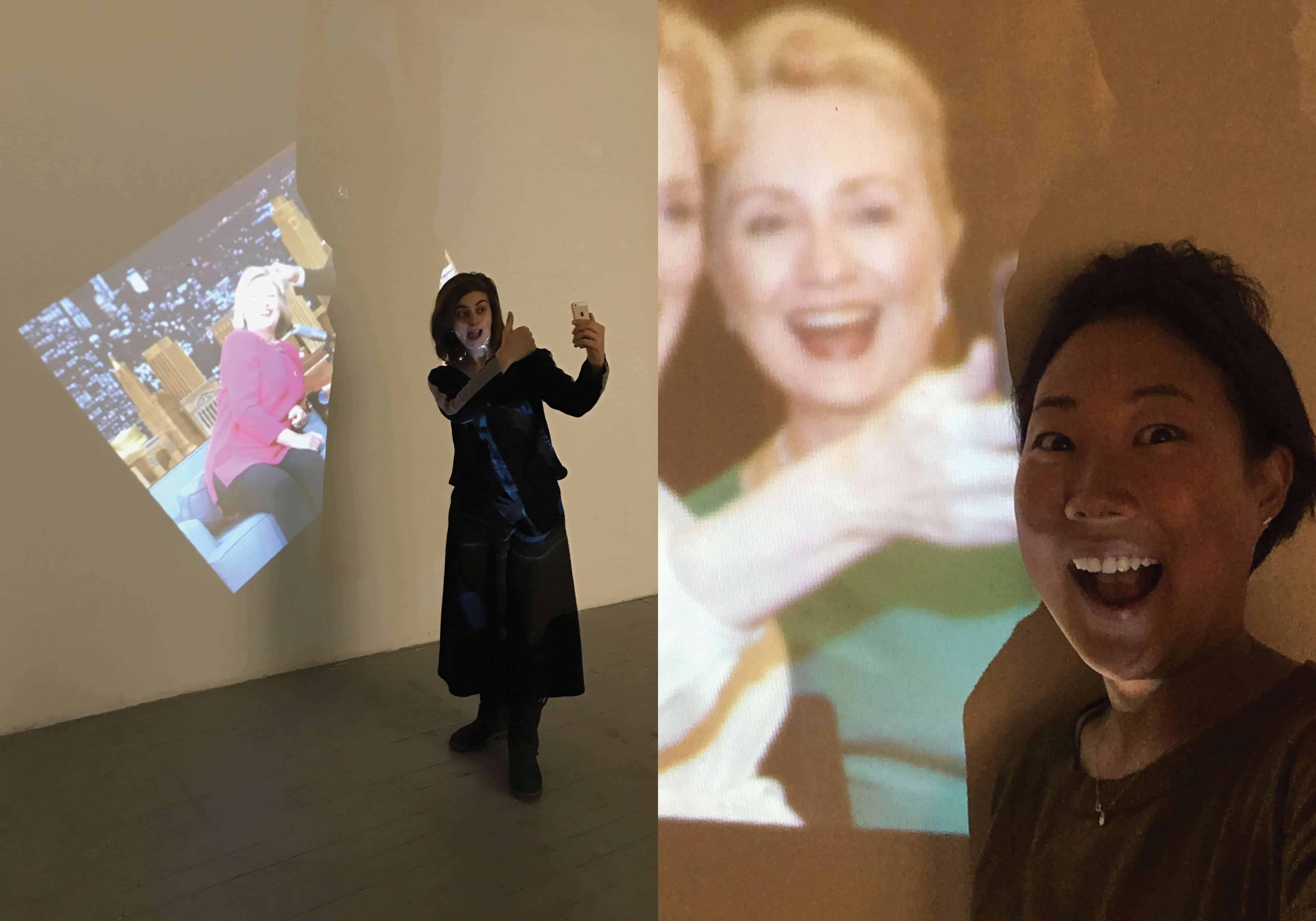
A series of selfie and selfie actions are collected through social media platforms under #Hillary #selfie #ImWithHer #HillaryForPresident #hope, et cetera. These fragments are sequenced based on the spatial relationship. With the images functioning as frames, I manage to render an animation of a candidate’s appearance in 360 degrees.
The video is projected in the same proportion as the candidate (5′ 5″), where a digitalized performance achieves its physical attributes. The piece is presented with the represented images, and I invite viewers to conduct another round of presentation by taking selfies with the piece.
It is essentially a generated visual that examines the relationship between the self and its manifestations. I attempted to investigate alternative ways of representing digital identities as the components for constructing the full self.
Video Link
III. All About That Yellow Box
Facial recognition system has been adapted in a wide range of media over the past 50 years. It affects people’s lives in every single aspect. There have been numerous discussions regarding this subject matter. For example, in response to the Deep Face algorithm that Facebook has developed, researches have raised the alarm about the severe consequences if we easily give up our privacy. Countersurveillance as a political proposition has been adapted in a good amount of facial recognition projects. For this work, I propose a different aspect of this subject by challenging the fundamental criteria of the system. How is a face supposed to look like to a program? To what extent does an image become recognizable as a face?
I am interested in how a machine functions imperfectly. I am sure everybody has encountered the situation where a facial recognition system on our iPhones registers something that is not a human face. The facial recognition program actually works by detecting legitimate color blobs, which is the contrast of shadows, on our faces. This process has nothing to do with any biological examination of our faces. Rather it is determined by the physical attribute of the subject matter.
Following its working method, I pixelate my face to test the limitation of the program and reconstruct the essential color blobs to piece out faces that are legitimate to the system. The alienation between quality and concept is dismissed through the emergence of the yellow box.
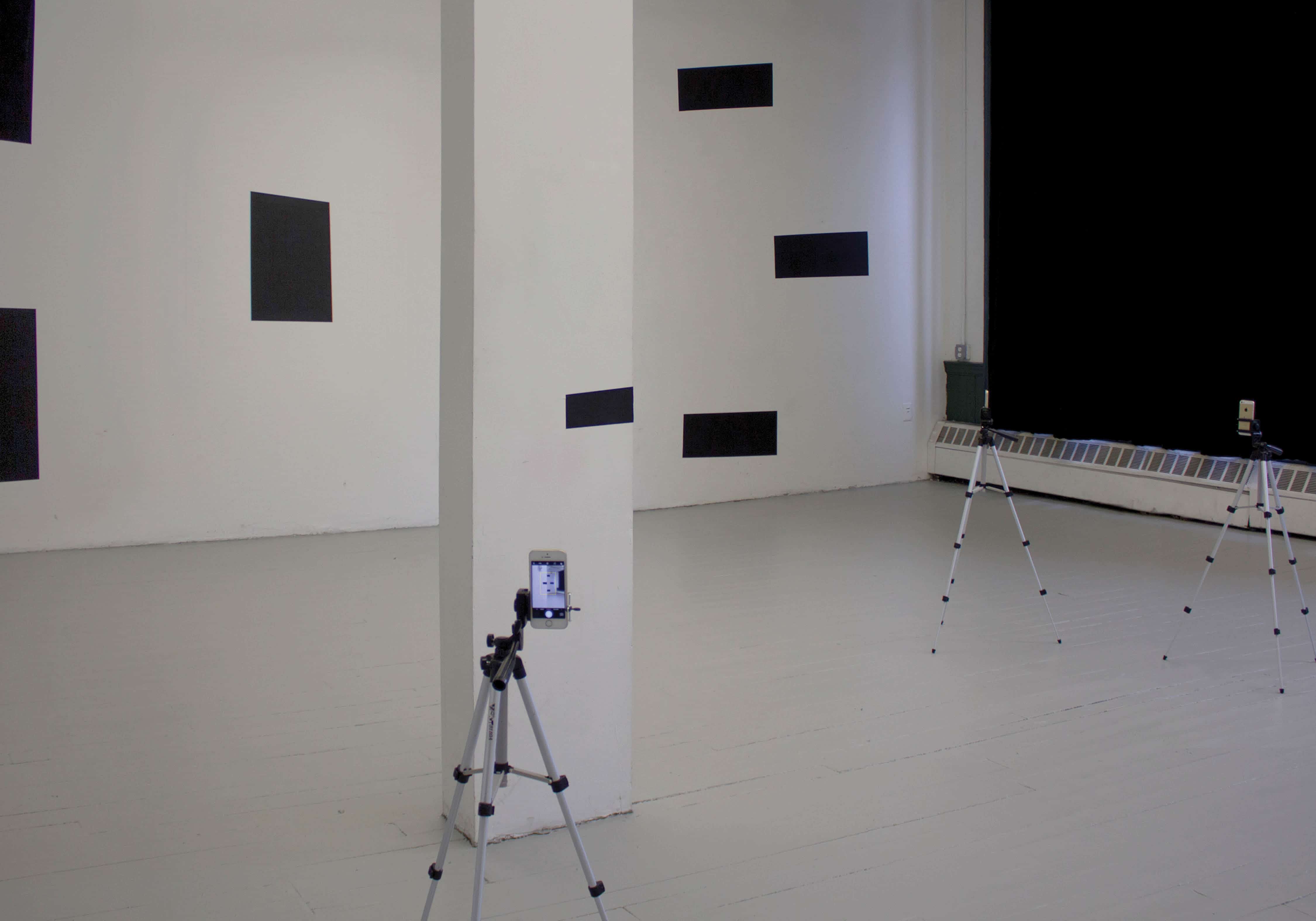
I choose Crit Room 203 as the installation site and disseminate the graphics on multiple surfaces so that viewers can only see the entire installation from certain angles, and these are where iPhones are placed in order to validate them. The work is an attempt to create an immersive abstract environment where the graphics are being validated through devices.
Video Link
boyangxia.com
The perennial challenge of the graphic design brief is such that it is always dictated by the conditions of the container it must fill. A 24 x 36" printed poster; a 48 foot-wide billboard; a tiny (or large!) exhibition space; a 200-page book. Sometimes, the forms that we are asked to produce are flexible— depending on the content, the client, and the situation — and if we are lucky, we are able to mold the format to the content. The likelier event, however, is working with a form that is fixed, or a system that is unrelenting.
The burden then lies on the content to respond—for it to fill whatever container it occupies to its brim. To occupy an existing set of systems and procedures, compressing or expanding to the elasticity of set parameters. In order meet such demands, to meet these specific conditions, the designer must exaggerate them. Ends must meet. Fat must be trimmed, pieces must be rearranged. The frame will transform the content. The form will also transform the content.
Design happens when the content sits just at the edge, fighting with the frame, sitting right on the form, making the audience constantly aware of the tension between the two.
This thesis is a demonstration of that.
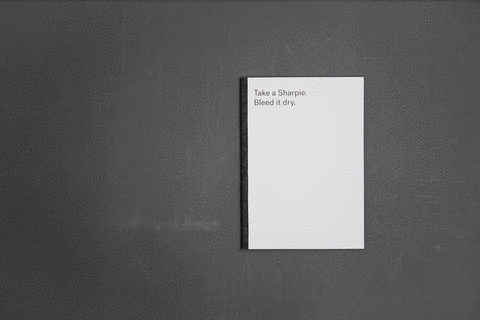
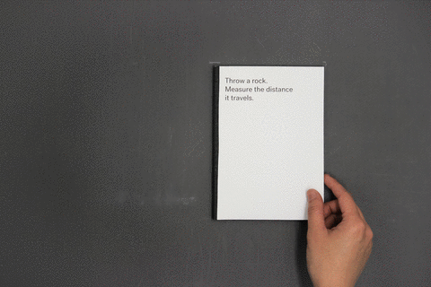
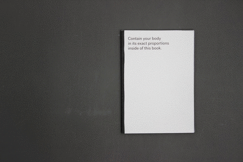
I. Fitting Objects into Books
Fitting Objects into Books is a series of exercises where I attempt the fitting and containment of various objects of various scales into books. The book is treated as an elastic container that can mold and shape the content of whatever it holds. Three examples of the objects transformed—a Sharpie, a thrown rock, and my body—are shown here in this website.
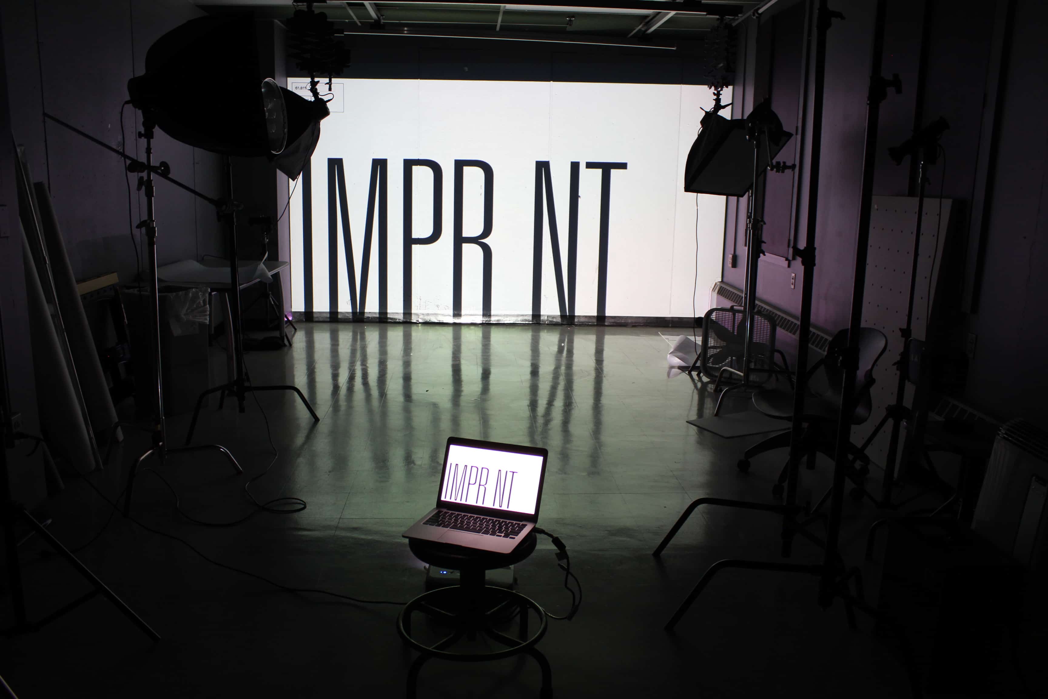
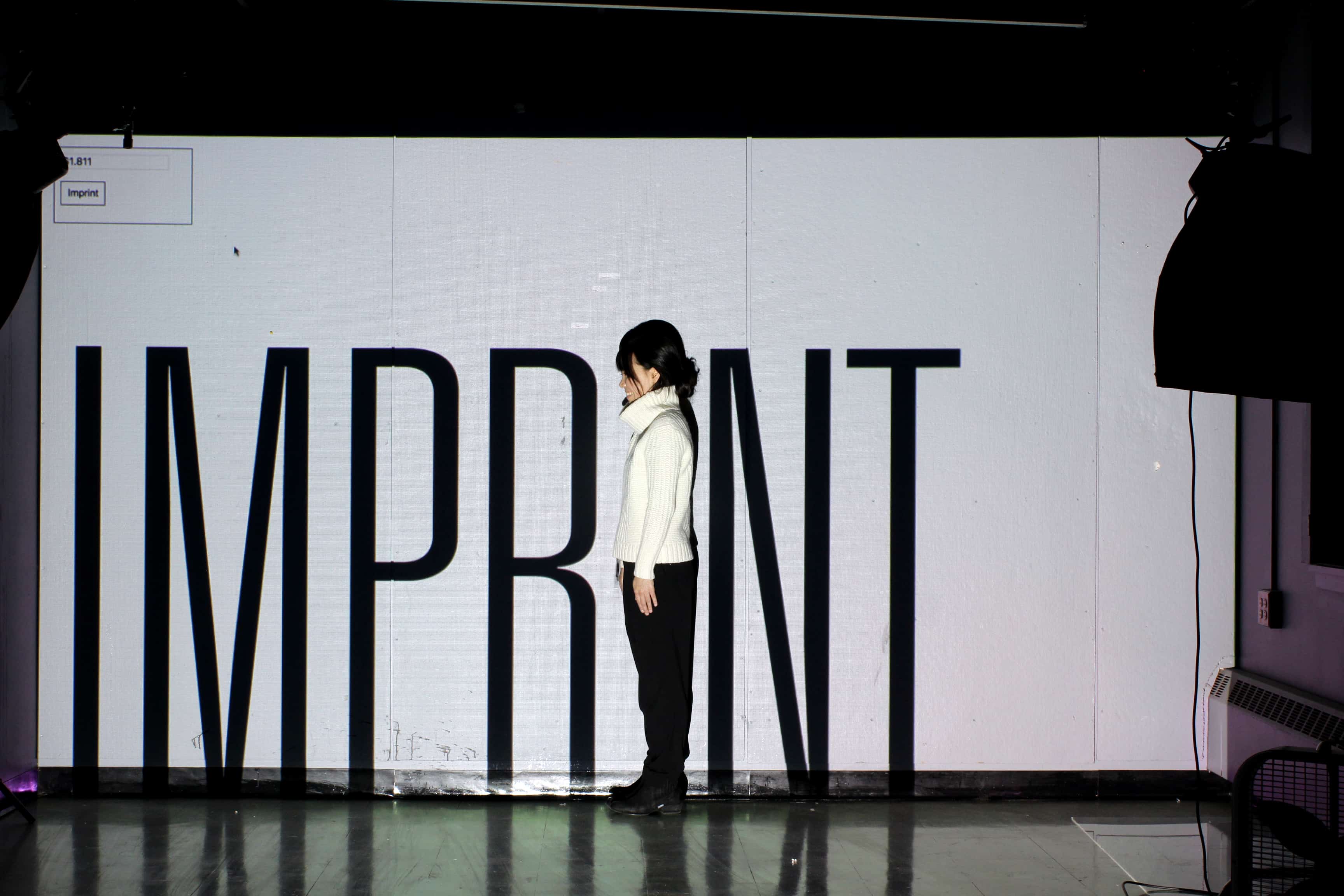
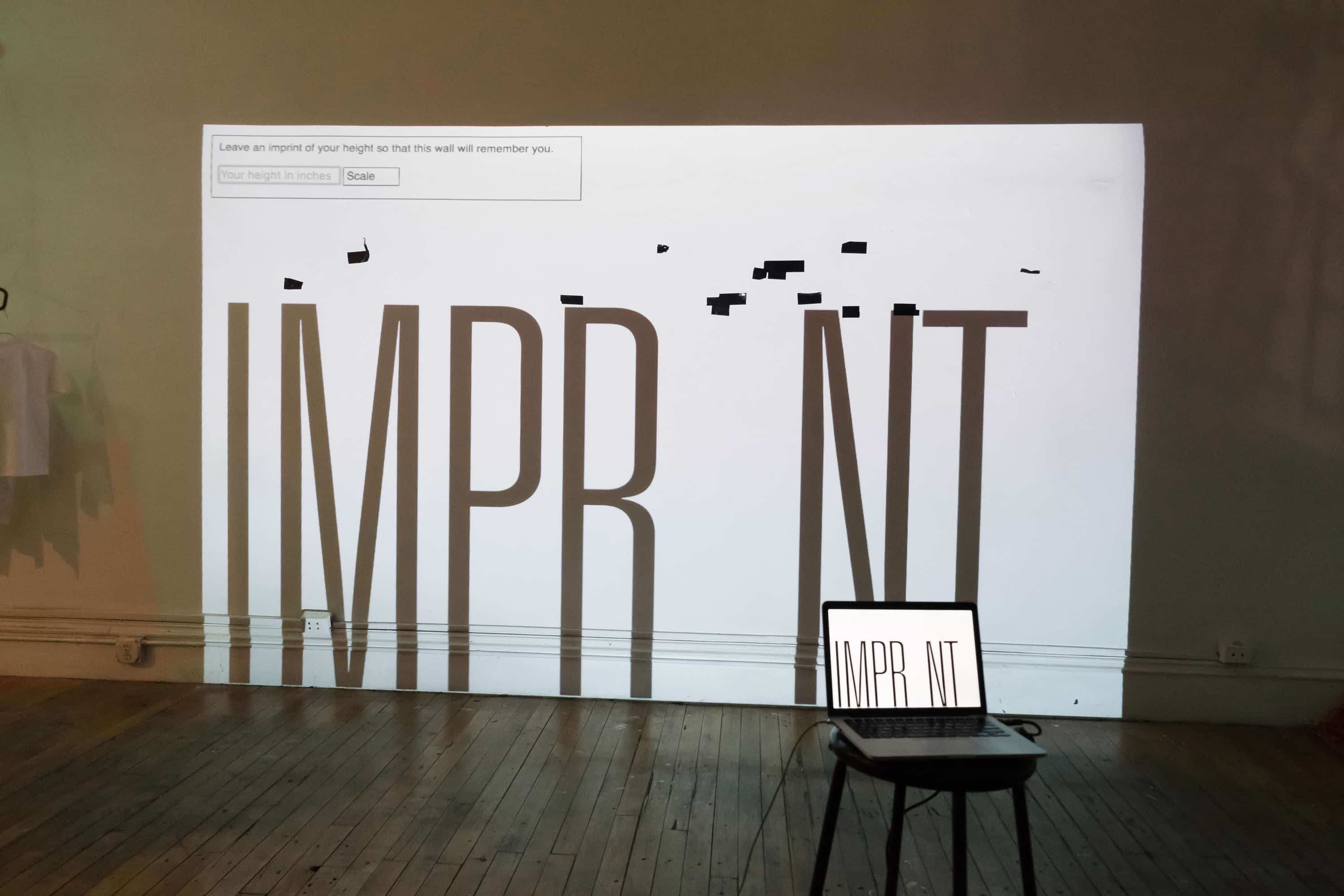
II. Imprint
How can we leave traces of ourselves behind? How can we make more visible the relationships between our bodies and the spaces that they inhabit, the presences that they command?
Imprint is an installation that asks users to scale light-projected type to match their bodies. Users mark where they stand with black duct-tape. Lines accumulate over time, giving us a portrait of all the bodies that had pressed up against the wall and partaken in this activity.
III. Car Choreography
Four cars. 30 x 40 square feet. Very little room for wiggling.
Car Choreography is a series of vignettes that stars a blue Ford, a tan Volvo, a shiny new Honda, and a beat-up little Kia. All park in the snug backyard of 54 Vernon Street in Providence, Rhode Island. How do they all fit?
Giant letters affixed to the roofs of the cars dramatize their movements. As the cars rearrange themselves throughout the day, inching in and out of each other’s paths and causing tiny dramas to unfold along the way, they don’t realize that they are all playing a part in a typesetting performance for a camera, installed on the roof of the house!
This performance ran from November 28 – December 5, 2016.